Branding
Mastering Healthcare Branding Unveiling the Top Logos that Define Industry Excellence
09.02.2025
By Shaikh Asif
Branding
09.02.2025
By Shaikh Asif


Embark on a captivating exploration of design and trust in the healthcare sector with our comprehensive guide. From the top healthcare brand logos and their meanings to the best medical logos in the healthcare industry, we delve into the elements that forge patient confidence and brand success.
Discover the healthcare logo design trends for patient trust, and how innovative healthcare logos and brand identity shape the narrative of compassion and innovation. Join us as we analyze the top healthcare logos for brand success, and how they engage patients through healthcare brand logo design for patient engagement.
Unravel the impact of effective healthcare logos on branding, and the strategic use of healthcare logo symbolism and color psychology in crafting logos that resonate with care and expertise. Through the stories of successful healthcare brand logos, we illuminate the artistry behind the symbols that stand at the forefront of healthcare branding. Dive into our blog post where we stitch together the threads of creativity and science, painting a picture of how healthcare brands communicate their core values and connect with the community.
The logo features a stylized hand figure that also resembles an arrow pointing upwards, with a red dot positioned above it. This figure could be interpreted as a person, with the red dot representing the head or perhaps an idea of vitality. The upward direction of the arrow symbolizes progress, improvement, and the aspiration to achieve better health outcomes.

Red Dot: Red is a color often associated with energy, strength, and life, which in the context of healthcare, can represent the heart, blood, and the essence of life.
Green Text: The green color of the “Fortis” text suggests health, growth, and renewal. It’s a comforting color that aligns with the brand’s commitment to life and vitality.
Typography: The modern sans-serif font used for the “Fortis” text is clean and professional, which is essential for a healthcare brand that values clarity, precision, and modernity. The simplicity of the font ensures that the brand is seen as accessible and straightforward in its communication.
Brand Values: The overall design of the Fortis logo reflects a commitment to excellence in healthcare. It conveys a message of dynamic progress and a focus on life-saving care. The combination of the upward arrow as well as the abstract hand and the red dot can also be seen as a metaphor for the brand’s dedication to elevating the standard of healthcare and putting patients’ well-being at the forefront.
Emotional Connection: The logo is designed to evoke a sense of trust and hope. The upward movement and vibrant colors encourage a positive outlook, which is crucial for patients and their families seeking care.
The brand identity of Dr. Reddy’s Laboratories. This pharmaceutical company’s logo is a fascinating blend of simplicity, symbolism, and professionalism.
The “Dr. Reddy’s” text is prominently displayed in a sans-serif font. The choice of font communicates modernity, clarity, and straightforwardness. It’s essential for a pharmaceutical brand to convey precision and reliability.
To the right of the text, there’s a graphic element that resembles a heart with droplets emanating from it. This combination suggests care, medicine, and healing. The heart symbolizes life, compassion, and the brand’s commitment to well-being.
Purple is often linked to creativity and originality, suggesting that Dr. Reddy’s is at the forefront of pharmaceutical innovation
A color associated with royalty and luxury, purple may imply that the company provides high-quality healthcare products.
Wisdom: The color can also signify wisdom and experience, indicating that Dr. Reddy’s has a deep understanding of healthcare needs.

Emotions Evoked
Trust: As a blend of the stability of blue and the energy of red, purple can evoke trust and integrity.
Pride: It can instill a sense of pride and accomplishment, reflecting the company’s achievements in the healthcare field.
Inspiration: Purple is also known to inspire and spark imagination, which can be comforting to patients looking for innovative treatments.
Heart: The heart is universally recognized as a symbol of life, love, and health. In Dr. Reddy’s logo, it conveys the brand’s dedication to improving lives through medicine.
Droplets: The droplets radiating from the heart evoke the idea of healing, medicine, and care. They imply that Dr. Reddy’s provides solutions that touch people’s lives.
Dr. Reddy’s Laboratories is committed to compassion, innovation, and patient-centric care. The logo reflects these values by emphasizing the heart (care) and the droplets (medicine). The brand’s mission is to enhance global health, and the logo reinforces this commitment.
The logo evokes feelings of trust, hope, and reassurance. Patients encountering this logo should feel that they are in capable hands, receiving quality healthcare. The heart shape also elicits emotions related to empathy and compassion.
Overall Impression:
Dr. Reddy’s Laboratories’ logo is memorable due to its simplicity and meaningful symbolism.
It communicates that the brand is not just about pharmaceuticals; it’s about caring for people’s well-being.
In summary, Dr. Reddy’s Laboratories’ logo encapsulates the essence of healthcare: compassion, innovation, and life-saving solutions. It’s a visual reminder that behind every medicine lies a heart that beats for patients’ health.
The “Cipla” logo is simple yet impactful. It consists of the brand name written in blue capital letters against a plain white background.
The choice of a clean, sans-serif font communicates professionalism, clarity, and reliability. It suggests that Cipla is straightforward and transparent in its approach.
Blue: Blue is a common color in healthcare branding. It represents trust, stability, and expertise. In the context of pharmaceuticals, blue conveys a sense of reliability and precision. The use of blue in the Cipla logo suggests that the brand is committed to providing high-quality healthcare solutions.
Minimalism: The simplicity of the logo reflects Cipla’s focus on essential healthcare. It avoids unnecessary embellishments, emphasizing the brand’s no-nonsense approach.The absence of complex graphics reinforces the idea that Cipla’s strength lies in its products and services.

Brand Values Reflection:
Cipla’s logo mirrors its core values: integrity, innovation, and accessibility. The straightforward design aligns with the brand’s commitment to making healthcare accessible to all. The blue color reinforces the brand’s reliability and dedication to improving lives.
The Cipla logo evokes feelings of trust, confidence, and efficiency. Patients encountering this logo should feel assured that they are dealing with a reputable pharmaceutical company.
The simplicity also conveys a sense of clarity—patients can rely on Cipla’s products without confusion.
Overall Impression:
Cipla’s logo is memorable due to its minimalistic design and strong color choice.
It communicates that Cipla is a brand that delivers essential healthcare solutions with integrity and expertise.
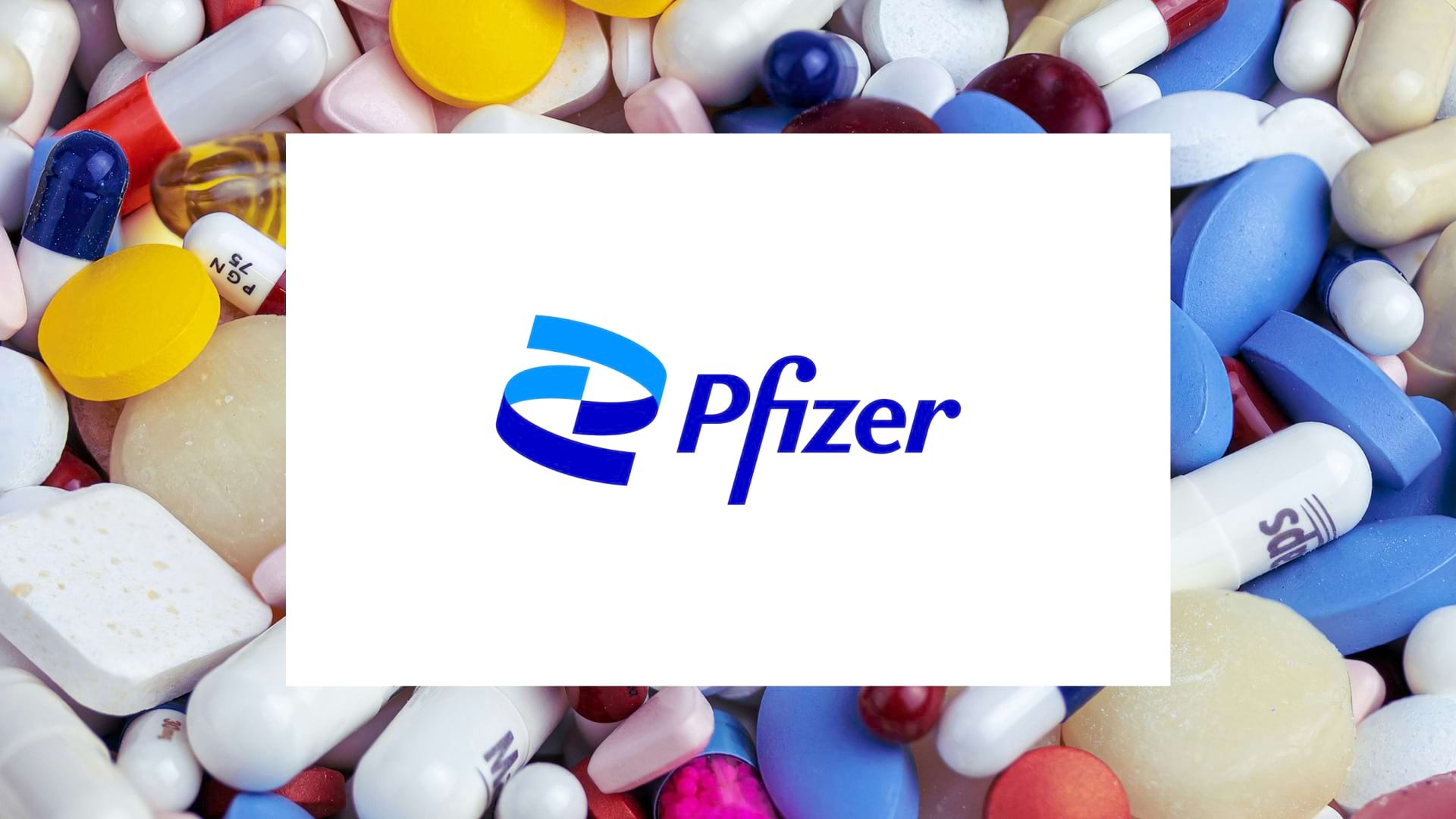
As a pharmaceutical giant, Pfizer’s logo is instantly recognizable and carries significant meaning.
The “Pfizer” logo features the brand name written in bold blue letters. The choice of bold typography conveys strength, authority, and confidence.
To the left of the text, there’s a graphic element that resembles a blue double helix or an abstract figure with two swooping arcs or ribbons. This element is a powerful symbol in the field of genetics and medicine.
Blue: Blue is a strategic choice for Pfizer. It represents trust, reliability, and professionalism. In healthcare, blue signifies expertise and scientific precision. The blue color reinforces Pfizer’s commitment to cutting-edge research and development.

Double Helix: The double helix is a fundamental representation of DNA, the building block of life. By incorporating it into the logo, Pfizer emphasizes its role in advancing medical science and improving lives.
The helix also suggests innovation, progress, and the brand’s continuous quest for breakthroughs.
Pfizer’s logo mirrors its core values: scientific excellence, research, and patient well-being. The double helix symbolizes the brand’s dedication to advancing healthcare through genetic understanding. The bold font and clean design reflect Pfizer’s position as a global leader in pharmaceuticals.
The Pfizer logo evokes feelings of trust, reliability, and hope. Patients encountering this logo should feel assured that they are dealing with a company at the forefront of medical innovation. The double helix also elicits emotions related to curiosity and discovery—a promise of better health through science.
Pfizer’s logo is iconic due to its simplicity, meaningful symbolism, and strong color choice.
It communicates that Pfizer is not just a pharmaceutical company; it’s a beacon of progress in healthcare.
In summary, the Pfizer logo encapsulates the brand’s commitment to scientific advancement, patient care, and a healthier future. It’s a visual reminder that behind every drug lies a story of research, dedication, and hope.
The “Piramal” logo features a combination of a graphic element and stylized text.
The graphic element on the left resembles an abstract flame with three swooshes in shades of orange and red. These swooshes converge at the bottom to form a point, suggesting energy, vitality, and upward movement.
To the right of this symbol is the word “Piramal” in black, stylized text. The capital “P” stands out, while the lowercase letters create a harmonious balance.
Orange and Red: These warm colors evoke feelings of energy, passion, and vitality. In the context of healthcare, they symbolize healing, warmth, and life.
Black: The black text adds sophistication and seriousness. It suggests professionalism and reliability.
Symbolism:
Flame: The flame represents transformation, renewal, and growth. It can symbolize healing, innovation, and the brand’s commitment to improving lives.
The upward movement of the flame implies progress, aspiration, and the brand’s drive to reach new heights.

Piramal’s logo mirrors its core values: innovation, care, and ambition. The flame embodies the brand’s mission to ignite positive change in healthcare.
The Piramal logo evokes feelings of hope, optimism, and trust. Patients encountering this logo should feel that they are in capable hands, receiving cutting-edge solutions. The flame also elicits emotions related to transformation and recovery.
Piramal’s logo is memorable due to its simplicity, vibrant colors, and meaningful symbolism.
It communicates that Piramal is not just a pharmaceutical company; it’s a catalyst for positive change in healthcare.
In summary, the Piramal logo encapsulates the brand’s commitment to innovation, care, and progress. It’s a visual reminder that behind every flame lies the potential for healing and transformation.
The “Biocon” logo features a combination of a graphic element and bold text.
The graphic element on the left resembles a stylized blue molecule or DNA helix. This design is instantly recognizable as a symbol of life sciences and genetics. To the right of this symbol is the word “Biocon” written in a bold sans-serif typeface. The choice of font communicates modernity, clarity, and professionalism.

Blue: Blue is a strategic choice for Biocon. It represents trust, scientific expertise, and innovation. In biotechnology, blue signifies precision and reliability. The blue color reinforces Biocon’s commitment to cutting-edge research and development in the field of life sciences.
Biocon’s logo mirrors its core values: innovation, research, and patient well-being. The DNA helix symbolizes the brand’s commitment to decoding life’s mysteries. The bold font reflects Biocon’s confidence in its scientific endeavors.
The Biocon logo evokes feelings of trust, curiosity, and hope. Patients encountering this logo should feel that they are dealing with a company at the forefront of biotechnology.
The DNA helix also elicits emotions related to discovepotential cures.
Biocon’s logo is memorable due to its simplicity, meaningful symbolism, and strong color choice.
It communicates that Biocon is not just a company; it’s a catalyst for scientific progress and better health.
In summary, the Biocon logo encapsulates the brand’s commitment to scientific advancement, patient care, and a healthier future.
The “LUPIN” logo is an emblem types of logo design.
The graphic element represents a stylized lupin plant within a rectangle. The lupin plant is characterized by its distinctive leaves and flowers.
At the bottom of this symbol is the word “LUPIN” written in bold, capital letters. The choice of font communicates strength, professionalism, and reliability.
Green: Green is a strategic choice for Lupin. It represents health, growth, and nature. In the context of pharmaceuticals, green signifies healing and vitality. The green color reinforces Lupin’s commitment to providing healthcare solutions.

Lupin Plant: The lupin plant is associated with medicinal properties and natural healing. By incorporating it into the logo, Lupin emphasizes its role in improving health.
The rectangular shape suggests stability, structure, and organization.
Lupin’s logo mirrors its core values: innovation, care, and sustainability. The lupin plant symbolizes the brand’s dedication to holistic well-being.
The bold font reflects Lupin’s confidence in its products and services.
The Lupin logo evokes feelings of trust, reliability, and natural healing. Patients encountering this logo should feel that they are dealing with a company that prioritizes their health. The lupin plant also elicits emotions related to hope and vitality.
Lupin’s logo is memorable due to its simplicity, meaningful symbolism, and strong color choice.
It communicates that Lupin is not just a pharmaceutical company; it’s a partner in wellness.
In summary, the Lupin logo encapsulates the brand’s commitment to scientific progress, patient care, and a healthier future.
The “Sun Pharma” logo features a combination mark one of the types of logo design. The mark or graphic element represents an abstract sun in orange. It appears as two intertwined shapes forming a circular pattern. The sun is a universal symbol of energy, light, and life.
Below the sun symbol is the word “Sun Pharma” written in grey capital letters. The choice of font communicates professionalism and reliability.

Orange: Orange is a strategic choice for Sun Pharma. It represents energy, vitality, and innovation. In healthcare, orange signifies healing and progress. The orange color reinforces Sun Pharma’s commitment to advancing medical science and improving health.
Symbolism:
Sun: The sun symbolizes life, growth, and illumination. By incorporating it into the logo, Sun Pharma emphasizes its role in providing essential healthcare solutions.
The intertwined shapes evoke a sense of dynamism, suggesting that Sun Pharma is constantly evolving and adapting.
Sun Pharma’s logo mirrors its core values: innovation, quality, and global impact. The sun represents the brand’s mission to bring light to healthcare challenges.
The bold font reflects Sun Pharma’s confidence in its products and services.
The Sun Pharma logo evokes feelings of trust, optimism, and vitality. Patients encountering this logo should feel that they are dealing with a company that prioritizes their well-being.
The sun also elicits emotions related to hope, energy, and positivity.
Sun Pharma’s logo is memorable due to its simplicity, meaningful symbolism, and strong color choice.
It communicates that Sun Pharma is not just a pharmaceutical company; it’s a beacon of light in healthcare.
As we conclude our journey through the vibrant landscape of healthcare branding, we’ve traversed the intricate paths of top healthcare brand logos and their meanings, admired the best medical logos in the healthcare industry, and grasped the healthcare logo design trends for patient trust. We’ve witnessed how innovative healthcare logos and brand identity serve as beacons of hope and assurance, and how they are pivotal in analyzing top healthcare logos for brand success.
These logos are not mere designs; they are the heartbeats of healthcare brand logo design for patient engagement, the silent yet eloquent ambassadors of effective healthcare logos and their impact on branding. They are the storytellers, narrating tales of compassion through healthcare logo symbolism and color psychology, and the visionaries that reflect the ethos of their brands. As we part ways, let the stories of successful healthcare brand logos and their stories inspire you to see beyond the visuals, into the soul of healthcare branding, where every color, shape, and line comes together to weave a narrative of life, care, and innovation.
A: An effective healthcare logo combines simplicity, memorability, and symbolism. It should evoke feelings of trust, care, and professionalism. The right color palette, typography, and imagery can communicate a brand’s commitment to excellence and compassion, fostering a strong bond with patients.
A: Absolutely. A well-designed logo serves as the first point of interaction and can significantly influence a patient’s perception. It’s a visual representation of a brand’s values and can sway a patient’s choice by conveying reliability, innovation, and empathy.
A: Colors play a crucial role in logo design, with each hue invoking specific emotions. For instance, blue represents trust and stability, green symbolizes growth and health, and red can denote energy and urgency. The right color choice enhances brand recognition and aligns with the emotional experience a healthcare brand aims to provide.
A: Memorable healthcare logos often feature distinctive symbols or typography that set them apart. They tell a story, resonate with cultural values, or incorporate elements that have a strong connection to the brand’s mission, making them stick in the minds of patients and professionals alike.
A: A healthcare brand should consider updating its logo when it undergoes significant changes, such as expansion, mergers, or shifts in services. However, frequent changes can disrupt brand continuity. It’s essential to strike a balance between staying current and maintaining a consistent brand identity.
A: A poorly designed logo can lead to misinterpretation, lack of engagement, and even distrust. It may fail to communicate the brand’s message or be forgettable, which can hinder the brand’s ability to connect with its audience and stand out in a competitive market.
A: Successful healthcare brands maintain consistency in their logo usage across all platforms, whether it’s digital, print, or physical spaces. This consistency ensures that the logo reinforces the brand identity at every patient touchpoint, from websites and social media to signage and packaging.
A: A logo is a cornerstone of a healthcare company’s brand strategy. It’s not just a visual mark; it’s a symbolic representation of the brand’s promise, quality, and reputation. It plays a pivotal role in branding efforts, from marketing campaigns to patient experience strategies.


Shaikh Asif is an Award-winning designer, director, strategist, and educator. He’s the Lead Strategic Brand Designer and Art Director of The Alitestar— a strategic branding and design agency that helps startups, ambitious CEOs, and passionate entrepreneurs to achieve success and ultimately create unforgettable brand experiences.