Business Fundamentals
Color Psychology How Colors Influence Business Decisions
09.02.2025
By Shaikh Asif
Business Fundamentals
09.02.2025
By Shaikh Asif


Color surrounds us every day, painting the world with a rich tapestry of hues. It's not merely an aesthetic choice but a powerful communicator of emotions and meanings.
Have you ever wondered why certain brands use red in their logos to evoke excitement and passion, while others opt for blue to convey trust and dependability? Or why do many restaurants use warm colors to stimulate appetite and create a cozy atmosphere? The answer lies in the fascinating world of color psychology, a field that explores how colors can influence our emotions, perceptions, and behaviors. Understanding color psychology is not only essential for designers crafting logos and marketing materials but also for business owners and entrepreneurs aiming to connect with their audience on a deeper level.In this comprehensive guide, we'll delve into the captivating realm of color psychology, providing insights and knowledge that will help you make informed decisions about the use of color in your branding and marketing strategies.
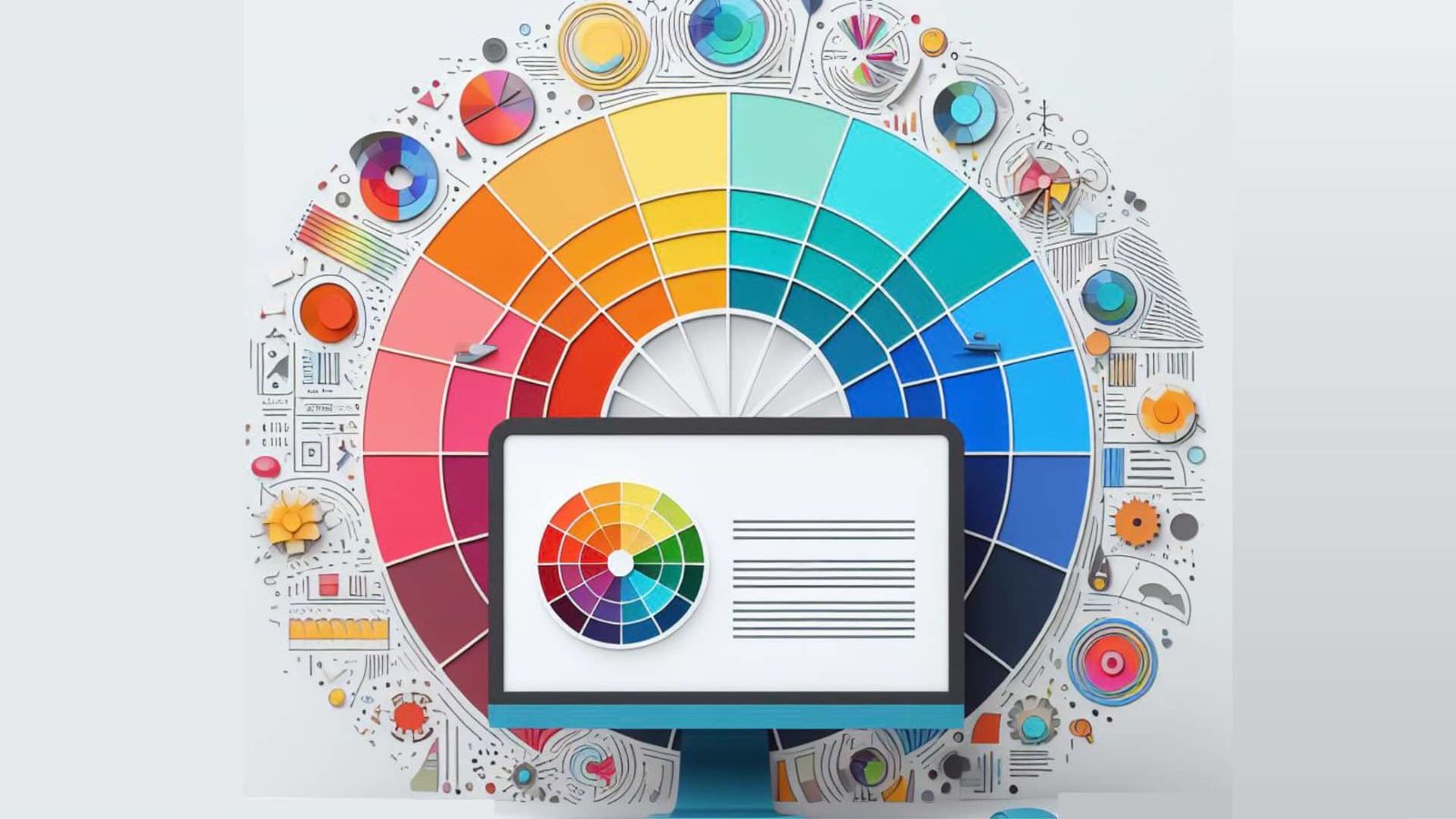
Understanding Color Psychology
At its core, color psychology is the study of how different colors can impact human psychology and behavior. It goes beyond personal preferences, acknowledging that each color has a unique set of associations and influences on our subconscious.Understanding these associations is crucial, as it empowers designers, marketers, and individuals to use colors intentionally to achieve specific goals. Let's take a closer look at some of the key colors on the emotional spectrum:
Red is associated with strong emotions like passion and love. It can evoke excitement, urgency, and high energy. Brands using red are often perceived as dynamic and enthusiastic.It is one of the most attention-grabbing colors. It naturally stands out, making it a powerful choice for brands that want to be noticed. It can stimulate appetite, which is why many food and beverage brands use it to attract customers. Red is youthful and bold. It conveys a sense of daring and modernity. Red is unique because of its dual nature.
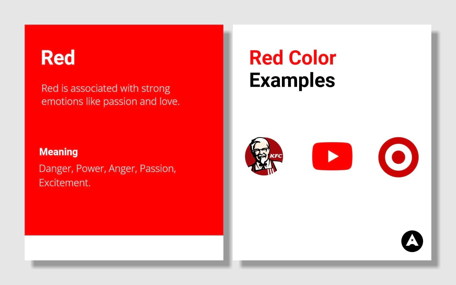
It can represent love and warmth, but it can also evoke strong emotions like anger and danger. This duality makes it a versatile color in branding. It's associated with both the heart and fire, conveying passion and intensity. On the other side, red can also represent anger, danger, and aggression, which might be off-putting to certain audiences or in contexts that require a calm atmosphere.
Let’s explore some real-world uses of red colors.
1. Food and Beverage: Fast-food chains like McDonald's and brands like Coca-Cola utilize red to stimulate appetite and create a sense of excitement.
2. Retail and Sales: Red is often used in clearance sales and discount offers. Retailers use it to convey urgency and encourage impulsive buying.
3. Technology: Brands like YouTube and Adobe use red to represent innovation and cutting-edge technology.
4. Sports and Entertainment: Red is prevalent in sports team logos and event branding due to its association with energy and excitement.
The choice of using red in branding extends beyond specific industries. It depends on how your target audience interprets the color red. For instance, red can effectively convey emotions like love, intimacy, nurturing relationships, and care.It's a versatile color that can be used creatively across various sectors based on the desired emotional and psychological impact on the audience.
Blue is associated with trustworthiness, reliability, and professionalism. It's commonly used in corporate branding because it conveys a sense of stability. Blue is a calming color that evokes feelings of serenity and relaxation. Brands in wellness, healthcare, and beauty often use blue to create a soothing atmosphere. Blue is incredibly versatile. It can be paired with many other colors, making it suitable for a wide range of industries and brand personalities. Tech companies often use blue to represent innovation and intelligence. It can create a sense of confidence in cutting-edge products.
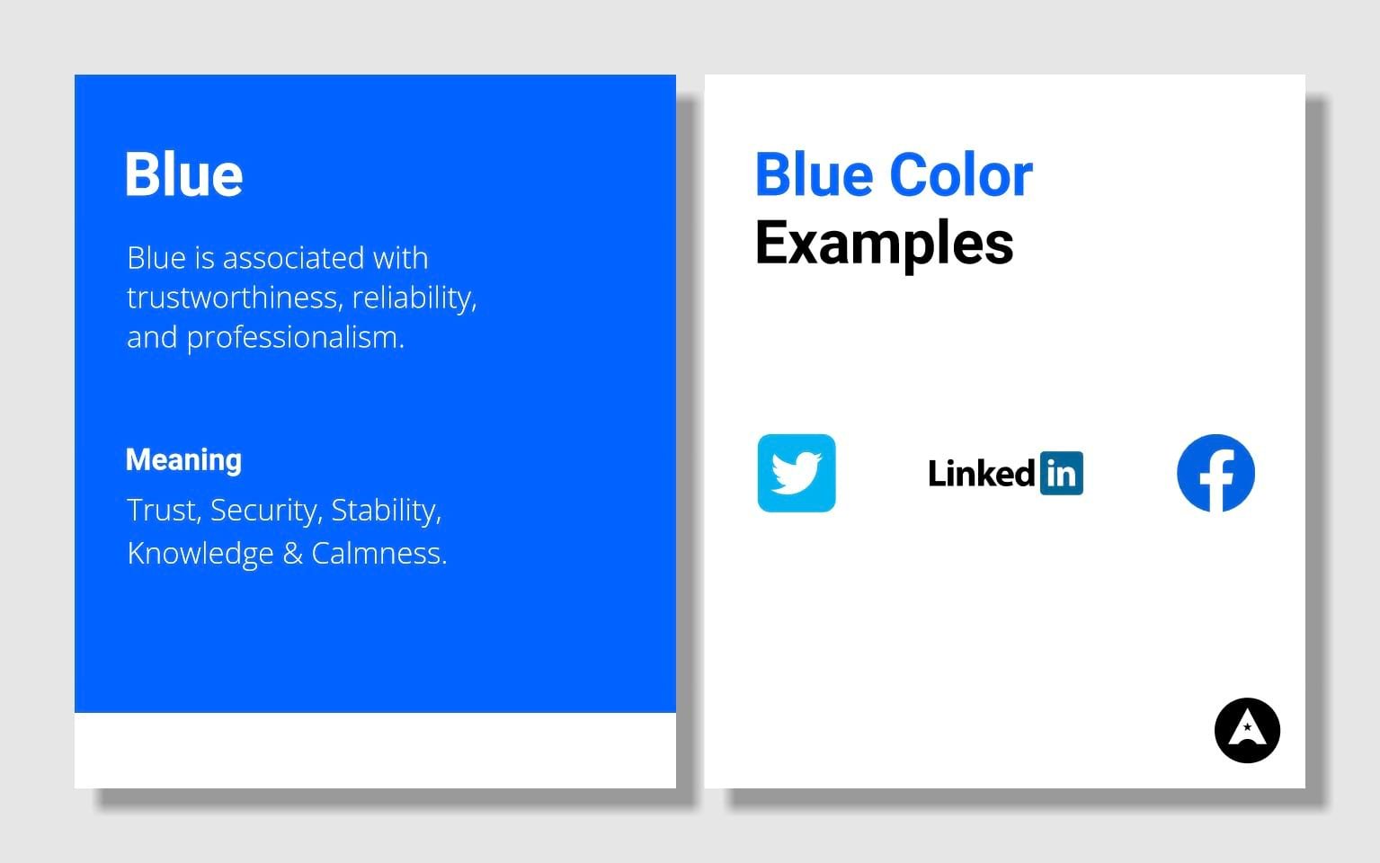
Blue's uniqueness lies in its ability to simultaneously evoke trust and tranquility. It's considered a safe choice in branding, but this versatility can also make it challenging to stand out in industries where many brands use blue. While Dark or overly desaturated blues can evoke feelings of sadness or depression. This is an essential consideration, especially in branding related to mental health or wellness.
1. Finance and Banking: Many banks and financial institutions use blue to convey trust and stability. Examples include Chase, American Express, and PayPal.
2. Healthcare and Wellness: Brands related to healthcare and wellness use blue to create a sense of calm and trust. Examples include Pfizer and Blue Cross Blue Shield.
3. Technology: Tech companies like IBM and Dell utilize blue to communicate reliability and innovation.
4. Social Media: Blue is prevalent in social media branding. Facebook, Twitter, and LinkedIn use blue to establish trust and professionalism.
In summary, blue is a versatile and dependable color that can communicate trust, professionalism, and tranquility. However, it's essential to select the right shade and use it thoughtfully to avoid potential negative connotations and to ensure it aligns with your brand's message and audience.
Green is intrinsically linked to nature, symbolizing life, growth, and renewal. It can convey a sense of freshness and health. In today's environmentally conscious world, green often represents eco-friendliness and sustainability. It's used by many eco-conscious brands to align with these values. Lighter shades of green can create a calming effect, making it ideal for wellness and relaxation-focused brands. People generally associate green with positive concepts like safety, prosperity, and peace.
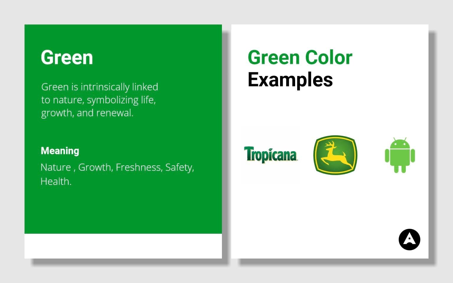
Green's uniqueness is its ability to connect with our primal need for nature and growth. It can convey a sense of calm, health, and eco-consciousness while also reflecting a connection to the environment.
1. Eco-Friendly and Sustainable Brands: Companies that emphasize sustainability and eco-friendliness often use green in their branding. Examples include Whole Foods Market and The Body Shop.
2. Health and Wellness: Green is commonly seen in brands related to health and wellness. The use of green can convey a message of vitality and well-being. Examples include Subway and John Deere.
3. Financial Services: Some financial institutions incorporate green to convey growth, stability, and financial prosperity. Examples include TD Bank and Mint.
4. Outdoor and Adventure Brands: Companies focused on outdoor activities or adventure often use green to align with nature. Examples include Land Rover and Timberland.
Yellow is associated with sunshine and happiness, making it an ideal choice for brands that want to convey optimism and positivity. Yellow is one of the most attention-grabbing colors. It can draw the eye and create a sense of urgency, making it useful for clearance sales or calls to action. Yellow is linked to creativity and innovation. Brands that aim to showcase their inventiveness or stand out as industry leaders often use yellow.

It evokes feelings of youthfulness and energy, which is valuable for brands targeting a younger audience. Yellow's uniqueness lies in its capacity to infuse brands with optimism and energy. It can make a brand appear youthful and innovative, and its attention-grabbing quality is unparalleled.
1. Food and Beverages: Yellow is commonly used in food branding to indicate freshness and flavor. Brands like McDonald's and Lay's leverage yellow in their logos.
2. Technology and Innovation: Some tech companies use yellow to emphasize their creativity and cutting-edge products. Snapchat is a notable example.
3. Retail and Sales: Yellow's attention-grabbing quality makes it suitable for brands in retail, particularly for sales and discounts.
4. Entertainment: Yellow is used by brands related to entertainment and leisure. Best Buy's yellow price tags, for instance, create a sense of urgency and value.
However, in some contexts, yellow can represent caution, particularly in the form of warning signs. Brands need to be mindful of this interpretation and use it judiciously.Overuse of yellow, especially in inappropriate contexts, can make a brand seem insincere or lacking in seriousness.
Orange is a vibrant color that can evoke feelings of energy, enthusiasm, and positivity. It's often associated with creativity and innovation. It is a warm and inviting color that can make brands feel approachable and friendly. It's great for creating a sense of community. Its high visibility makes Orange an excellent choice for catching attention, whether in a busy retail environment or online advertising.
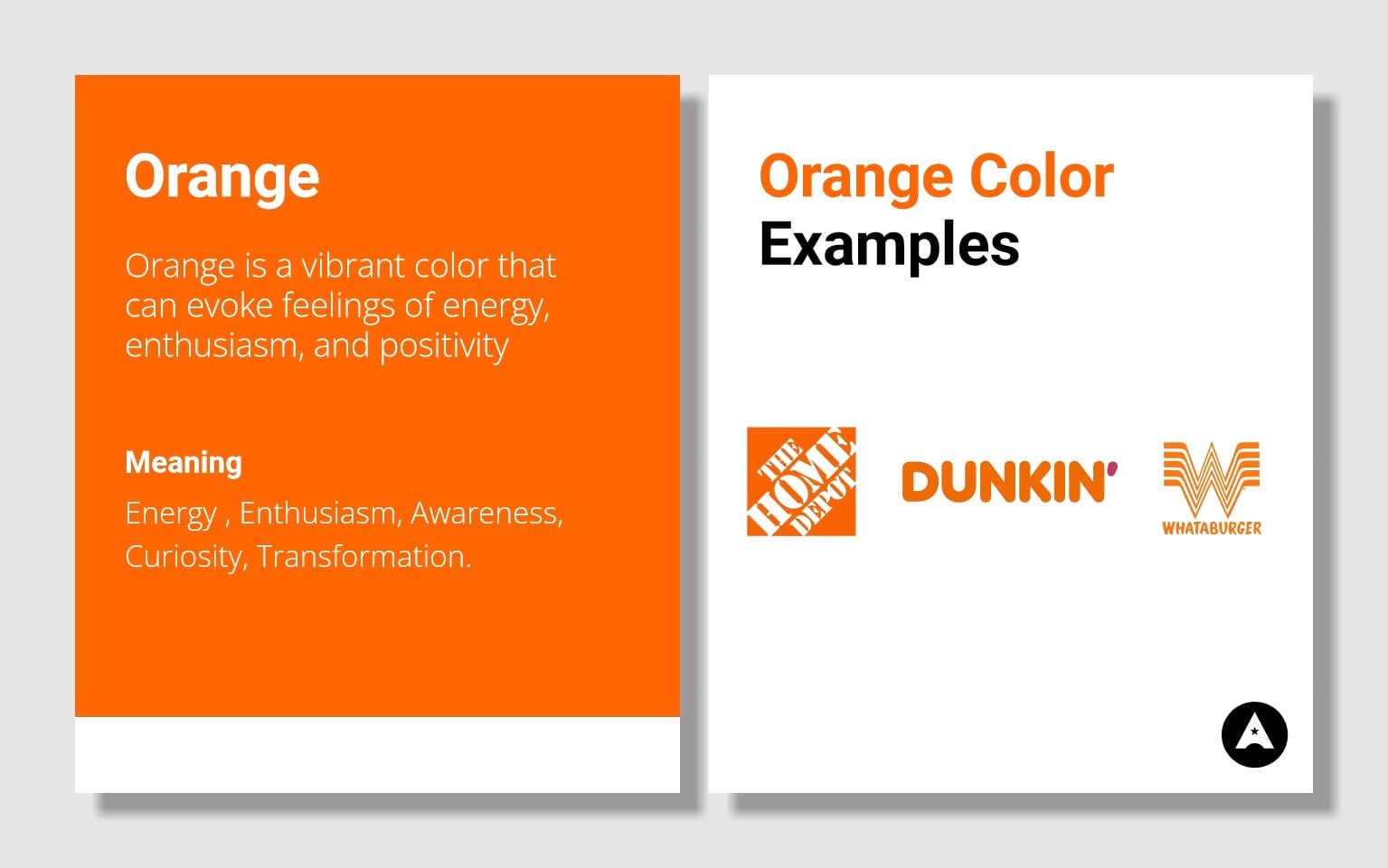
Orange is frequently used for call-to-action elements in marketing, such as buttons and highlights, due to its ability to inspire action. The uniqueness of orange lies in its ability to be simultaneously energetic and friendly. It's an inviting color that encourages action, making it an excellent choice for brands that want to stand out and inspire enthusiasm.
1. Entertainment and Creativity: Many entertainment brands, such as Nickelodeon and Fanta, use orange to convey creativity and fun.
2. Sports and Adventure: Orange is associated with action and adventure, making it suitable for brands in the sports and outdoor industry. Examples include The North Face and Orange Theory Fitness.
3. E-commerce and Call-to-Action: Amazon: While Amazon's primary color is blue, it uses strategically placed orange call-to-action buttons (such as "Buy Now") to encourage users to take action in a user-friendly way.
4. Fashion and Apparel: The luxury fashion brand Hermès uses a specific shade of orange called "Hermès orange" to represent prestige, style, and exclusivity.
On the other side, Too much orange can be overwhelming and might lead to a sense of overstimulation. It's crucial to use it in moderation and balance it with other colors. In some contexts, especially when paired with red, orange can convey a sense of aggression. Brands need to be cautious about the specific shade and how they use it.
Purple is associated with royalty, luxury, and sophistication. Brands that use purple can convey a sense of high quality and exclusivity. Purple is a color that sparks creativity and imagination. It can make a brand appear artistic, imaginative, and unique. It is a balanced color that combines the energy of red and the calmness of blue. It can create a harmonious and peaceful brand image.
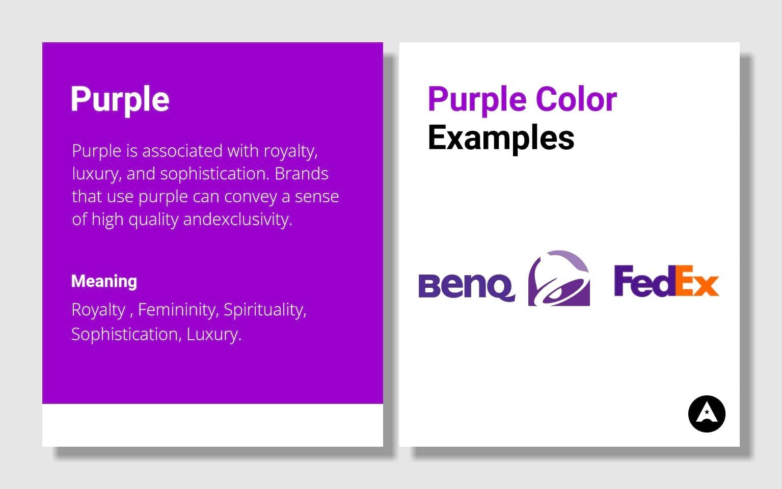
Purple can add an element of mystery and intrigue to a brand. It's a color that piques my curiosity. What makes purple unique is its ability to strike a balance between the passionate energy of red and the calming stability of blue. It's both sophisticated and imaginative, making it a versatile choice for brands.
1. Beauty and Cosmetics: Many beauty brands use purple to convey a sense of elegance and luxury. Examples include Chanel and Milani.
2. Creative Services: Agencies and brands in creative industries often use purple to emphasize their imaginative and artistic nature. DeviantArt is an example.
3. Education and Learning: Purple can be used by educational brands to indicate wisdom, knowledge, and imagination. Hallmark Education is an example.
Overusing dark or intense shades of purple can lead to feelings of oppression or even arrogance. It's crucial to strike the right balance.
In summary, purple is a color associated with luxury, imagination, and creativity. It's ideal for brands looking to convey sophistication, artistic flair, and balance. However, it's essential to use it thoughtfully and in the right shade to avoid overwhelming or appearing too distant.
Pink is associated with femininity, love, and romance. It can be used to create a sense of tenderness and caring. Pink is known for its calming and nurturing qualities. It can convey compassion, understanding, and empathy. Brighter shades of pink can evoke a sense of youthfulness and playfulness, making it ideal for brands targeting younger audiences. Pink can stimulate creativity and imagination. It's often used by creative and artistic brands. Pink stands out with its associations with love, empathy, and a caring nature.
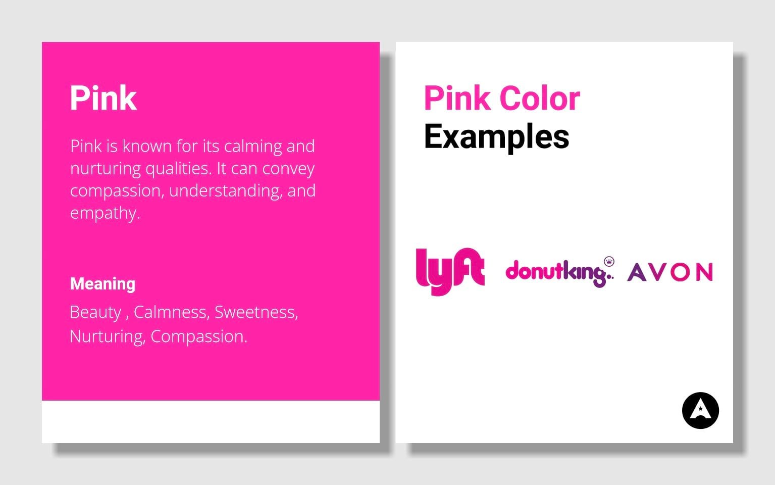
It has the unique ability to convey both a sense of elegance and a playful, youthful spirit.
1. Fashion and Beauty: Many fashion and beauty brands use pink to convey elegance, femininity, and a sense of pampering. Victoria's Secret and Barbie are prime examples.
2. Healthcare and Wellness: Pink is used by healthcare and wellness brands to convey compassion and caring. The Breast Cancer Awareness ribbon is a well-known example.
3. Toys and Children's Products: Pink is often used in branding toys and children's products, symbolizing playfulness and imagination.
Depending on the context, pink may be seen as overly feminine, potentially alienating male audiences or those who don't resonate with stereotypically feminine qualities. Bright, hot pink shades may sometimes be associated with immaturity, so brands targeting more mature audiences should use them thoughtfully.
Grey Color: The Neutral and Timeless Choice
Grey is a classic, timeless color that doesn't go out of style. It can give brands an air of sophistication and longevity. Grey is a neutral color that works well with almost any other color, making it an excellent choice for creating balance in branding.
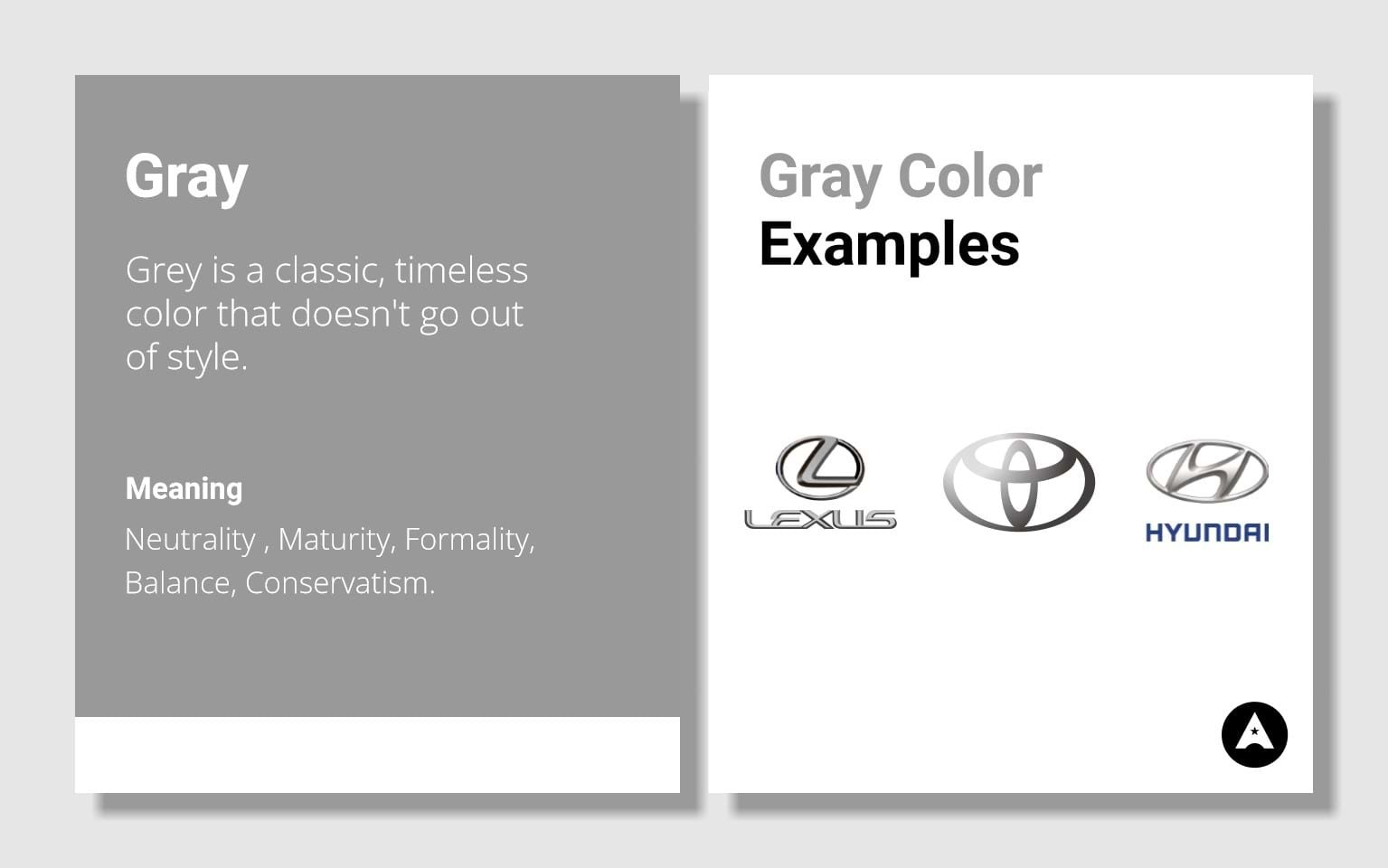
It doesn't overpower other colors and can provide a subtle, elegant backdrop for branding elements. Grey often conveys a sense of professionalism, making it ideal for brands looking to establish authority and trust. The uniqueness of grey lies in its ability to be a canvas for other colors. It doesn't compete for attention, allowing other brand elements or colors to shine. This versatility makes it a valuable addition to branding.
1. Tech and Innovation: Many tech brands, like Apple, use shades of grey in their branding to signify innovation, sleek design, and high-quality products.
2. Fashion and Luxury: Grey is often associated with luxury and high fashion. Brands like Chanel and Rolex use it to convey elegance and sophistication.
3. Corporate and B2B: In the corporate world, grey is a common choice as it signifies professionalism and reliability. Many law firms and financial institutions use grey in their branding.
4. Healthcare: In the healthcare industry, grey can represent dependability and trustworthiness. Hospitals and medical companies sometimes incorporate grey into their branding.
Grey, when used excessively or inappropriately, can be perceived as dull and uninspiring. It may not be suitable for brands that want to convey energy and excitement In some contexts, grey can be associated with gloominess or negativity. Brands need to be cautious about the specific shade and how they use it.
Black is synonymous with elegance, luxury, and sophistication. Brands that use black can convey a sense of exclusivity and refinement. Black is a timeless color that rarely goes out of style. Brands that utilize black can maintain a consistent and enduring image. Black is often associated with authority, power, and formality. Brands in the financial, automotive, and luxury sectors leverage black to symbolize control and influence.
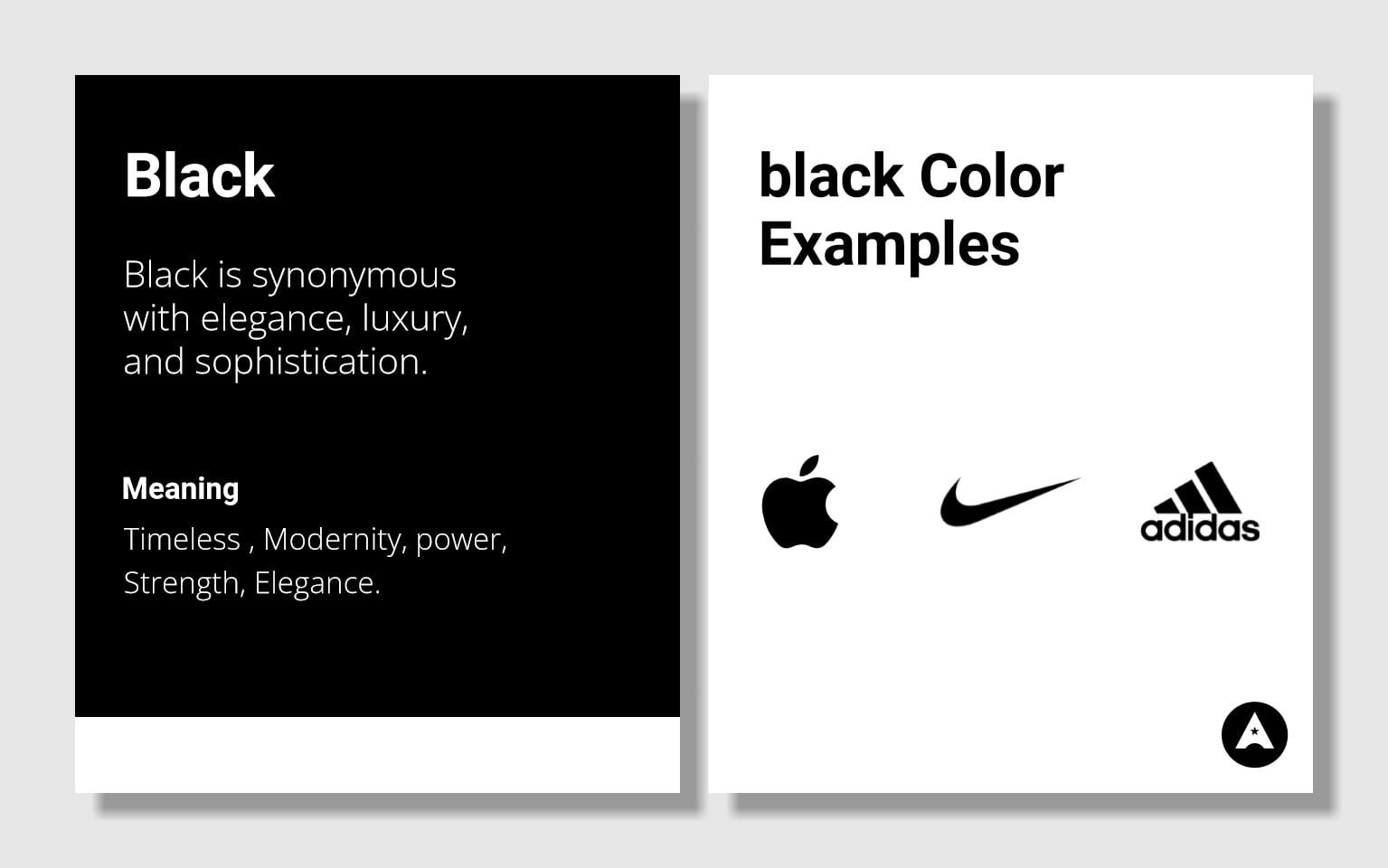
Black is a popular choice for minimalist and modern design. It can help convey a sense of simplicity and sleekness. The uniqueness of black lies in its timeless and authoritative nature. It can communicate a wide range of emotions, from classic elegance to contemporary minimalism. Black is a versatile color that can work well in various contexts.
1. Fashion and Luxury: Many high-end fashion brands like Chanel and Prada use black as their primary color to convey luxury and sophistication.
2. Technology and Premium Electronics: Companies like Apple utilize black to signify premium quality, elegance, and innovation.
3. Automotive: Luxury car manufacturers, such as Mercedes-Benz and Bentley, often incorporate black to exude power and prestige.
4. Entertainment and Media: Black is widely used in the film and music industries to evoke a sense of glamour and intrigue.
Overusing black can make a brand seem distant, unapproachable, or overly serious. Balance is essential when using black. In some contexts, black can be associated with sadness or negativity. Brands should be mindful of the message they want to convey.
White is associated with purity and cleanliness. It conveys a sense of hygiene and perfection, making it an ideal choice for brands in healthcare, cosmetics, and cleaning products. White's simplicity is often used to represent minimalism and simplicity. Brands like Apple and IKEA have harnessed white to convey these qualities. White is a timeless color that never goes out of style. It's often used to establish a sense of purity and authenticityWhite provides excellent visibility and contrast. It's frequently used as a background color for text and images, ensuring content is easy to read and understand.
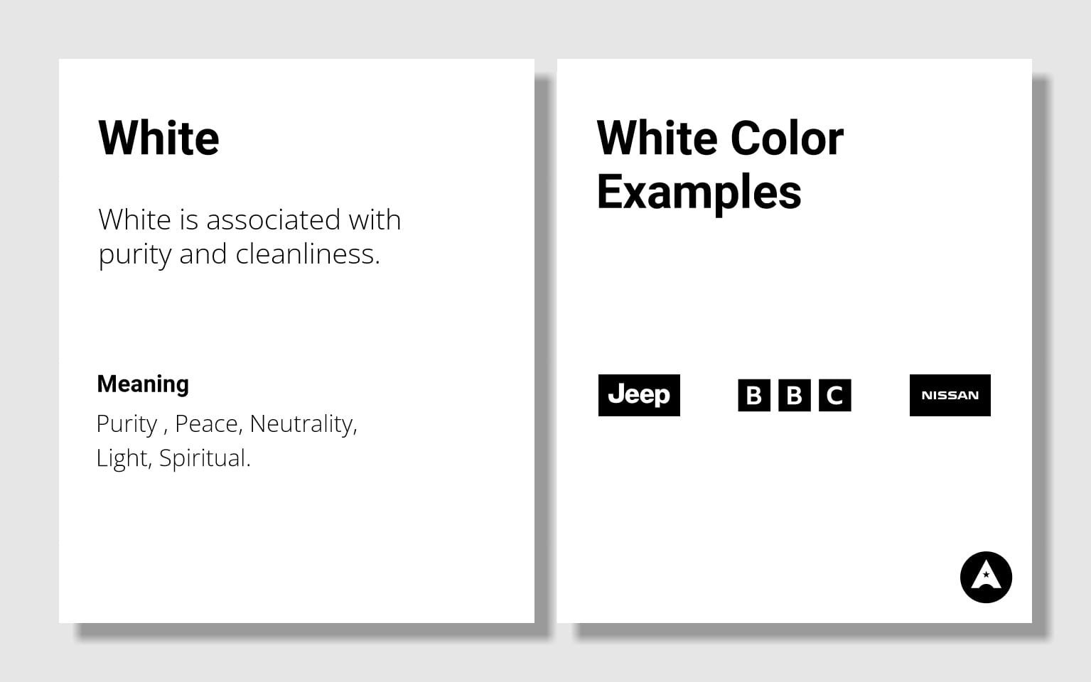
White's uniqueness lies in its timeless simplicity. It represents purity and cleanliness and can easily convey a sense of sophistication and luxury. Its versatility allows it to adapt to various brand identities.
1. Healthcare and Pharmaceuticals: Many healthcare and pharmaceutical brands use white to convey purity, safety, and professionalism. Think of brands like Johnson & Johnson or Pfizer.
2. Tech and Electronics: White is often used in tech and electronics to represent minimalism and modernity. Apple's iconic white branding is an excellent example.
3. Fashion and Luxury: Luxury brands, such as Chanel and Rolls-Royce, utilize white to emphasize simplicity,
elegance, and exclusivity
4. Weddings and Events: In the event planning and wedding industry, white is associated with purity and new
beginnings, making it a popular choice for branding. White can be seen as high-maintenance since it shows dirt and imperfections easily. Brands that use white should be mindful of the need for maintenance and upkeep.
In conclusion, white represents purity, cleanliness, and simplicity, making it a powerful choice for brands seeking a timeless and sophisticated image. It's especially suitable for industries where hygiene and perfection are key, but it should be used thoughtfully to avoid appearing cold or inaccessible.
In the colorful realm of brand identity and psychology, understanding the powerful impact of color on human emotions and perceptions is the key to creating a successful and resonating brand.
Color theory, a complex and nuanced field, plays a pivotal role in determining the hues that represent your brand's identity. While color meanings can vary across cultures and contexts, there are universal associations that businesses can leverage to their advantage. Incorporating the insights of color psychology into your brand identity can be a game-changer. It's not just about aesthetics; it's about creating a powerful emotional connection with your audience. Your brand colors should convey the right message, resonate with your customers, and ultimately drive success in the competitive world of business.By exploring the fascinating world of color psychology, you unlock a creative toolbox for building a brand identity that truly stands out.Understanding the psychological and emotional impact of colors is at the heart of successful branding. Dive into the world of color theory to choose the hues that represent your brand effectively. The process of selecting your brand colors is a crucial one. Learn how to make the right choices to create a compelling brand identity.


Shaikh Asif is an Award-winning designer, director, strategist, and educator. He’s the Lead Strategic Brand Designer and Art Director of The Alitestar— a strategic branding and design agency that helps startups, ambitious CEOs, and passionate entrepreneurs to achieve success and ultimately create unforgettable brand experiences.