Design
Choosing The Right Logo For Your Business
09.02.2025
By Shaikh Asif
Design
09.02.2025
By Shaikh Asif


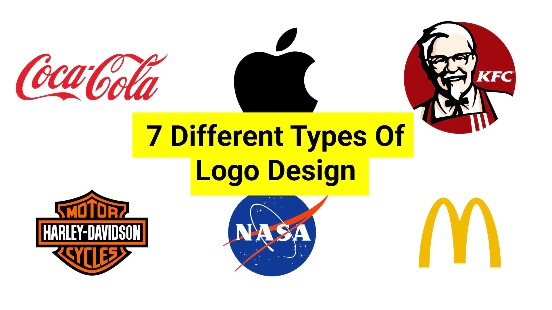
But did you know that logos come in various forms, each with its unique attributes and applications? In this comprehensive guide, we'll delve deep into the fascinating world of logos by exploring seven different types, providing famous examples, and explaining when to use each type. In today's visually driven world, a logo serves as the cornerstone of your brand identity. It's the first impression that can leave a lasting impact on your target audience. Choosing the right logo is as important as understanding each different type of logo design. But at the end of this guide, you will be able to get an understanding of at least which one would be the best fit for your brand or business.
Let’s deep dive into each type, with the best examples of famous logos.
Wordmark logos consist of the brand's name, usually stylized in a unique font or typography. These logos rely solely on text to convey the brand's identity. Wordmark logos, also known as logotype, focus primarily on the brand's name, often rendered in a unique or customized font.
![]()
The best example of a wordmark is Google. Google's wordmark stands out with its playful and ever-changing "Google Doodle" variations, keeping the logo fresh and engaging. The other best examples would be Coca-Cola and Disney.
Wordmark logos are ideal when your brand name is distinctive or when you want to emphasize your brand's name itself. They work well for businesses with short, memorable names.
Avoid wordmark logos when your brand name is not distinctive or memorable. If your business name is long, complex, or doesn't convey any inherent meaning, a wordmark logo may not effectively capture your brand's essence.
Lettermark logos are composed of the initials or acronym of a brand, creatively intertwined or styled uniquely. Lettermark logos, also known as monogram, sometimes referred to as initialism logos, distill a brand's identity into its core initials or acronym, creatively styled to form a distinctive symbol." The perfect example of a lettermark is IBM. IBM's lettermark is renowned for its iconic, horizontal stripes, reflecting a sense of unity and connectivity.
![]()
NASA and HBO are the two best examples of lettermark logos.
Lettermark logos are effective when a brand has a long or complex name, and you want to simplify its representation. They are also suitable when the initials are more recognizable than the full name.
Don't opt for lettermark logos if the initials or acronyms of your brand are not widely recognized or if they don't have inherent significance. Using initials that are less known may confuse your audience.
Pictorial logos feature a distinctive image or symbol that represents the brand. These symbols are often memorable and can stand alone without the brand name. Pictorial logos are also known as brand marks. Pictorial logos are powerful when the symbol alone can convey the essence of the brand. It is also significant for creating a unique and iconic symbol that resonates with the brand's values and message. The best example of a pictorial logo is the Apple logo. Apple logo is instantly recognizable and reflects simplicity, elegance, and innovation.
![]()
And Twitter's logo, a stylized bird known as "Larry the Bird" or "Twitter Bird," is synonymous with social interaction, freedom of expression, and real-time communication, making it a universally recognizable symbol of online connectivity.
Pictorial logos are ideal when you have a unique and recognizable symbol associated with your brand. They work well for companies with a strong visual identity.
Avoid pictorial logos if you don't have a unique or relevant symbol associated with your brand. Using generic or unrelated imagery can dilute your brand's identity and message.
Abstract logos use non-representational shapes, forms, or patterns to create a unique and visually appealing design. They often evoke emotions or convey concepts without using literal imagery. Abstract logos invite interpretation and can be versatile across various industries. The Pepsi symbol is a perfect example of an abstract logo. Pepsi's globe logo uses a unique wave design, suggesting a dynamic and refreshing brand image. Another great example of an abstract logo is Nike— the iconic Swoosh, is an instantly recognizable and timeless symbol that represents movement, speed, and motivation, embodying the brand's "Just Do It" ethos.
![]()
Adidas's logo features three parallel stripes, known as the "Three Stripes," which convey a sense of progression, innovation, and sporty elegance, symbolizing the brand's athletic heritage.
Abstract logos are suitable when you want to evoke emotions and associations without using literal imagery. They can be versatile and used in various industries.
Don't choose abstract logos if you need a logo that explicitly conveys a specific message or if your brand identity relies heavily on literal imagery. Abstract logos may leave room for interpretation but might not suit all industries or businesses.
Mascot logos feature a character, often an anthropomorphic figure, that personifies the brand. These logos are friendly and relatable. A famous example of a mascot logo is KFC. Colonel Sanders, KFC's mascot, is a distinctive figure representing the brand's heritage and finger-licking-good chicken.
![]()
Another great example of a mascot is Michelin's Michelin Man, Pringles' Mr. Pringle.
Mascot logos are great for brands that want to establish a friendly and approachable persona. They are common in the food and beverage industry.
Avoid mascot logos if your brand's identity is more serious, formal, or professional. Mascots are typically associated with playful or approachable brands and may not align with brands aiming for a different image.
Combination logos seamlessly integrate a wordmark or lettermark with a distinctive symbol or icon, providing a balanced representation of both text and imagery. For example McDonald's logo—a combination of the Golden Arches and the memorable brand name, with the arches symbolizing the "M" for McDonald's.
![]()
Another example of a combination logo is Adidas, Adidas reflects both abstract and combined nature in their logo, three parallel stripes, known as the "Three Stripes," which convey a sense of progression, innovation, and sporty elegance, symbolizing the brand's athletic heritage with a bold and distinctive wordmark.
Combination logos are recommended when brands want to emphasize both their name and a recognizable symbol. These logos offer versatility and are popular choices for businesses aiming for a well-rounded brand identity.
Don't opt for combination logos if you want to keep your branding simple and minimalistic. These logos inherently combine text and imagery, which may not suit brands looking for a sleek, uncluttered aesthetic
Emblem logos feature the brand's name or initials enclosed within a distinctive shape, often resembling a badge, seal, or crest. The perfect example of an emblem logo is Harley-Davidson—Harley-Davidson's emblem logo features a shield-like design with a distinctive font, conveying a sense of tradition and rebellion.
![]()
BMW, BMW's emblem logo features a bold black circle with a white and blue checkerboard pattern, evoking a sense of precision, engineering excellence, and the brand's Bavarian roots.
Emblem logos evoke a sense of tradition and authority. They are well-suited for brands seeking to convey heritage and authenticity.
Avoid emblem logos if you want a modern and minimalist brand identity. Emblems tend to carry a sense of tradition and history, which may not align with brands striving for a more contemporary image.
In the diverse world of logo design, choosing the right type of logo for your brand is a pivotal decision. It's not just about aesthetics; it's about crafting an identity that resonates with your audience, communicates your values, and leaves a lasting impression. how do you choose the perfect logo for your brand? I've explained the seven different types of logos, from wordmarks to emblems, each with its merits and demerits. But ultimately it depends on many factors, such as your Brand name, Target audience, Brand personality & voice, Industry, Brand values, and more. So, before choosing the right logo you need to define your brand first, defining a brand means you need to conduct a comprehensive brand-building strategy to understand your target audience, analyze your competitors, and define your brand values, personality, & voice, and more. Ultimately, the designer strategically determines which type of logo would be best for your brand.If you need help with your business logo, then visit our portfolio and shoot us an email.


Shaikh Asif is an Award-winning designer, director, strategist, and educator. He’s the Lead Strategic Brand Designer and Art Director of The Alitestar— a strategic branding and design agency that helps startups, ambitious CEOs, and passionate entrepreneurs to achieve success and ultimately create unforgettable brand experiences.