Design
Top 10 Best Agriculture Brand Logos for 2024: A Comprehensive Guide
16.08.2024
By Shaikh Asif
Design
16.08.2024
By Shaikh Asif


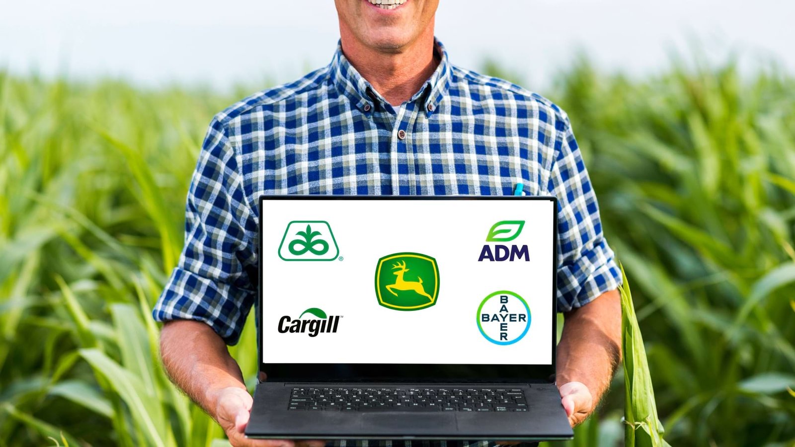
In this guide we will explore the stories behind iconic logos that have become the face of farms and agribusinesses. Discover how thoughtful design not only cultivates recognition but also sows the seeds of success in the ever-growing field of agriculture branding. So whether you are a business owner who wants to create a visual identity for your agribusiness or a designer who wants to design a logo & brand identity for your client this guide will inspire you from the artistry, innovation, and symbolism woven into each logo, and gain insights into the strategic cultivation of brand identities in the agricultural realm.
John Deere is an American corporation that manufactures agricultural machinery, heavy equipment, forestry machinery, etc. The company’s slogan is “ Nothing Runs Like a Deere “ and the logo itself explains what John Deere is known for. The leaping deer symbol ( pictorial mark ) is the most iconic and unique aspect of the John Deere logo.
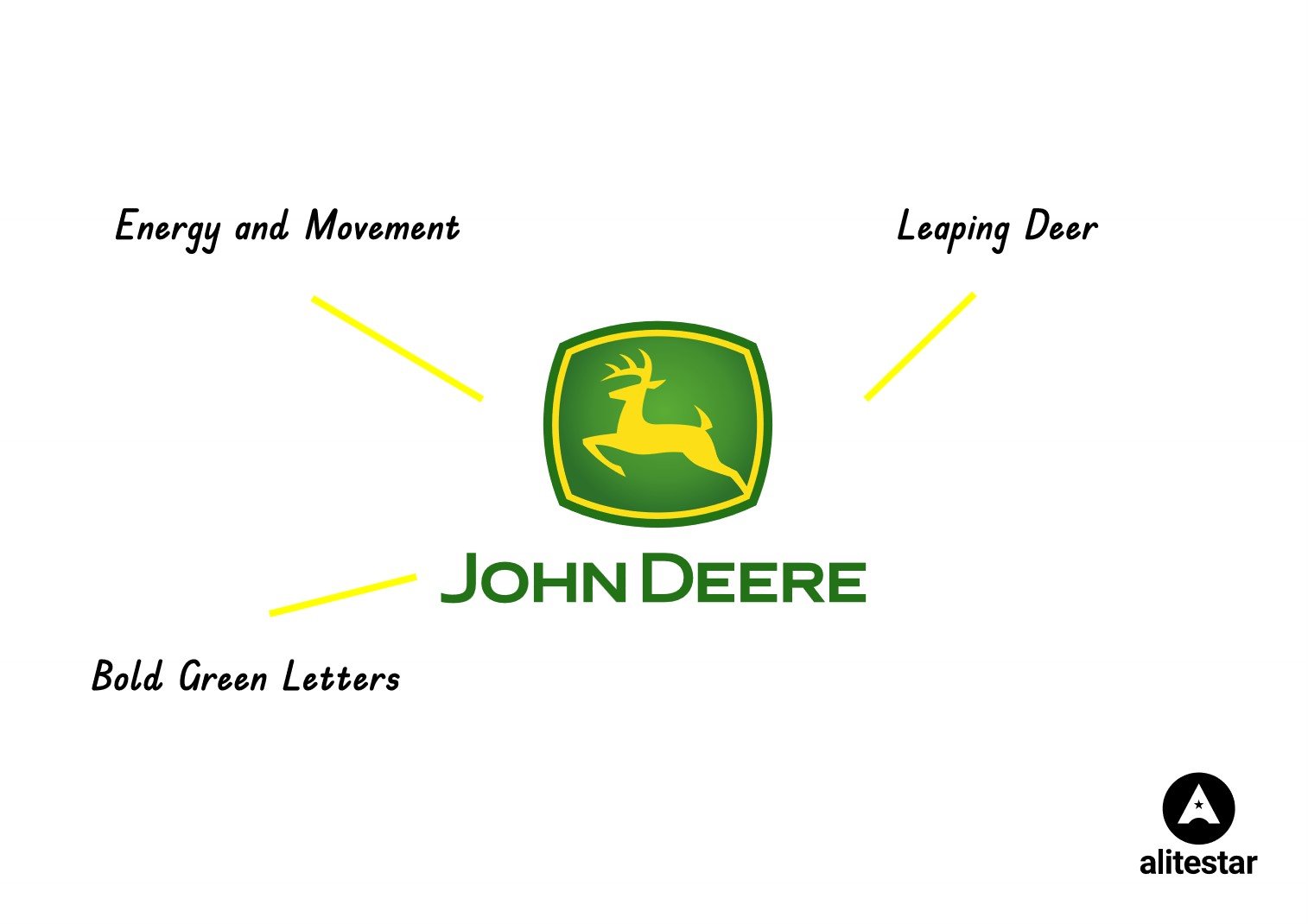
The leaping deer not only reflects the brand's connection to the outdoors but also conveys a sense of energy and movement. The leaping deer has become synonymous with the quality and durability of John Deere products. The John Deere logo predominantly features the color green and yellow, which is closely associated with agriculture, nature, and the outdoors. The logo typically includes the brand name "John Deere" in bold, green letters. The combination of the green background, typography, and the yellow leaping deer creates a harmonious and memorable visual identity.
Learn more about the history of the leaping Deere logo. The John Deere logo stands out due to its simplicity, iconic imagery, and strong association with the agricultural industry. The leaping deer has become a symbol of reliability and quality in agricultural machinery. Over time, the logo has gained global recognition and is widely known, even among those who may not be directly involved in agriculture.
Cargill is a family company providing food, ingredients, agricultural solutions, and industrial products to nourish the world. The bright green leaf is a unique and identifiable feature of the Cargill Agriculture logo. The incorporation of a leaf emphasizes the company's connection to agriculture, nature, and sustainability.
![]()
The Cargill Agriculture logo features a combination of black and bright green. The bright green leaf is a standout element against the black wordmark. Green is a common color in agriculture logos, symbolizing growth, freshness, and sustainability. The wordmark "Cargill" is in bold black letters, providing a strong and readable presence. The choice of a bold and simple font contributes to a modern and professional look. The logo's design is clean and minimalist, placing the green leaf to the left of the black wordmark. This arrangement creates a balanced and cohesive visual identity. The leaf not only symbolizes the agricultural aspect of the business but also conveys a commitment to environmentally friendly practices.
Syngenta is a global agribusiness company specializing in agricultural science and technology. Founded in 2000 through the merger of Novartis Agribusiness and Zeneca Agrochemicals, Syngenta has since become one of the world's leading agricultural companies. The Syngenta logo is unique with the stylized leaf incorporated into the letter "g." This design element not only symbolizes the company's focus on plant science and agriculture but also adds a distinctive and memorable touch to the overall logo and identity.
![]()
The Syngenta logo features a combination of blue and green. Blue often conveys trust, stability, and reliability, while green symbolizes nature and agriculture. The combination of these colors reflects Syngenta's commitment to science, innovation, and sustainable agriculture. The logo's design is clean and balanced, typographic treatment with the stylized leaf seamlessly integrated into the wordmark. The blue and green color combination enhances the visual appeal and reinforces Syngenta's position as a leading global agriculture company.
ADM is an American multinational food processing and commodities trading corporation. A simple, legible, and bold letter mark logo with the initials of the company name and with a clean stylized leaf is a well know identity of the ADM.
![]()
The ADM logo typically features a combination of deep blue and vibrant green colors. The Blue is associated with trust, stability, and reliability, while the green colors adds a touch of nature, nutrition, and health. The logo design is compact and balanced, with the stylized arrangement of the leaf at the top of the letter mark "ADM". The simplicity of the design enhances versatility across various applications.
Corteva also known as Corteva Agriscience, is a US-based agricultural chemical and seed company. It provides a range of products and services, including seeds, crop protection, and digital solutions.
![]()
Corteva Agriscience is the only major agriscience company completely dedicated to agriculture. The company is driven by its core beliefs and purpose to enrich the lives of those who produce and those who consume, ensuring progress for generations to come. The Corteva logo is a combination mark— a simple, unique, and iconic symbol that brings science, agriculture, and technology together paired with a bold, simple, and cutting-edge font that balances the overall identity.
The combination of blue and black color works well for Corteva and creates a cohesive brand identity that communicate its purpose and beliefs.
Coromandel is one of the most trusted agricultural brands in India for innovation and manufacturing of fertilizer for crop protection and special nutrients. The Coromandel logo is a stylized representation of a coromandel flower, which is a type of orchid native to India and other parts of Asia.
![]()
The coromandel flower is known for its beauty, fragrance, and resilience, and it symbolizes the company’s values of quality, innovation, and sustainability. The logo symbol in saffron color complements the grey wordmark creates contrast, adds visual interest, and makes the identity stands out. These colors reflect the company’s pride in being an Indian corporation, as well as its commitment to serving the nation’s farmers and consumers. The logo also suggests a sense of movement and dynamism, indicating the company’s growth and progress in the agricultural sector. The Coromandel logo is a simple yet elegant design that conveys the essence of the brand and its vision.
Pioneer is a U.S.-based producer of seeds for agriculture. They are a major producer of genetically modified crops with insect and herbicide resistance. The word “Pioneer” reflects the company’s history of innovation and leadership in the field of agriculture since 19262.
![]()
It also conveys the company’s vision of being a pioneer in developing new solutions for the challenges of feeding a growing population. The Pioneer logo is a meaningful identity of the company. The oval shape represents the global scope of the company, as well as the continuity and stability of its operations. The oval also suggests a seed or a grain, which is the core products of the company. The leaf symbolizes the company’s focus on plant science and biotechnology, as well as its commitment to environmental sustainability and stewardship. The leaf also evokes the idea of growth, vitality, and diversity.
Bayer is a German multinational pharmaceutical and biotechnology company. It is one of the largest pharmaceutical and biomedical companies in the world. The Bayer logo is a combination of the word “Bayer” written vertically and horizontally, sharing the Y, and enclosed in a circle. This design is known as the Bayer Cross, and it was introduced in 19041.
![]()
The Bayer Cross has several meanings and symbols associated with it. The cross shape suggests a medical connection, as it resembles the Red Cross or a pill. This reflects the company’s history and expertise in pharmaceuticals and biotechnology. The circle shape represents the global scope and presence of the company, as well as the continuity and stability of its operations. The word “Bayer” reflects the company’s name and identity, as well as its innovation and leadership in the field of agriculture and chemistry since 18631.
It also conveys the company’s vision of being a pioneer and a partner in improving the quality of life for people and animals. The colors of the logo are green, blue, and white. Green symbolizes the company’s focus on plant science and environmental sustainability, as well as its commitment to health and well-being. Blue symbolizes innovation, leadership, and stability. White symbolizes the company’s purity and quality standards, as well as its transparency and trustworthiness.
Learn more about the history of the Bayer logo
Wimar International is a Singapore-based agribusiness company that is involved in various sectors such as oil palm cultivation, edible oils refining, sugar milling and refining, specialty fats, oleochemicals, biodiesel, and fertilizers. The company’s logo consists of two elements: a stylized letter W in cyan and the company name in grey color.
![]()
The letter W represents the initial of the company name, as well as the word “world”, implying the company’s global presence and vision. The cyan color together with the grey of the company name reflects the company’s corporate identity and values, such as trust, integrity, and professionalism. The logo is designed to convey the company’s mission of creating value for its stakeholders, customers, and the communities it operates in while being mindful of its environmental and social impact.
The logo also aims to communicate the company’s competitive edge in the agribusiness industry, as well as its aspiration to be a leader in innovation and quality.
I hope this top agriculture brand logo inspires you to design an iconic logo for your agribusiness. However, it is always kept in mind designing a logo is not an art. It is the most important step to create a strong identity for your brand. So you must run a comprehensive brand strategy first then think for the logo design process. A logo is one of the most vital elements of your brand, so it is always based on the strategy and must follow the fundamental principle of logo design.


Shaikh Asif is an Award-winning designer, director, strategist, and educator. He’s the Brand Strategist and the Founder and CEO of The Alitestar— a strategic branding and design agency that helps startups, ambitious CEOs, and passionate entrepreneurs to achieve success and ultimately create unforgettable brand experiences.