Design
Top 10 Best Architecture Firm Logos in the World: Iconic Designs and Branding Insights for Your Firm
10.02.2025
By shaikh asif

Design
10.02.2025
By shaikh asif


In the world of architecture, a logo is more than just a visual mark—it's the embodiment of a firm’s identity, philosophy, and reputation. A well-crafted logo serves as a powerful tool to communicate the essence of an architectural practice, resonating with clients and stakeholders alike. For architecture firms, where innovation, precision, and creativity are paramount, a logo must reflect these qualities while standing out in a competitive industry.
At Alitestar, we understand the critical role a logo plays in defining and elevating a brand. As experts in logo design, brand identity, and branding, we take pride in creating logos that not only capture the unique vision of our clients but also position them as leaders in their field. In this article, we’ll explore the top 10 best architecture firm logos globally, offering an in-depth analysis of each logo’s design, symbolism, and impact on brand identity. This exploration will provide valuable insights for startups, entrepreneurs, CEOs, and business leaders across various industries who are considering a branding or rebranding journey.
When evaluating the best architecture firm logos, we considered several key factors that contribute to an effective and memorable logo:
Uniqueness: The ability to stand out in a crowded market.
Simplicity: The effectiveness of a logo in conveying the brand’s message without unnecessary complexity.
Relevance: How well the logo reflects the firm’s values, ethos, and architectural style.
Scalability: The ability of the logo to retain its integrity across different sizes and mediums.
Versatility: The logo’s adaptability for various applications, from print to digital platforms.
These criteria ensure that the logos featured not only look great but also function effectively as key elements of each firm’s brand identity.
The logo’s clean, sans-serif typography reflects the firm’s modernist approach. The simplicity of the design, coupled with the absence of decorative elements, allows the firm’s name to take center stage, symbolizing its straightforward, innovative ethos.Foster + Partners is known for its pioneering designs, and the logo mirrors this by being both contemporary and timeless. The firm’s emphasis on sustainability and technology is subtly hinted at through the precise and unembellished design.

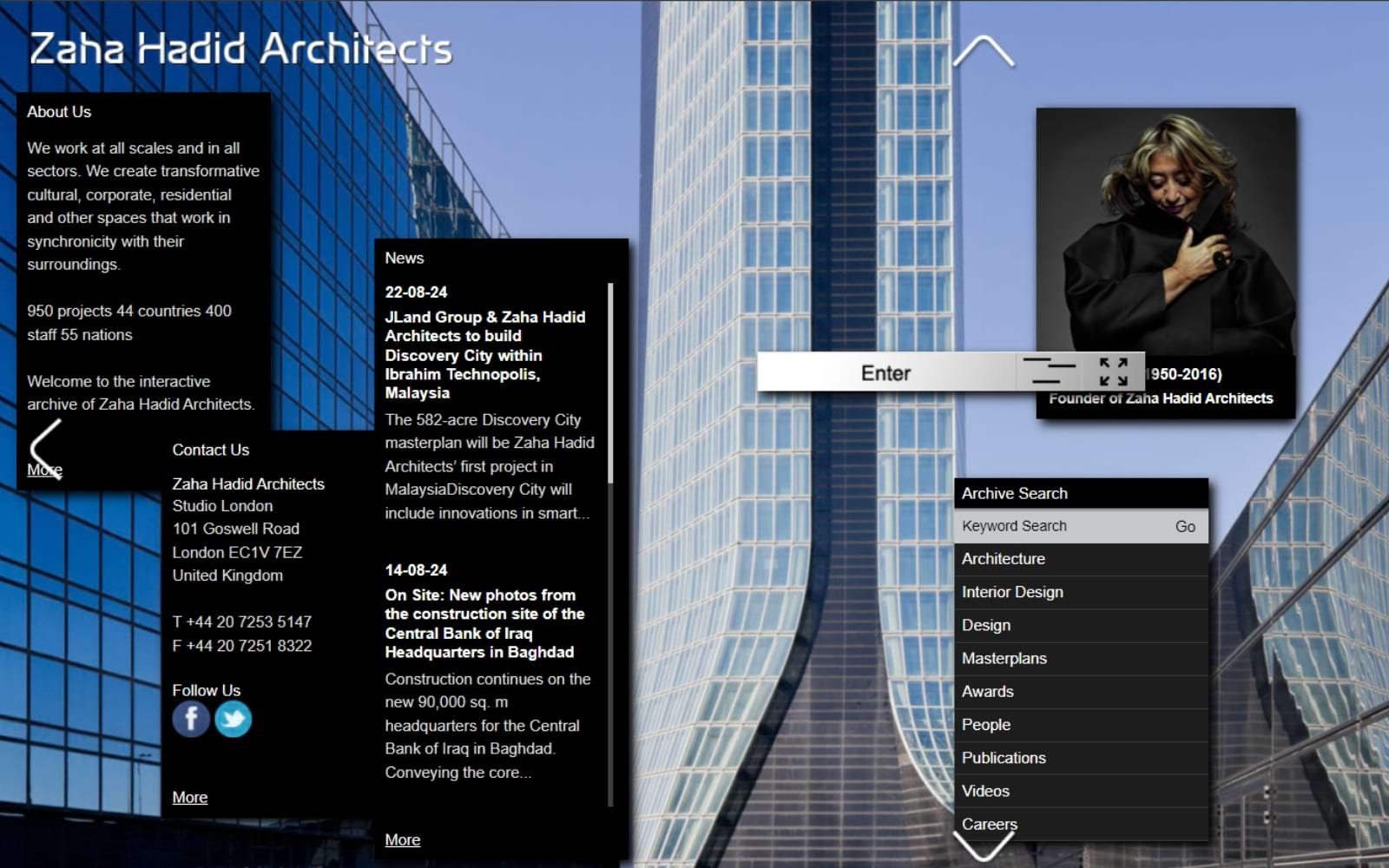
2. Zaha Hadid Architects (UK)
The logo features fluid, dynamic lines that echo the firm’s signature architectural style. The use of curvilinear forms in the typography embodies the innovative and futuristic designs that Zaha Hadid Architects is renowned for. Zaha Hadid Architects is synonymous with bold, visionary projects, and the logo encapsulates this spirit of innovation. The design reflects the firm’s commitment to pushing the boundaries of architecture.
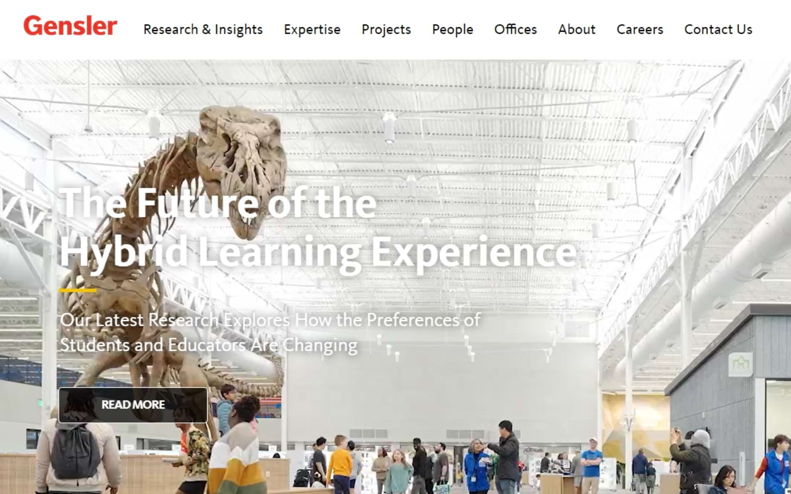
3. Gensler (USA)
The Gensler logo uses a strong, geometric typeface, conveying stability and professionalism. The simplicity of the logo, combined with its boldness, makes it easily recognizable across various platforms. As a global architecture, design, and planning firm, Gensler’s logo reinforces its authority and expertise in the industry. The firm’s focus on client-centric solutions is mirrored in the logo’s straightforward design.
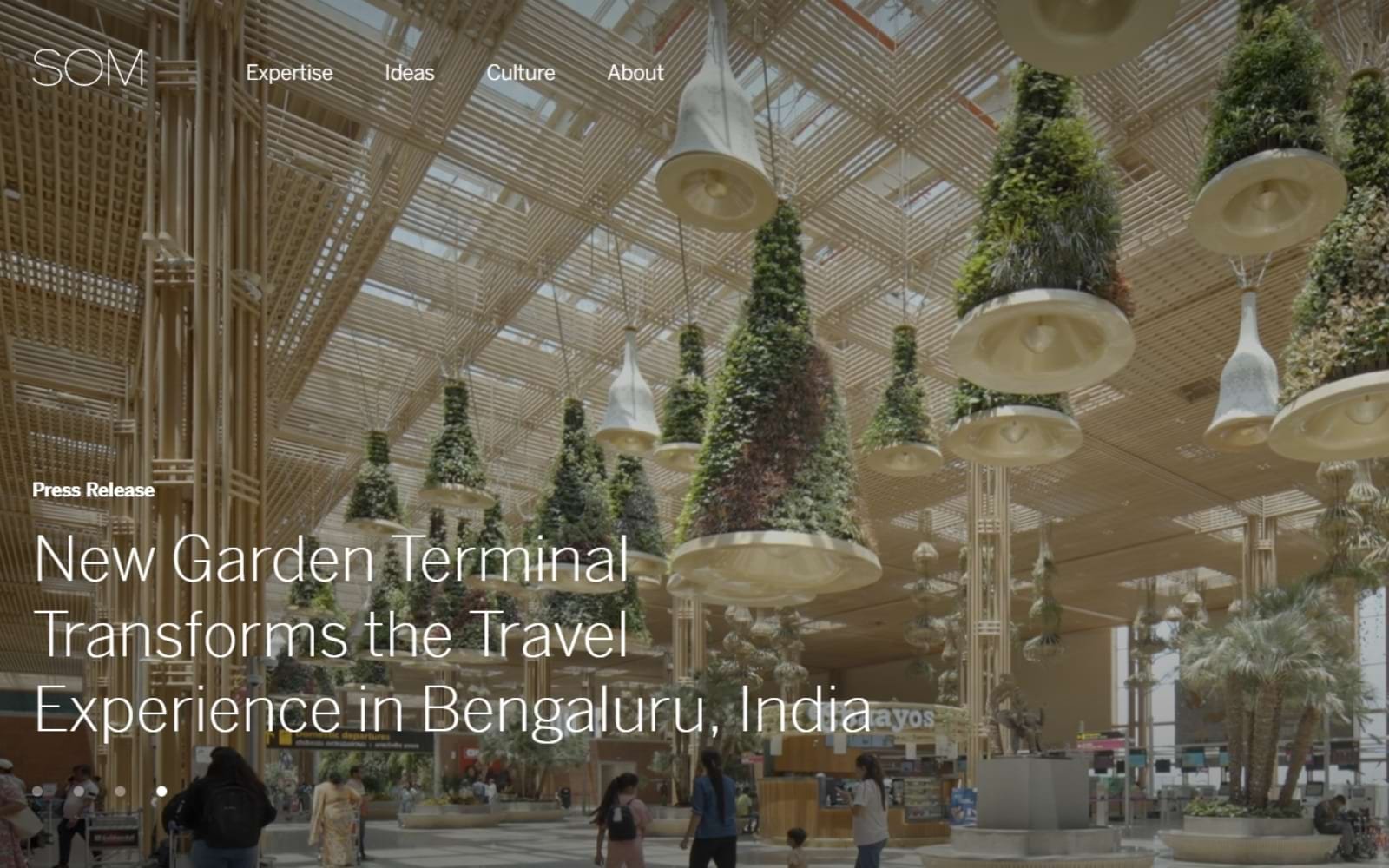
4. SOM (Skidmore, Owings & Merrill) (USA)
The SOM logo is a masterclass in minimalism, with its clear, uppercase typography. The design is versatile, working well across different mediums while maintaining its visual impact. SOM’s logo is as enduring as the firm itself, symbolizing its long-standing legacy in architecture. The simplicity of the design underscores the firm’s emphasis on structural clarity and functionality.
5. Herzog & de Meuron (Switzerland)
The logo often features custom typography, reflecting the firm’s artistic approach to architecture. The unique design elements in the logo hint at the firm’s focus on blending art with architecture. Herzog & de Meuron’s logo reflects its reputation for creating culturally resonant buildings. The artistic flair in the logo design is a nod to the firm’s philosophy of integrating architecture with its cultural context.

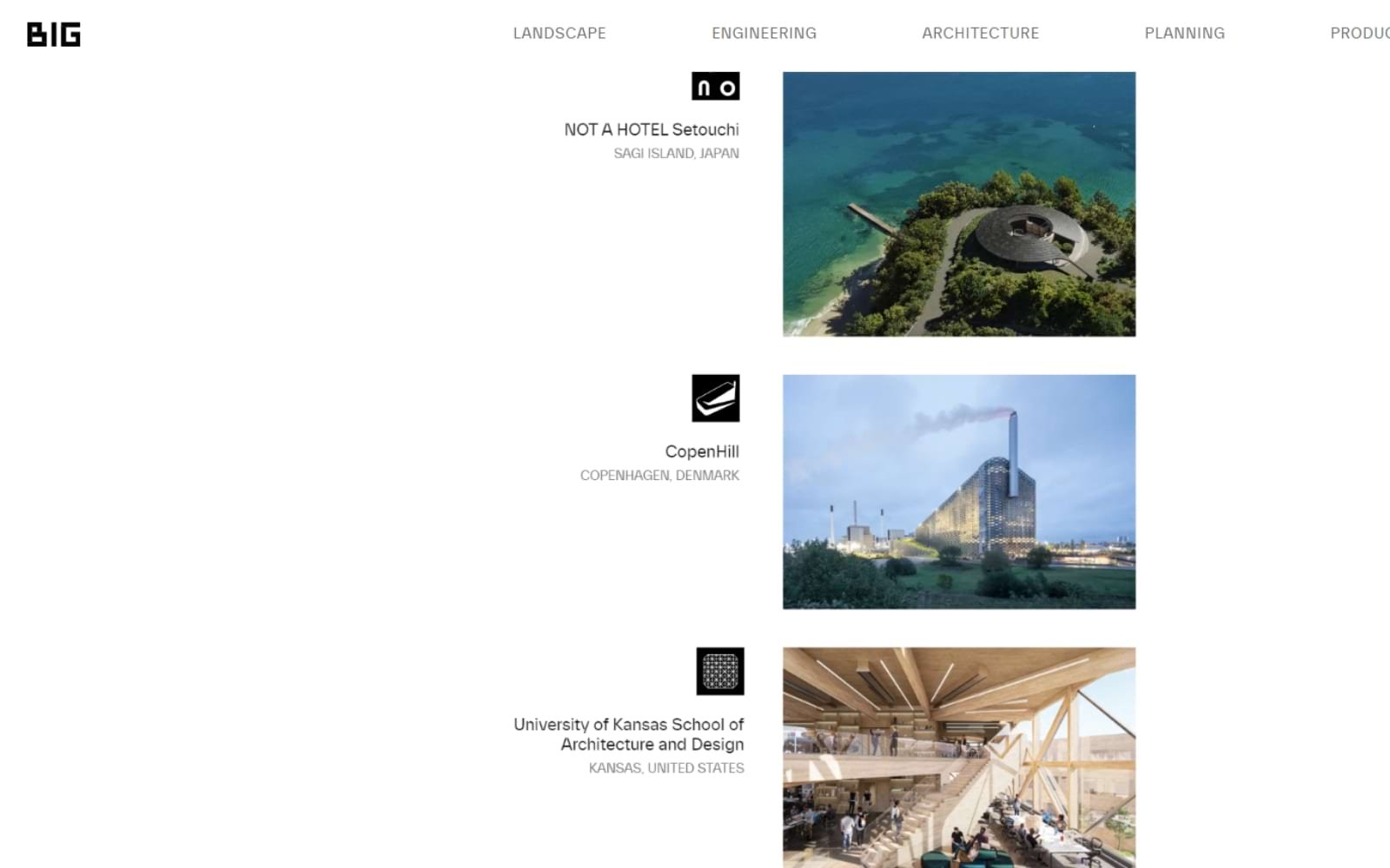
6. BIG (Bjarke Ingels Group) (Denmark)
The BIG logo is bold and unconventional, much like the firm’s architectural projects. The strong, capitalized font reflects the firm’s commitment to breaking the mold and challenging architectural norms. The logo perfectly encapsulates BIG’s identity as a disruptor in the architecture world. Its design conveys a sense of strength and innovation, aligning with the firm’s avant-garde projects.
7. Perkins + Will (USA)
The logo is clean and corporate, using modern typography that reflects the firm’s professional and client-focused approach. The simplicity and elegance of the logo make it highly adaptable. Perkins + Will’s logo embodies the firm’s commitment to sustainable and human-centered design. The sleek design reflects the firm’s forward-thinking and client-centric philosophy.

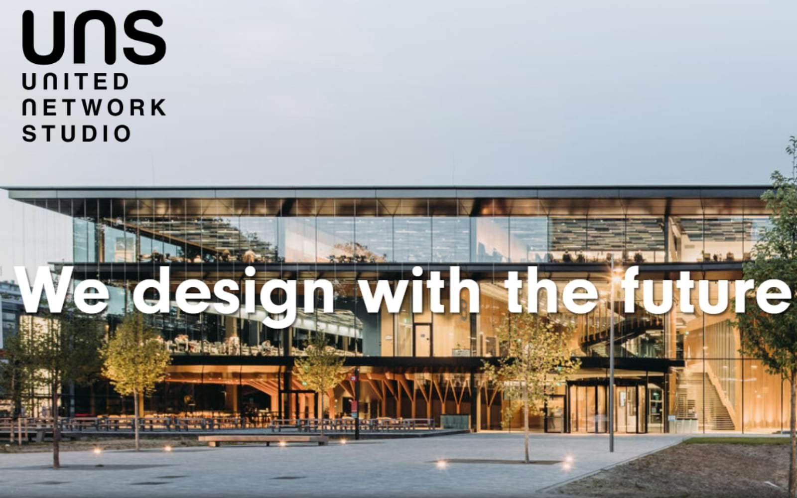
8. UNStudio (Netherlands)
The UNStudio logo is modern and minimalistic, with a focus on clarity and functionality. The simplicity of the design ensures it remains timeless and versatile. The logo reflects UNStudio’s focus on innovative, user-oriented architecture. Its minimalist design aligns with the firm’s emphasis on efficiency and modernity.
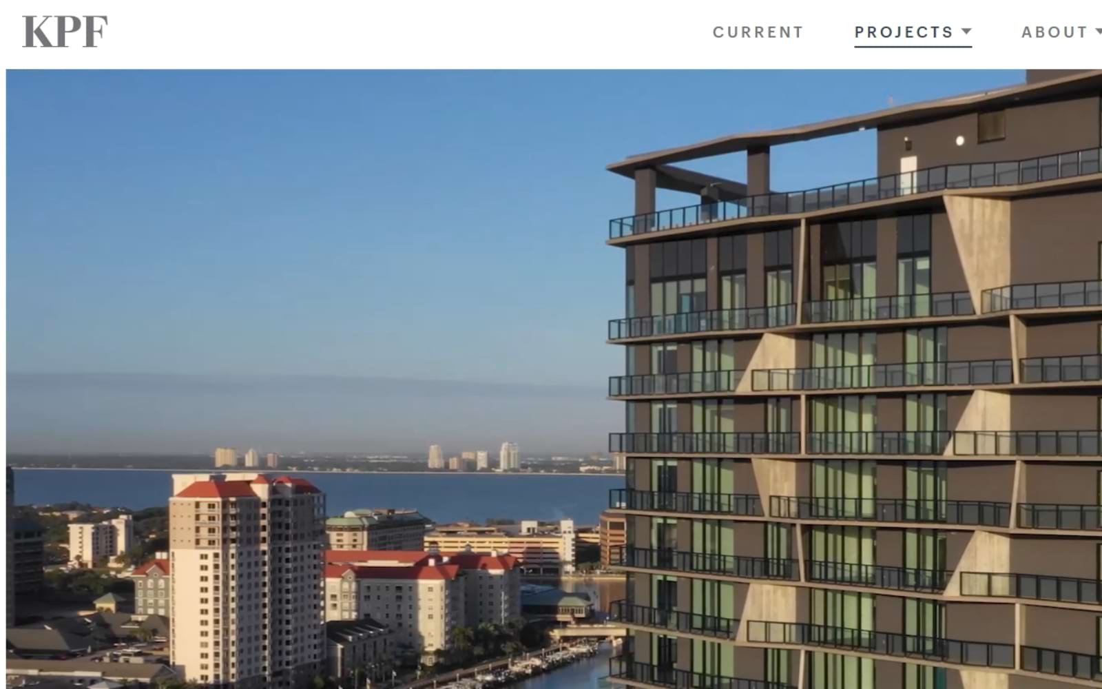
9. Kohn Pedersen Fox (KPF) (USA)
The KPF logo is simple yet impactful, designed to be easily recognizable and highly adaptable. The bold, uppercase letters convey strength and reliability. KPF’s logo is a reflection of the firm’s global influence and its commitment to creating iconic, structurally sound buildings. The design emphasizes the firm’s stability and trustworthiness.
10. Hafeez Contractor (India)
The logo is authoritative and straightforward, using clean typography that reflects the firm’s stature in Indian architecture. The design exudes professionalism and trust. As one of India’s leading architecture firms, Hafeez Contractor’s logo mirrors its expansive and varied portfolio. The logo’s simplicity and strength reflect the firm’s focus on delivering high-quality, reliable designs.

12. CP Kukreja Architects (India)
The logo is sleek and modern, using geometric shapes to convey balance and precision. The design reflects the firm’s commitment to innovative and sustainable architecture. CP Kukreja Architects’ logo embodies the firm’s philosophy of blending functionality with aesthetic appeal. The modern design elements reflect the firm’s forward-thinking approach.

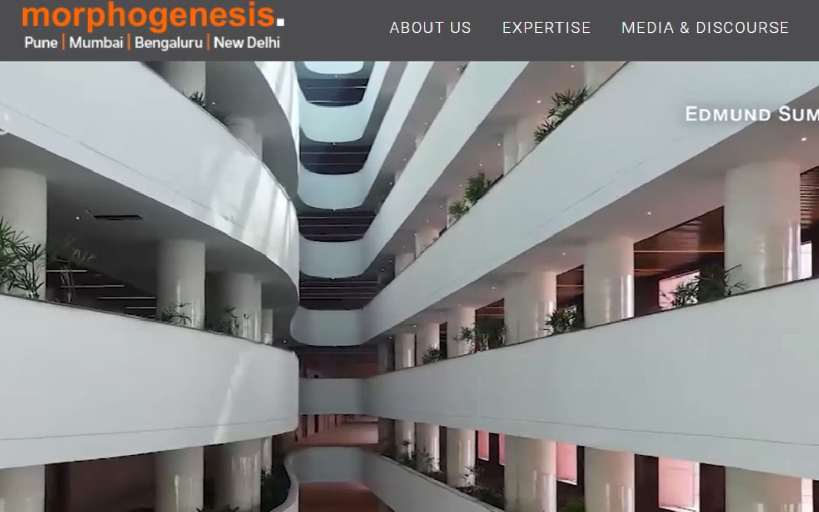
13. Morphogenesis (India)
The Morphogenesis logo is dynamic and innovative, using abstract shapes and modern typography. The design echoes the firm’s focus on sustainable and context-driven architecture. The logo represents Morphogenesis’ commitment to creating environmentally conscious designs. The abstract and modern design elements reflect the firm’s innovative approach to architecture.
The world of architecture branding is continuously evolving, with firms increasingly focusing on logos that are not only visually striking but also deeply reflective of their brand ethos. Current trends include:
Simplicity and Minimalism: Many top architecture firms are opting for minimalist logos that are timeless and versatile. This trend reflects a broader movement towards simplicity in design, where less is more.
Custom Typography: Custom fonts are becoming a hallmark of high-end architecture firms, allowing them to create a unique identity that stands out.
Sustainability: Logos that reflect a firm’s commitment to sustainability are increasingly popular, especially among firms focused on green architecture and environmentally conscious designs.
Cultural Integration: Firms are increasingly integrating elements of local culture and heritage into their logos, especially in regions with rich architectural traditions.
A well-designed logo is a cornerstone of an architecture firm’s brand identity. It serves as the first point of contact between the firm and its potential clients, making it crucial for the logo to convey the right message. A strong logo:
Builds Trust: A professional, well-crafted logo instills confidence in potential clients, signaling that the firm is reputable and capable.
Differentiates the Firm: In a competitive market, a unique logo helps a firm stand out from its competitors.
Communicates Expertise: A logo that reflects the firm’s architectural style and values can effectively communicate its areas of expertise.
Enhances Brand Recognition: Consistent use of a logo across all marketing materials helps build brand recognition and recall, making the firm more memorable to potential clients.
At Alitestar, we specialize in creating logos that are not just visually appealing but also strategically aligned with your firm’s brand identity. Whether you are an established architecture firm looking to rebrand or a startup aiming to make a mark, our team of expert designers is here to help you craft a logo that resonates with your audience and sets you apart in the industry.
Our approach combines in-depth research, creative innovation, and a deep understanding of your firm’s vision to deliver a logo that is not just a symbol but a powerful tool for brand building. Contact us today to learn how we can help you elevate your brand with a logo that truly represents your architectural excellence.
In the architecture industry, where first impressions are often made through visual cues, a logo holds immense power. The top 10 logos featured in this article exemplify how a well-designed logo can encapsulate a firm’s identity, ethos, and vision. As architecture continues to evolve, so too will the designs that represent it. By staying attuned to trends and maintaining a focus on clarity, simplicity, and relevance, firms can create logos that not only stand the test of time but also propel their brand to new heights.
For architecture firms ready to take their branding to the next level, Alitestar is here to guide you through the process with expertise and creativity. Let’s build something extraordinary together.


Shaikh Asif is an Award-winning designer, director, strategist, and educator. He’s the Lead Strategic Brand Designer and Art Director of The Alitestar— a strategic branding and design agency that helps startups, ambitious CEOs, and passionate entrepreneurs to achieve success and ultimately create unforgettable brand experiences.