Design
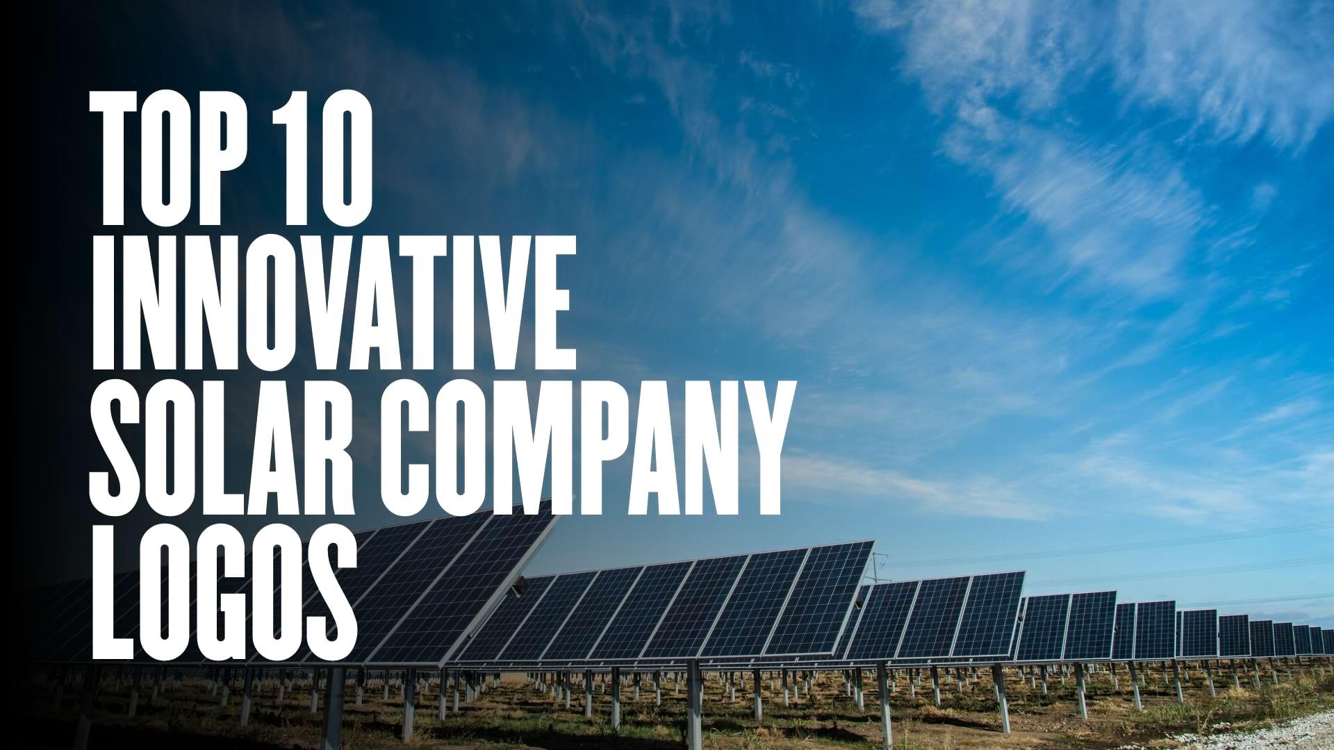
Top 10 Innovative Solar Company Logos That Shine Globally
10.02.2025
By shaikh asif
Design
10.02.2025
By shaikh asif


In an industry driven by innovation, sustainability, and the relentless pursuit of cleaner energy solutions, the solar sector stands as a beacon of the future. As the world increasingly shifts toward renewable energy, the importance of a strong visual identity for solar companies cannot be overstated. A well-crafted logo is not just a symbol; it’s the embodiment of a brand’s values, mission, and vision. It’s the first impression that resonates with stakeholders, from environmentally conscious consumers to potential investors.
In this article, we’ll explore the top 10 best solar company logos in the world, dissecting the elements that make them effective, memorable, and aligned with their brands’ ethos. We’ll delve into how these logos not only capture the essence of their respective companies but also contribute to their market success. Whether you’re a startup looking to make your mark in the solar industry or an established business aiming to rebrand, understanding these logos will provide valuable insights into the power of design in shaping a brand’s identity.
At Alitestar, we pride ourselves on creating premium logos that do more than just look good—they tell a story, create a connection, and build trust. Our expertise in logo design, brand identity, and branding strategies ensures that your brand is not only seen but remembered. As we walk you through these examples, you’ll see firsthand the impact of thoughtful, strategic design, and how it can propel your brand to new heights.
Whether you’re a CEO, entrepreneur, or business leader, the logos we’ll analyze are not just benchmarks—they’re blueprints for success. Let’s dive in and discover what makes these solar company logos the best in the world, and how Alitestar can help you create a visual identity that shines as brightly as your mission.
To truly appreciate the top solar company logos, it’s essential to understand the criteria that make a logo not just good, but exceptional. In the context of the solar industry, where branding is crucial to communicate sustainability and innovation, certain design elements and principles are particularly significant. Here’s a breakdown of the key factors that contribute to the effectiveness of a solar company logo:
1. Creativity and Originality
Unique Design Elements: The logo should stand out from the competition through unique and creative design elements. This includes innovative use of symbols, shapes, and colors that differentiate the brand in a crowded market.
Originality: A successful logo avoids clichés and overused symbols. In the solar industry, this means steering clear of generic sun or solar panel imagery and opting for designs that offer a fresh perspective.
2. Relevance to the Industry
Industry Representation: The logo should clearly convey the company’s association with the solar industry. Effective use of relevant symbols, like sun motifs or renewable energy icons, helps in instantly communicating the company’s focus.
Alignment with Brand Values: The design should reflect the company’s commitment to sustainability and clean energy, resonating with eco-conscious consumers and stakeholders.
3. Simplicity and Clarity
Minimalist Design: A simple and uncluttered design enhances recognition and memorability. In logo design, less is often more. A clean design ensures that the logo remains effective across various sizes and mediums.
Easy Recognition: The logo should be easily identifiable and legible, even when scaled down. Simplicity helps in creating a logo that is versatile and adaptable.
4. Memorability
Distinctive Features: A memorable logo has distinctive features that make it easy to recall. This could be a unique shape, color scheme, or typographic element that leaves a lasting impression.
Consistency: The logo should consistently represent the brand across all platforms, reinforcing its identity and aiding in brand recall.
5. Market Impact
Brand Recognition: The logo should contribute to strong brand recognition and differentiate the company from its competitors. An impactful logo helps in establishing a strong market presence.
Consumer Perception: Effective logos influence how consumers perceive the brand. A well-designed logo can enhance credibility, trust, and overall brand perception.
As we explore each of the top 10 solar company logos, we will apply these criteria to evaluate their design effectiveness. We’ll examine how each logo embodies creativity and originality, represents the solar industry, maintains simplicity and clarity, and impacts the market.
In the upcoming sections, we’ll analyze each logo in detail, providing insights into how these design principles are applied and what makes each logo exemplary in the solar sector. Stay tuned as we delve into the specifics of the First Solar logo, setting the stage for a deeper understanding of what makes a solar company logo truly outstanding.
1. First Solar
Detailed Analysis: First Solar’s logo features a stylized red arc, symbolizing the sun’s power and energy flow. The modern, sans-serif font underscores the company’s forward-thinking approach.
Brand Story: First Solar is known for its advanced thin-film solar panels, and the logo reflects their innovative spirit.
Visual Appeal: The use of red adds energy and visibility, making the logo stand out in the industry.
Market Impact: The logo’s unique design has helped First Solar establish a strong brand identity, aiding in global expansion.
Lessons for Your Brand: Use bold colors and distinctive shapes to create a lasting impression.
2. SunPower
Detailed Analysis: SunPower’s logo features a bright yellow sun in the distinctive wordmark, representing solar energy and optimism. The bold typography and clean design elements reflect innovation and reliability.
Brand Story: Founded in 1985, SunPower has been a pioneer in solar technology. The logo encapsulates their commitment to clean, sustainable energy.
Visual Appeal: The logo’s simplicity and vibrant colors make it easily recognizable and appealing.
Market Impact: SunPower’s logo has become synonymous with high-quality solar panels, enhancing their reputation worldwide.
Lessons for Your Brand: Embrace simplicity and ensure your logo communicates your core values clearly.
3. Tesla Energy
Detailed Analysis: Tesla Energy’s logo incorporates the iconic Tesla “T” with a sleek, futuristic look. The minimalist design signifies elegance and efficiency.
Brand Story: Tesla’s venture into solar energy aligns with their mission to accelerate the world's transition to sustainable energy.
Visual Appeal: The logo’s simplicity and association with the Tesla brand make it instantly recognizable.
Market Impact: Tesla Energy’s logo has helped position the company as a leader in sustainable energy solutions.
Lessons for Your Brand: Leverage existing brand recognition and maintain consistency across different business segments.
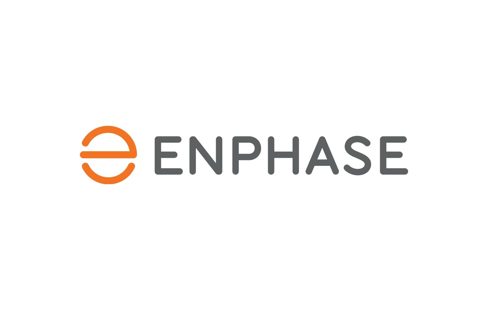
4. Enphase Energy
Detailed Analysis: The Enphase Energy logo features an “e” symbol within a circle, representing unity and continuity in energy flow. The logo’s clean lines and balanced design reflect precision and reliability.
Brand Story: Enphase Energy specializes in microinverter technology, and the logo signifies their role in enhancing solar power systems’ efficiency.
Visual Appeal: The logo’s modern design and neutral color scheme appeal to a wide audience.
Market Impact: Enphase Energy’s logo has contributed to their reputation as a leader in smart energy solutions.
Lessons for Your Brand: Incorporate symbols that convey your company’s technological advancements and reliability.
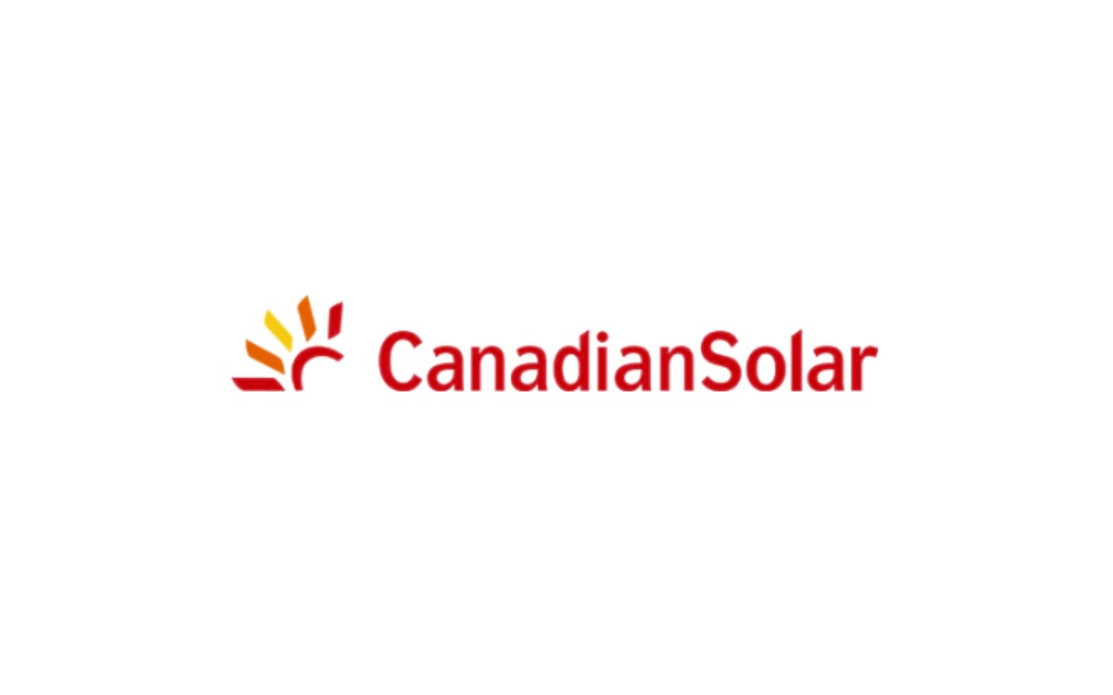
5. Canadian Solar
Detailed Analysis: Canadian Solar’s logo features a stylized maple leaf, a nod to their Canadian heritage. The red and blue colors represent energy and stability.
Brand Story: As one of the world’s largest solar panel manufacturers, Canadian Solar’s logo reflects their commitment to quality and innovation.
Visual Appeal: The maple leaf is a strong national symbol, adding a unique touch to the logo.
Market Impact: The logo has helped Canadian Solar establish a strong brand presence in the global market.
Lessons for Your Brand: Utilize national symbols to create a connection with your audience and enhance brand loyalty.
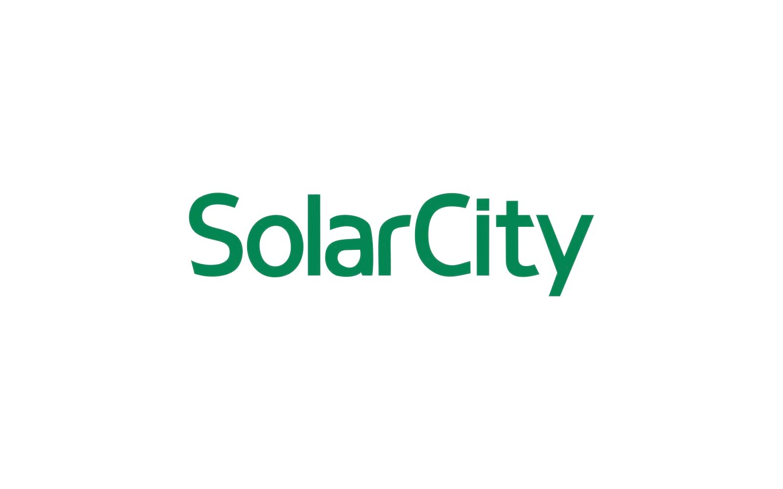
6. SolarCity
Detailed Analysis: SolarCity’s logo, now part of Tesla, features a vibrant green leaf symbolizing sustainability and eco-friendliness. The modern font and clean lines suggest efficiency and innovation.
Brand Story: SolarCity was a leader in solar panel installation, and the logo represented their commitment to green energy.
Visual Appeal: The green color and leaf symbol resonate with environmentally conscious consumers.
Market Impact: SolarCity’s logo played a crucial role in building their reputation as a top solar panel installer in the U.S.
Lessons for Your Brand: Emphasize sustainability in your logo design to attract eco-conscious customers.
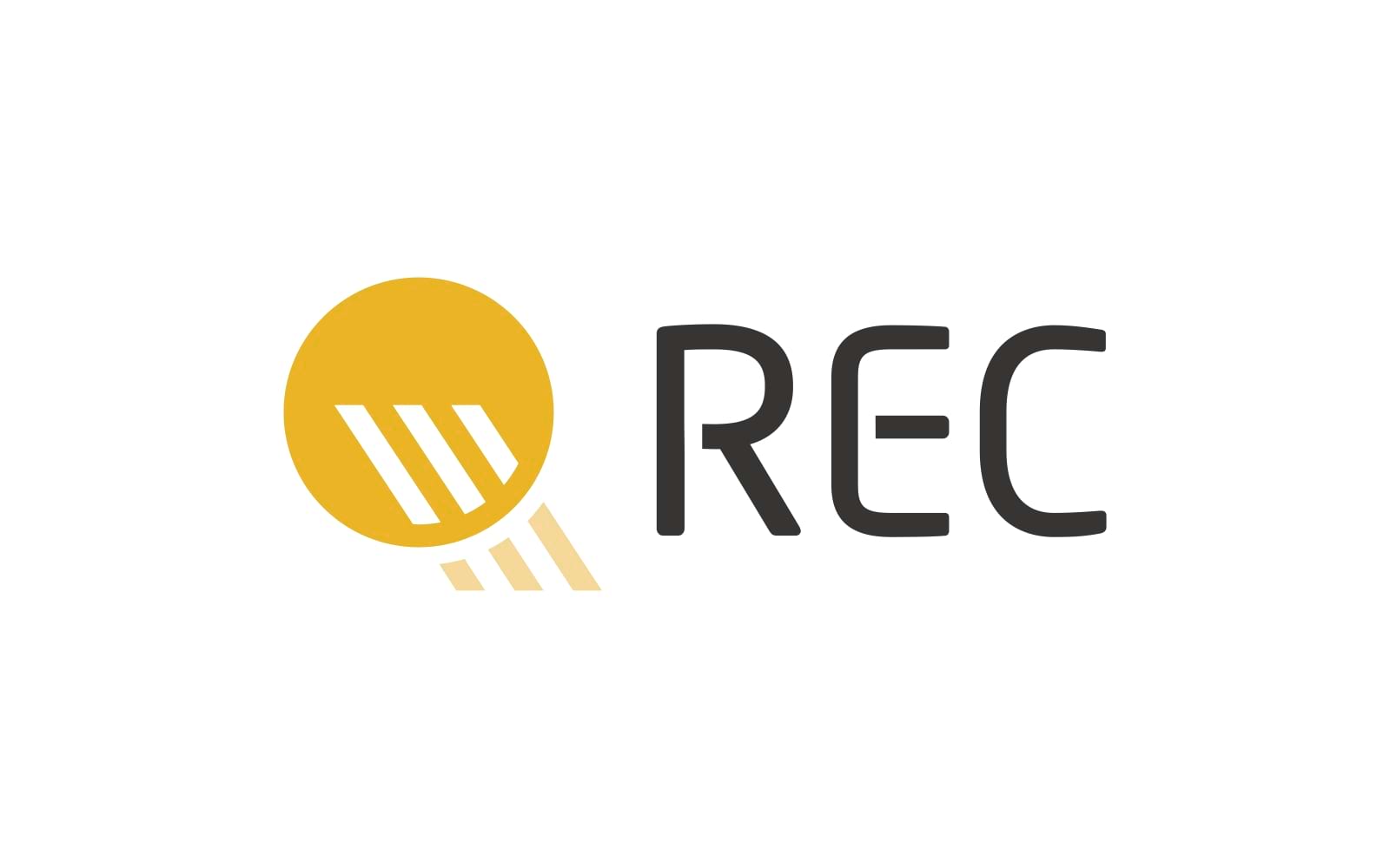
7. REC Group
Detailed Analysis: The REC Group logo features a stylized orange circle and the company name in a clean, sans-serif font. The design symbolizes energy, innovation, and global reach.
Brand Story: REC Group is known for its high-efficiency solar panels, and the logo signifies their commitment to quality and innovation.
Visual Appeal: The orange circle adds a vibrant touch, making the logo stand out.
Market Impact: The logo has been instrumental in building REC Group’s brand identity, especially in the European market.
Lessons for Your Brand: Incorporate elements that symbolize your company’s core values and mission.
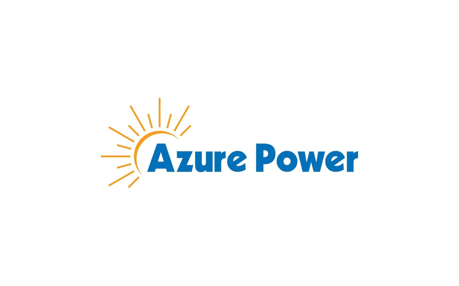
8. Azure Power
Detailed Analysis: Azure Power’s logo features a stylized blue and green arc, representing the horizon and sustainable energy. The bold, lowercase font reflects the company’s approachable and modern brand image.
Brand Story: Azure Power is a leading solar power producer in India, known for its commitment to clean energy and technological innovation.
Visual Appeal: The arc design adds a dynamic element, making the logo visually engaging and memorable.
Market Impact: The logo has helped Azure Power enhance its brand identity and expand its market presence.
Lessons for Your Brand: Use dynamic design elements to create a sense of movement and progress.
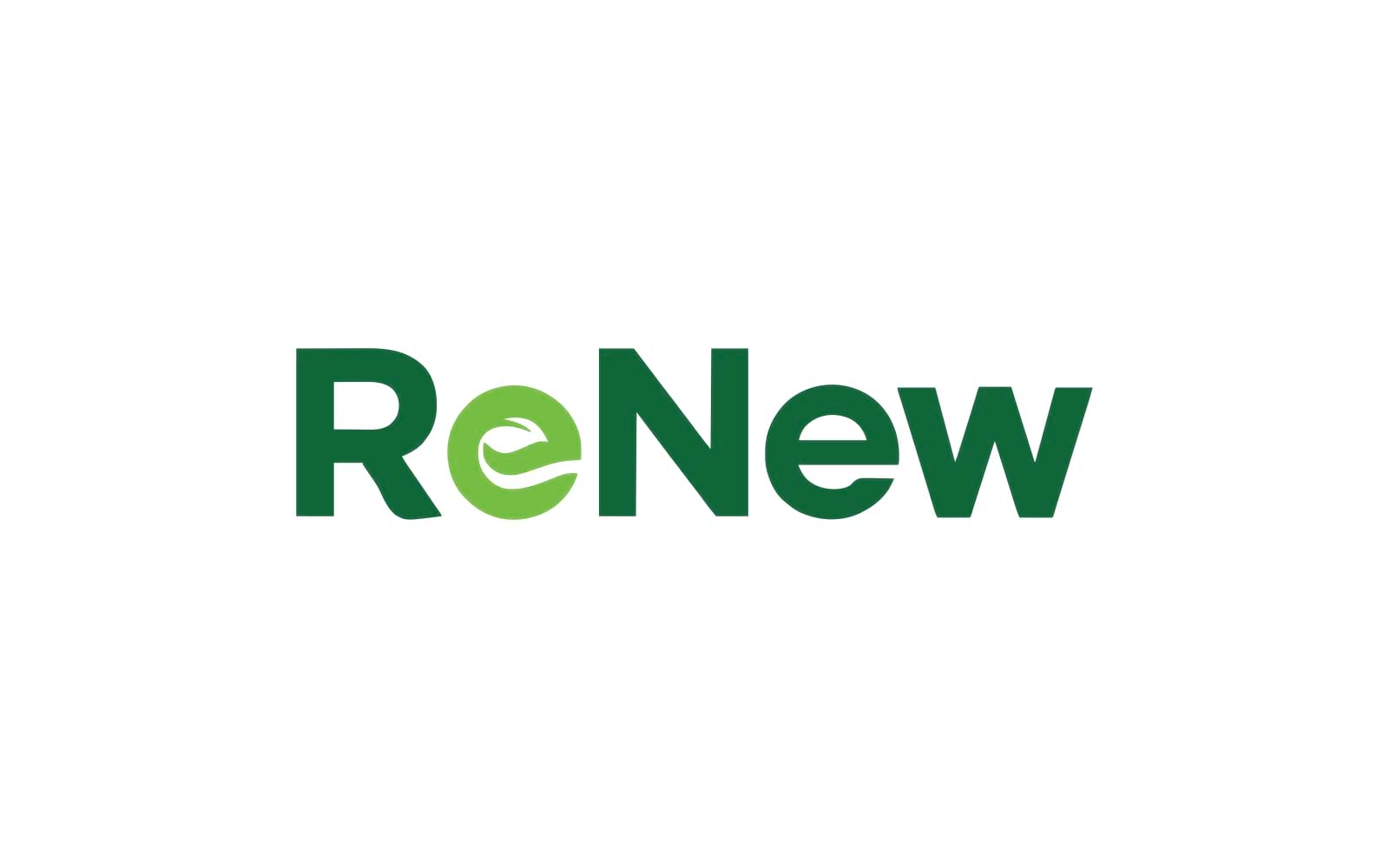
9. Renew Power
Detailed Analysis: Renew Power’s logo features a stylized green and blue circle, symbolizing renewal and sustainability. The modern, sans-serif font conveys a sense of innovation and efficiency.
Brand Story: Renew Power is one of India’s largest renewable energy companies, focusing on solar and wind power projects.
Visual Appeal: The circular design and color scheme make the logo easily recognizable and visually appealing.
Market Impact: The logo has been instrumental in building Renew Power’s reputation as a leader in the renewable energy sector.
The solar industry is evolving rapidly, and with it, the trends in branding and logo design. Some of the current trends include:
Minimalism: Clean, simple designs that convey the essence of the brand.
Sustainability Symbols: Incorporating elements that reflect eco-friendliness and sustainability.
Bold Colors: Using vibrant colors to stand out in a competitive market.
Adaptability: Logos that are versatile and can be used across various platforms and media.
A well-designed logo is crucial for any solar company. It serves as the face of the brand, creating a lasting impression on customers and stakeholders. A strong logo can:
Enhance Brand Recognition: A memorable logo helps customers easily identify your brand.
Build Trust: A professional logo conveys credibility and reliability.
Differentiate Your Brand: A unique logo sets you apart from competitors.
At Alitestar, we specialize in creating premium logos, brand identities, and branding strategies that resonate with your target audience. Our expert team understands the nuances of the solar industry and can help you craft a logo that reflects your company’s values and mission. Whether you’re a startup or an established company, we’re here to elevate your brand through exceptional design.
The top 10 best solar company logos in the world exemplify the power of strategic design in building a brand’s identity. A well-crafted logo is not just a visual symbol; it’s a statement of your company’s mission, values, and aspirations. At Alitestar, we’re committed to helping you achieve your branding goals with our premium quality logo design and branding services. Contact us today to discover how we can help your solar company shine brighter.


Shaikh Asif is an Award-winning designer, director, strategist, and educator. He’s the Lead Strategic Brand Designer and Art Director of The Alitestar— a strategic branding and design agency that helps startups, ambitious CEOs, and passionate entrepreneurs to achieve success and ultimately create unforgettable brand experiences.