Design
Top 10 Best Bank Logos in the World: Iconic Designs & Branding Strategies
10.02.2025
By shaikh asif
Design
10.02.2025
By shaikh asif
In the competitive world of banking, a logo is much more than a mere symbol. It’s the visual cornerstone of a bank's brand identity, a powerful tool that communicates trust, stability, and professionalism. A well-designed logo can make a significant impact, helping a bank to stand out in a crowded market and build a strong connection with its customers.
In this article, we will explore the top 10 best bank logos from around the world, delving into the design elements that make them successful and the branding strategies behind them. Whether you’re a startup, entrepreneur, CEO, or business leader, understanding these exemplary logos will provide valuable insights into effective branding. We’ll also show you how Alitestar can help you create a logo that not only looks great but also embodies your brand's values and aspirations.
Selecting the best bank logos in the world is no small feat. Our choices are based on several critical factors:
Design Quality: The aesthetic appeal and craftsmanship of the logo.
Brand Identity: How well the logo represents the bank’s brand values and mission.
Market Impact: The logo’s recognition and influence in the banking industry and beyond.
Longevity: The durability and timelessness of the design.
1. Chase Bank (USA)
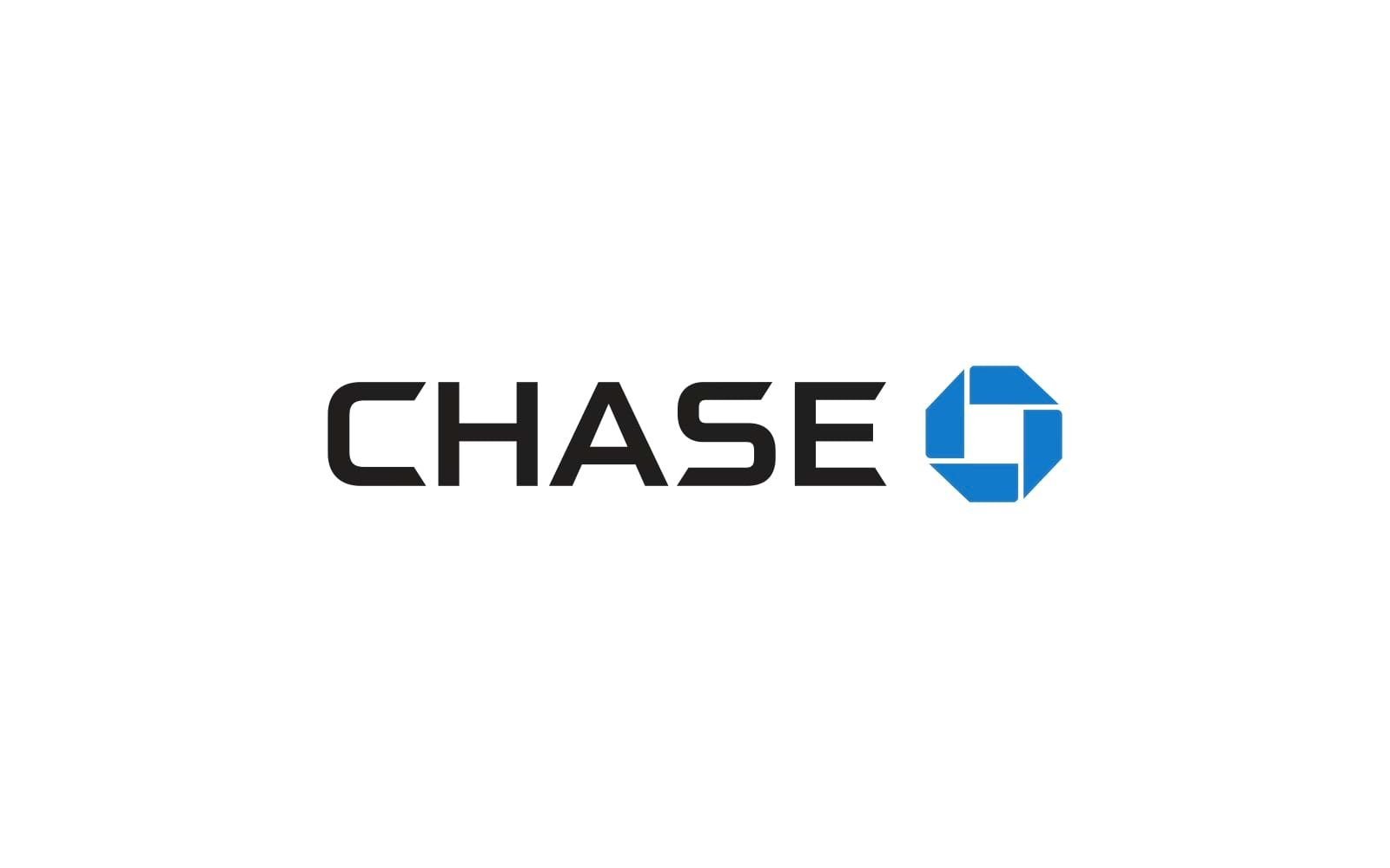
The Chase logo features an iconic blue octagon with white lines that form a geometric shape in the center. The typography is clean and modern, using a sans-serif font. The logo was introduced in 1961 by Chermayeff & Geismar. The octagon symbol represents motion and progress, key attributes Chase wanted to convey. Over the years, the logo has undergone minor updates to maintain its contemporary appeal. The Chase logo is distinctive and easily recognizable. The geometric design conveys a sense of stability and innovation, which aligns perfectly with the bank’s brand values.
2. HSBC (UK)
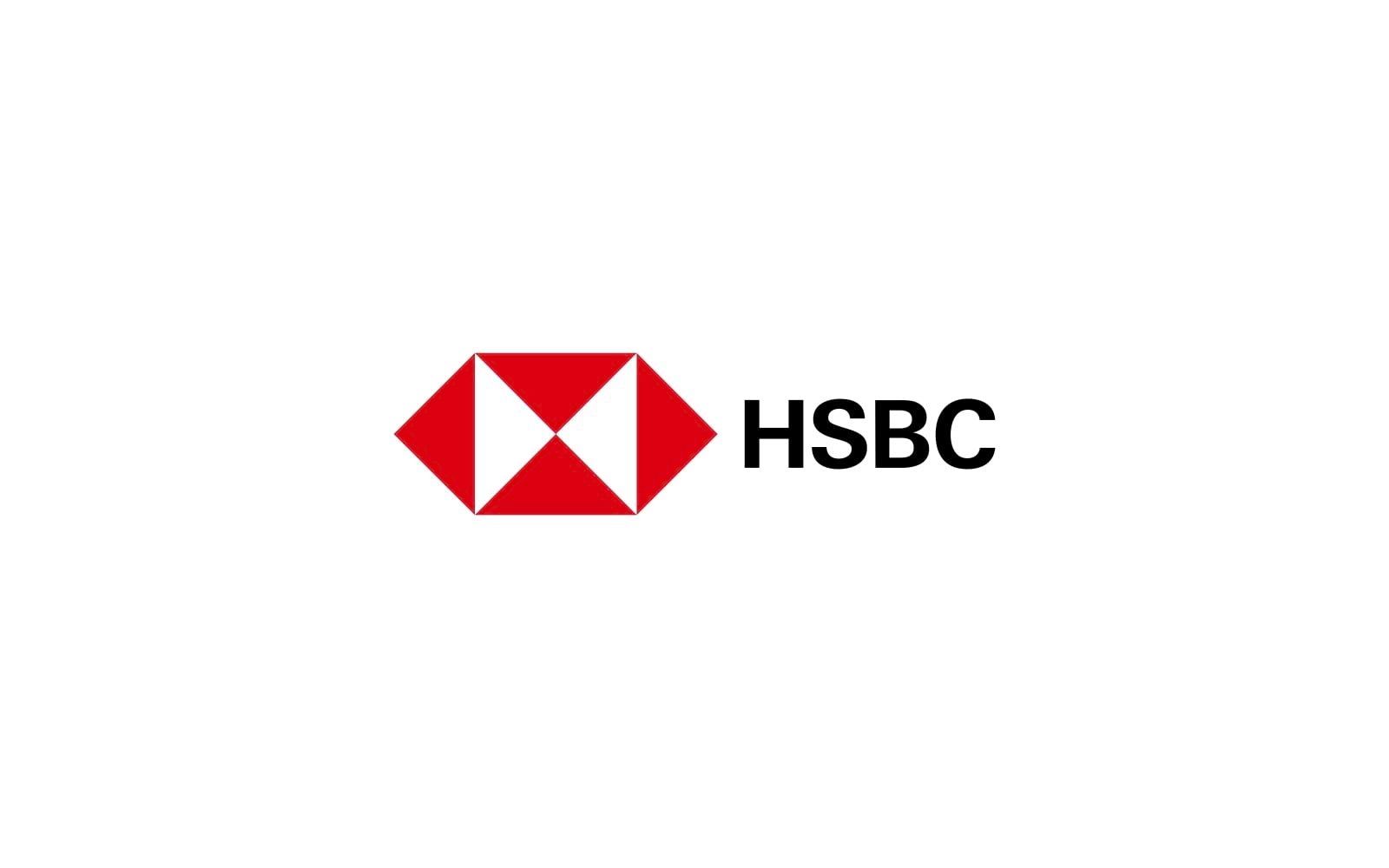
The HSBC logo consists of a red and white hexagon, with the bank’s name in a bold, serif font. The color scheme is simple yet powerful.
The logo was inspired by the flag of Hong Kong and the bank’s maritime heritage. It was designed in 1983 by Henry Steiner and has remained largely unchanged since then.
The HSBC logo is globally recognized, symbolizing trust, strength, and international reach. Its timeless design ensures it remains relevant across different markets.
3. ING (Netherlands)
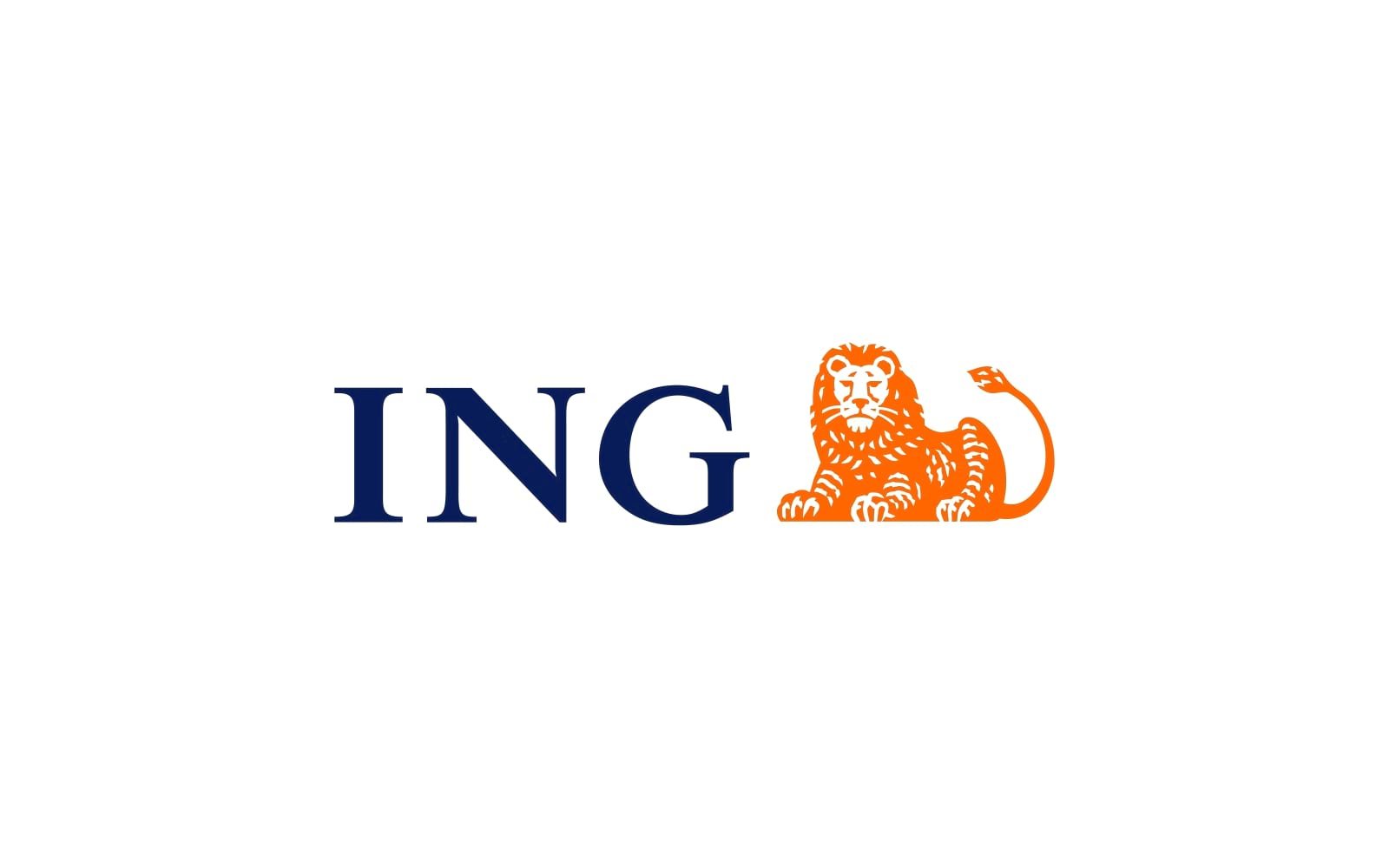
ING’s logo features a lion symbol, representing strength and courage, paired with vibrant orange color, which signifies energy and optimism. The typography is modern and approachable.
The logo was created in 1991 when ING was formed through a merger. The lion is a nod to the bank’s Dutch heritage.
:The combination of the strong lion symbol and the friendly orange color makes ING’s logo both authoritative and approachable, appealing to a broad audience.
4. Citi (USA)
The Citi logo features a red arc over the letters “t” and “i” in the bank’s name, creating an umbrella shape. The font is clean and modern.
The logo was designed in 1998 by Paula Scher from Pentagram. The arc symbolizes protection and umbrella-like coverage, reflecting Citi’s comprehensive financial services.
The simplicity and clever symbolism of the Citi logo make it memorable and effective. It conveys a sense of protection and reliability.
5. Deutsche Bank (Germany)
The Deutsche Bank logo consists of a blue square with a white diagonal line inside it. The typography is simple and elegant.
The logo was introduced in 1974 and designed by Anton Stankowski. The diagonal line represents growth within a stable environment.
The minimalistic design and strong symbolism of growth and stability make the Deutsche Bank logo highly effective and recognizable.
6. Barclays (UK)
The Barclays logo features an eagle, which symbolizes strength and freedom, paired with a modern sans-serif font.
The eagle has been part of Barclays’ identity for over 300 years. The current logo, designed in 2004, modernized the eagle while retaining its historical significance.
The Barclays logo successfully combines tradition with modernity, appealing to both long-term customers and new generations.
7. Bank of America (USA)
The Bank of America logo consists of a stylized American flag, with red and blue stripes forming an abstract shape, and a clean sans-serif font.
The logo was introduced in 2001 after a merger. The flag design represents the bank’s American roots and national presence.
The patriotic elements of the logo resonate strongly with American customers, emphasizing the bank’s national identity and commitment.
8. Standard Chartered (UK)
The Standard Chartered logo features intertwined blue and green ribbons forming an abstract “S” shape, paired with a modern font.
The logo was redesigned in 2003 to reflect the bank’s global outlook and dynamic approach.
The abstract design and vibrant colors make the Standard Chartered logo visually appealing and reflective of the bank’s innovative spirit.
9. BNP Paribas (France)
The BNP Paribas logo includes a green square with white stars forming an abstract bird, alongside a clean, modern font.
The logo was designed in 2000 when BNP and Paribas merged. The bird symbolizes freedom and ambition.
The BNP Paribas logo’s unique symbolism and contemporary design effectively communicate the bank’s aspirations and values.
10. Santander (Spain)
The Santander logo features a red flame icon and the bank’s name in a bold, serif font. The red color signifies energy and passion.
The logo was introduced in 2007, with the flame representing a beacon of trust and leadership in banking.
The vibrant color and bold design of the Santander logo make it highly recognizable and convey a strong sense of energy and leadership.
Bank logos have evolved over the years, adapting to new design trends and consumer expectations. Some of the current trends include:
Minimalism: Simplified designs that are clean and modern.
Versatility: Logos that work well across various mediums and platforms.
Use of Negative Space: Clever use of space to create memorable designs.
These trends reflect a move towards clarity and versatility, ensuring that bank logos remain effective in an increasingly digital world.
A great bank logo does more than just look good; it builds trust, fosters customer loyalty, and reinforces the bank’s brand identity. Research shows that consumers are more likely to engage with and trust brands that have professional, well-designed logos. A strong logo can also enhance brand identity and loyalty, making it a valuable asset for any financial institution.
A study by the American Marketing Association found that brands with consistent and professionally designed logos experienced a 23% increase in customer loyalty.
At Alitestar, we understand the critical role a logo plays in your branding strategy. Our team of expert designers and strategists will work with you to create a logo that not only captures your brand’s essence but also stands the test of time. From initial concept to final design, we ensure every detail aligns with your brand identity and goals.
Ready to elevate your brand with a powerful logo? Contact Alitestar today to start your branding journey.
In the world of banking, a powerful logo is a vital asset. By studying the top bank logos globally, we can glean insights into what makes a logo truly effective. Let Alitestar help you craft a logo that not only represents your brand but also resonates with your audience.


Shaikh Asif is an Award-winning designer, director, strategist, and educator. He’s the Lead Strategic Brand Designer and Art Director of The Alitestar— a strategic branding and design agency that helps startups, ambitious CEOs, and passionate entrepreneurs to achieve success and ultimately create unforgettable brand experiences.