Design
Top Best Famous Technology Logos Examples
10.02.2025
By shaikh asif
Design
10.02.2025
By shaikh asif


In the fast-paced world of technology, a well-crafted logo is more than just a visual representation of a brand; it's a powerful tool that communicates a company's identity, values, and mission at a glance. As the tech industry continues to evolve, so too does the importance of having a distinctive and memorable logo. In this article, we will explore some of the most iconic technology logos from both the USA and India. We’ll delve into their design elements, the evolution of their branding, and the impact these logos have had on their respective companies. Additionally, we'll showcase how Alitestar, a leading branding agency, can help businesses achieve similar branding success with our premium logo design, brand identity, and branding services.
A logo serves as the face of a company, particularly in the technology sector where competition is fierce and innovation is constant. It is often the first point of contact between a business and its potential customers. A well-designed logo can convey a company's core values, foster trust, and differentiate it from competitors. In the tech industry, where first impressions are crucial, a logo's ability to communicate the essence of a brand quickly and effectively cannot be overstated.
Impact on Brand Identity
A strong logo is integral to a company's brand identity. It is a visual shorthand that encapsulates the brand's essence and helps to establish a consistent and recognizable image across various platforms and media. For technology companies, whose products and services often involve complex and abstract concepts, a clear and impactful logo can simplify and humanize the brand, making it more accessible and relatable to the target audience.
Research on Logo Importance
A study by the Journal of Marketing Research found that logos with visual symmetry are more likely to be perceived as aesthetically pleasing and are therefore more effective in establishing a strong brand identity. Another study published in the Harvard Business Review emphasized that a well-designed logo can significantly enhance customer perception and loyalty. These findings underscore the critical role of logo design in branding, particularly in the technology sector where brand differentiation is key.
![]()
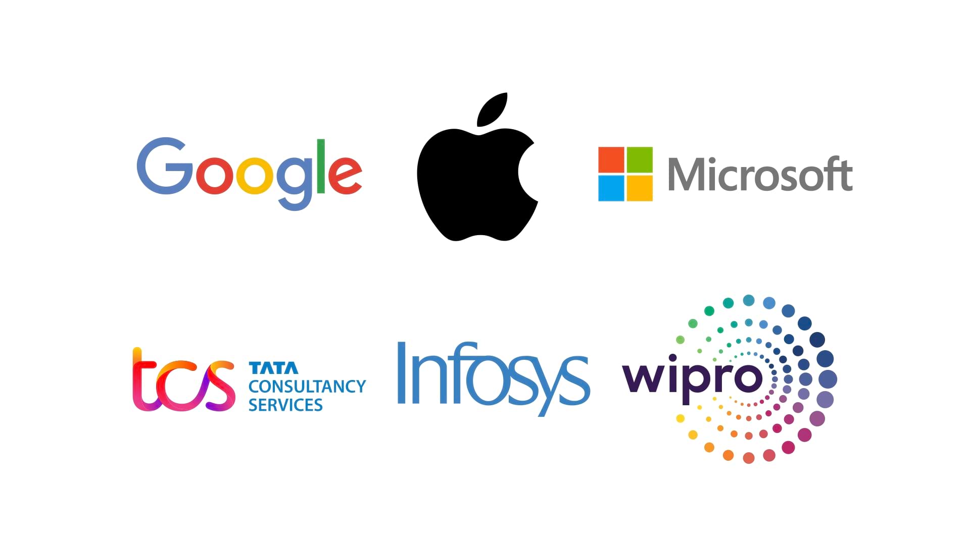
Example 1: Apple
Apple's logo has undergone significant changes since its inception. The original 1976 logo featured a complex illustration of Isaac Newton under an apple tree, but it was soon replaced by the more recognizable rainbow-colored apple with a bite taken out. This design, created by Rob Janoff in 1977, symbolized innovation and the breaking of barriers.
The simplicity of the apple shape, combined with the bite mark, makes the logo easily recognizable. The monochromatic version adopted in 1998 aligns with Apple's minimalist design philosophy.
Apple's logo is synonymous with innovation, quality, and elegance. It has played a crucial role in establishing Apple's identity as a leader in the tech industry. The logo's evolution reflects the company's journey and its commitment to staying ahead of the curve.
Example 2: Google
Google's logo has seen several iterations since the company's founding in 1998. The most notable change came in 2015 when the company introduced a new, sans-serif typeface and a more vibrant color palette.
The use of primary colors in the Google logo signifies simplicity and approachability. The sans-serif typeface adds a modern and clean look, reflecting the company's focus on user-friendly and innovative technology.
Google's logo is instantly recognizable worldwide. It effectively conveys the company's mission to organize the world's information and make it universally accessible and useful. The logo's playful yet professional design mirrors Google's culture and its emphasis on creativity and innovation.
Example 3: Microsoft
Microsoft's logo has evolved from a bold, uppercase typeface in the 1970s to the modern, four-colored window design introduced in 2012. This change marked a new era for the company, focusing on a unified user experience across its products.
The four squares of the Microsoft logo represent the company's diverse product portfolio. The colors are intended to convey a sense of harmony and integration.
The Microsoft logo is a symbol of the company's commitment to innovation and its ability to adapt to changing market dynamics. It reflects Microsoft's strategy of creating a cohesive and integrated ecosystem of products and services.
Example 1: Infosys
Infosys has maintained a relatively consistent logo design since its founding in 1981, with minor tweaks to modernize the font and color scheme.
The Infosys logo features a simple, blue typeface that exudes professionalism and trustworthiness. The clean lines and spacing reflect the company's emphasis on clarity and precision.
The Infosys logo has become a symbol of excellence and reliability in the IT services sector. It reinforces the company's reputation as a leading provider of consulting and outsourcing solutions.
Example 2: TCS (Tata Consultancy Services)
TCS's logo has evolved from a traditional serif typeface to a more modern, sans-serif font. The latest iteration, introduced in 2016, features a vibrant blue color.
The TCS logo's clean and contemporary design reflects the company's innovative approach to technology and business solutions. The use of blue symbolizes trust, stability, and reliability.
The TCS logo is a testament to the company's ability to adapt and grow in the ever-changing technology landscape. It represents the brand's commitment to delivering cutting-edge solutions and services to its clients worldwide.
Example 3: Wipro
Wipro's logo has transformed from a simple wordmark to a dynamic, multi-colored sunflower design introduced in 2017. This change was part of a broader rebranding effort to emphasize the company's focus on digital transformation.
The Wipro logo features a stylized sunflower with vibrant colors, symbolizing growth, diversity, and innovation. The circular pattern conveys a sense of motion and progress.
The Wipro logo reflects the company's transition into a global leader in technology and consulting services. It embodies Wipro's vision of embracing change and driving innovation.
Common Elements
Simplicity: All these logos share a simple and clean design, making them easily recognizable and memorable.
Color Psychology: The strategic use of colors helps convey the brand's values and evoke specific emotions.
Consistency: A consistent logo design across various platforms strengthens brand identity and recognition.
Design Principles
Scalability: Ensure the logo looks good at any size, from a website favicon to a billboard.
Versatility: The logo should work well in different contexts and backgrounds.
Timelessness: Aim for a design that remains relevant and effective over time.
Research on Effective Logo Design
A study by the MIT Sloan Management Review highlighted that companies with well-designed logos experience greater customer loyalty and brand engagement. Another research by the University of Loyola found that color increases brand recognition by up to 80%, emphasizing the importance of thoughtful color selection in logo design.
Our Services
At Alitestar, we specialize in creating impactful and memorable logos that resonate with your target audience. Our services include:
Logo Design: Crafting unique logos that capture your brand's essence.
Brand Identity: Developing a cohesive brand identity that reflects your company’s values and mission.
Brand Guidelines: Creating comprehensive brand guidelines to ensure consistency across all touchpoints.
Branding: Offering end-to-end branding services to help you build a strong and recognizable brand.
Our Approach
Our approach to logo design is rooted in understanding your business, audience, and goals. We combine creative expertise with strategic insights to deliver logos that not only look great but also drive business success.
Ready to elevate your brand with a standout logo? Contact Alitestar today to start your branding journey. Let us help you create a logo that speaks to your audience and sets you apart from the competition.
![]()
In this article, we explored the top technology logos from the USA and India, examining their design elements, evolution, and impact on their respective brands. A strong logo is crucial for establishing a memorable and effective brand identity, especially in the competitive technology sector. At Alitestar, we are dedicated to helping businesses achieve their branding goals with our premium logo design, brand identity, and branding services. Reach out to us today to see how we can transform your brand with a logo that truly stands out.


Shaikh Asif is an Award-winning designer, director, strategist, and educator. He’s the Lead Strategic Brand Designer and Art Director of The Alitestar— a strategic branding and design agency that helps startups, ambitious CEOs, and passionate entrepreneurs to achieve success and ultimately create unforgettable brand experiences.