Design
Mastering Design Fundamental: 8 Essential Principles Of Design
09.02.2025
By Shaikh Asif
Design
09.02.2025
By Shaikh Asif


In the fast-paced world of startups and businesses, design isn't just about making things look good; it's a critical factor that can make or break your brand's success. According to a Microsoft study, the first 10 seconds are crucial for creating a positive first impression on website visitors. This underscores the importance of effective design in capturing and retaining your audience's attention. In this article, we will delve into the fundamental principles of design, providing you with practical, step-by-step insights that you can apply to enhance your brand's visual appeal and effectiveness.
Balance in design refers to the distribution of visual weight in a composition. It ensures that no single part of a design overpowers other parts, creating a sense of stability and structure. There are three main types of balance: symmetrical, asymmetrical, and radial.
Symmetrical Balance: This type of balance is achieved when elements are evenly distributed around a central axis. It conveys a sense of formality and elegance. For example, the layout of a corporate website often uses symmetrical balance to project a professional image.
Asymmetrical Balance: This involves different elements that are not identical but are arranged to create a balanced visual weight. Asymmetrical balance often appears more dynamic and interesting, suitable for innovative startups aiming to convey creativity.
Radial Balance: This occurs when elements radiate from a central point. It's less common but can be effective in creating focal points within a design.
Research shows that balanced designs are perceived as more aesthetically pleasing and trustworthy. For instance, a study published in the "Journal of Consumer Research" found that balanced visual layouts can enhance the perceived value of products.

Contrast is a powerful design principle that involves the use of opposing elements, such as light vs. dark, large vs. small, or bold vs. subdued. It helps to create focal points and draw attention to the most important parts of a design.
Importance of Contrast: By highlighting key elements, contrast can guide users' attention and make important information stand out. For example, a call-to-action button in a contrasting color can significantly increase conversion rates.
Practical Examples: Consider a tech startup's landing page where the primary message is displayed in bold, dark text against a light background, ensuring it catches the eye immediately.
A study by the Nielsen Norman Group revealed that users are more likely to notice and remember information that stands out due to high contrast.
Emphasis involves making certain parts of a design more prominent to convey importance. This can be achieved through size, color, typography, and other design elements.
Techniques for Emphasis: Use larger fonts for headings, bright colors for key information, or unique typography to draw attention to specific areas.
Practical Examples: In an e-commerce site, the "Add to Cart" button is often emphasized to stand out and encourage user interaction.
According to a study in the "International Journal of Human-Computer Interaction," effective emphasis can significantly improve user engagement and information retention.
Movement guides the viewer's eye through the design in a deliberate way. It helps to direct attention and ensure that the viewer sees the most important elements in the intended order.
Guiding the Viewer’s Eye: Use lines, shapes, and positioning to create a visual path. For example, a website might use directional cues like arrows or strategically placed images to lead visitors through the content.
Practical Examples: A business homepage might guide users from the headline to the key features and finally to the call-to-action button.
Research by the University of Toronto found that designs that effectively use movement can improve the user's ability to process and remember information.

Repetition involves the use of the same or similar elements throughout a design to create unity and consistency. This principle helps reinforce the overall message and makes the design more cohesive.
Creating Unity and Consistency: Use consistent fonts, colors, and styles throughout your marketing materials to establish a strong brand identity.
Practical Examples: A company's website, business cards, and social media profiles should all use the same color scheme and typography to maintain a cohesive look.
A study in the "Journal of Business Research" found that consistent use of design elements can enhance brand recognition and loyalty.

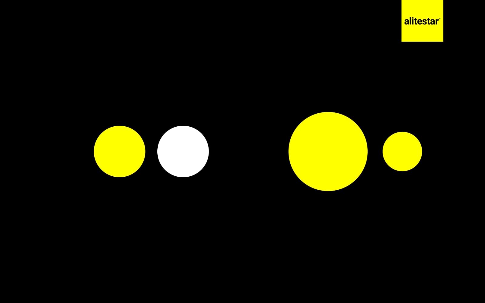
Proportion refers to the relative size and scale of the various elements in a design. It ensures that all parts of the design relate well to each other and to the whole composition.
Relationship Between Elements: Proper proportion can help create harmony in a design. For instance, in a brochure, the size of images should be balanced with the amount of text to avoid overwhelming the reader.
Practical Examples: A product catalog should have images and text that are proportionally balanced to ensure readability and visual appeal.
Research published in "Design Studies" indicates that well-proportioned designs are more aesthetically pleasing and easier to navigate.

White space, or negative space, is the area between and around design elements. It helps to reduce clutter and improve readability.
Enhancing Readability and Focus: Adequate white space can make your content more digestible and highlight the key elements. For example, a clean, minimalist website design can enhance user experience by making navigation simpler.
Practical Examples: Use white space to separate sections on a webpage, making it easier for users to find the information they need.
A study by the "Human Factors International" found that designs with appropriate white space improve comprehension by up to 20%.

Unity is the principle that ensures all design elements work together to create a cohesive and harmonious look. It makes the design feel complete and consistent.
Achieving Unity in Design: Use consistent colors, typography, and styles. Ensure that all elements support the overall message and brand identity.
Practical Examples: A brand's marketing materials should all align in style and message to reinforce the brand's identity and values.
Research from the "Journal of Marketing" shows that unified branding can enhance brand perception and customer loyalty.

Mastering the fundamental principles of design is essential for any business or startup aiming to create a strong visual presence. These principles—balance, contrast, emphasis, movement, repetition, proportion, white space, and unity—are the building blocks of effective design. By applying these principles thoughtfully, you can create designs that not only look good but also communicate your message clearly and effectively. Remember, continuous learning and application of these principles will keep your design skills sharp and your business ahead of the competition.
A: The fundamental principles of design are crucial because they ensure that your visual communications are effective and engaging. Good design can attract and retain customers, convey professionalism, and differentiate your brand from competitors. According to a Microsoft study, the first 10 seconds are critical for making a positive impression on website visitors, highlighting the importance of well-executed design.
A: Balance in design ensures that elements are evenly distributed, creating a sense of stability and harmony. This can make your design more visually appealing and easier to navigate. Symmetrical balance projects formality and elegance, while asymmetrical balance adds dynamism and interest. Radial balance can create focal points, guiding the viewer's eye effectively.
A: Contrast helps to highlight key elements and draw attention to important information by using opposing elements like light vs. dark or large vs. small. Effective use of contrast can significantly improve readability and user engagement. For example, a high-contrast call-to-action button can increase conversion rates.
A: Emphasis can be achieved through various techniques such as using larger fonts, bright colors, or unique typography. The goal is to make certain elements stand out to convey their importance. Emphasizing key elements like headlines or calls-to-action can enhance user engagement and retention.
A: Movement guides the viewer's eye through the design in a deliberate way, ensuring they see the most important elements in the intended order. This can be achieved through lines, shapes, and positioning. Effective use of movement can improve the user's ability to process and remember information.
A: Repetition involves using the same or similar elements throughout a design to create consistency and cohesion. This reinforces the overall message and makes the design more unified. Consistent use of design elements like fonts, colors, and styles can enhance brand recognition and loyalty.
A: Proportion refers to the relative size and scale of elements in a design. Proper proportion creates harmony and balance, ensuring that all parts of the design relate well to each other. This makes the design aesthetically pleasing and easier to navigate.
A: White space, or negative space, is the area around and between design elements. It helps to reduce clutter, improve readability, and highlight key elements. Adequate white space can enhance user experience by making content more digestible and easier to navigate.
A: Unity is achieved by ensuring all design elements work together to create a cohesive and harmonious look. This involves using consistent colors, typography, and styles. Unified designs reinforce the brand's identity and values, enhancing brand perception and customer loyalty.
A: Continuous learning is key to improving design skills. Stay updated with the latest design trends, study successful designs, and seek feedback from peers and mentors. Applying the fundamental principles of design in various projects will help you refine your skills and create more effective designs.


Shaikh Asif is an Award-winning designer, director, strategist, and educator. He’s the Lead Strategic Brand Designer and Art Director of The Alitestar— a strategic branding and design agency that helps startups, ambitious CEOs, and passionate entrepreneurs to achieve success and ultimately create unforgettable brand experiences.