Design
Mastering the Market The Definitive Guide to Real Estate Brand Logos
09.02.2025
By Shaikh Asif
Design
09.02.2025
By Shaikh Asif


In the dynamic world of real estate, a logo is more than just a symbol; it’s the face of a brand, a silent ambassador that communicates values, trust, and professionalism. As we embark on a journey through the landscape of real estate brand logos, we’ll uncover the secrets behind the best real estate logos for brand recognition, analyze the success of top real estate logos, and reveal how these icons influence buyer decisions.
From the iconic real estate logos that dominate the visual landscape to the real estate logos that stand out in competitive markets, this blog post is your gateway to understanding the artistry and psychology that transform simple designs into powerful marks of the industry. Join us as we decode the messaging and emotional connection these logos create, and how they reflect the brand values of some of the most prestigious names in real estate. Whether you’re a marketer, a real estate professional, or simply a design enthusiast, prepare to be inspired by the logos that have become symbols of trust and elegance in the property world.
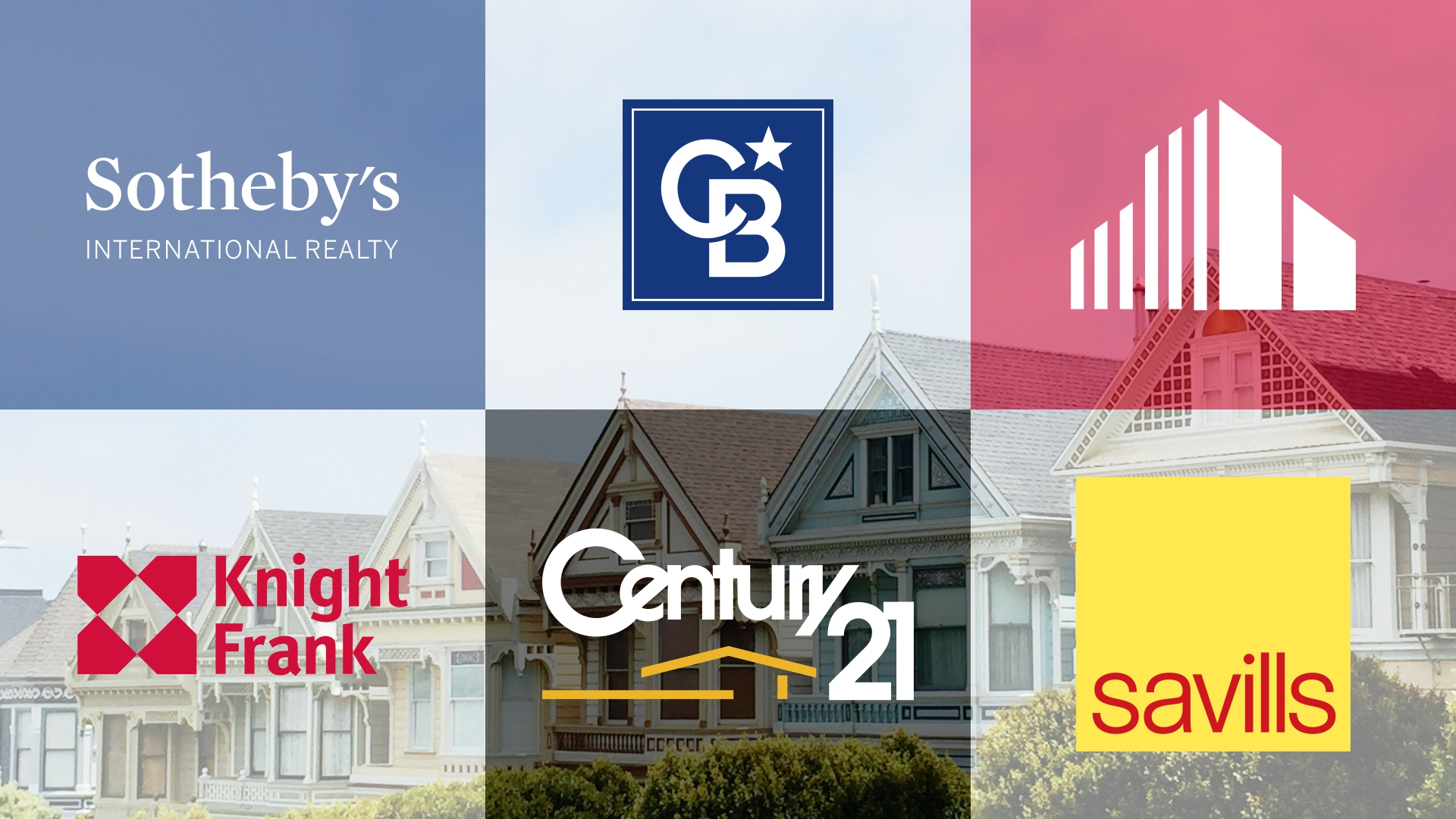
The Savills logo features a simple yet impactful design. Here’s what stands out:
Color Palette:
Yellow: The bold yellow rectangle serves as the background. Yellow is associated with optimism, energy, and warmth. In the context of real estate, it conveys a sense of confidence and approachability.
Red Text: The lowercase red letters spelling “savills” create a striking contrast against the yellow background. Red symbolizes passion, strength, and determination. It suggests that Savills is committed and assertive in its real estate services.

Typography:
The font used for “savills” is clean, sans-serif, and straightforward. It communicates professionalism and clarity. The lowercase letters emphasize approachability, making potential clients feel at ease.
Symbolism:
The simplicity of the design is intentional. The yellow rectangle represents stability and reliability, akin to the solid foundation of a property. The red text within it signifies the brand’s dynamic approach to real estate. The absence of elaborate symbols or icons suggests that Savills relies on its reputation and expertise rather than gimmicks.
Brand Values Reflection:
Savills values transparency, honesty, and direct communication. The straightforward typography and lack of embellishments reflect this commitment. The yellow background also hints at Savills being a beacon of guidance for clients navigating the real estate market.
Messaging:
The message is clear: Savills is a dependable partner in real estate transactions. The bold red text reinforces their confidence in achieving results. The absence of unnecessary frills implies efficiency and no-nonsense dealings.
Emotional Connection:
The logo evokes feelings of trust, reliability, and optimism. It says, “We’ve got this; leave your real estate worries to us.” The warm yellow invites clients to approach Savills with confidence.
Now, let’s add an imaginative twist! Imagine that the yellow rectangle isn’t just a background but a portal—a gateway to homeownership. When clients see the Savills logo, they feel like they’re stepping into a world of possibilities. The red text becomes a compass needle, pointing toward their dream home. It’s not just a logo; it’s a key to a brighter future.
Remember, branding isn’t just about visuals; it’s about the emotions and stories you evoke. Savills isn’t merely a real estate company; it’s a guide, a trusted friend, and a beacon of hope.
The Coldwell Banker logo is a blend of simplicity and symbolism. Here’s what makes it unique:
Color Palette:
Dark Blue: The square background in dark blue exudes professionalism, trust, and stability. Dark blue is often associated with reliability and dependability, which aligns perfectly with the real estate industry.
White: The white border and letters create a strong contrast against the blue. White signifies purity, clarity, and transparency. It suggests that Coldwell Banker operates with integrity and openness.
Typography:
The uppercase letters spelling “COLDWELL BANKER” are clean and straightforward. The sans-serif font communicates professionalism and expertise.
The boldness of the letters conveys confidence and authority. Clients can trust that Coldwell Banker knows the real estate market inside out.

Symbolism:
The white star above the letters adds a touch of aspiration. It represents excellence, guidance, and reaching for the stars. Coldwell Banker aims to elevate clients’ real estate experiences.
The square shape itself implies stability and structure. It’s like a solid foundation for clients’ property dreams.
Brand Values Reflection:
Coldwell Banker values tradition, reliability, and personalized service. The classic design reflects their long-standing reputation in the industry. The white border suggests transparency—clients can see through to the heart of the brand.
Messaging:
The logo says, “We’re here for you.” It’s a handshake, a promise, and an invitation to explore real estate possibilities. The star symbolizes guidance—Coldwell Banker will lead clients toward their ideal homes.
Emotional Connection:
The logo evokes feelings of trust, security, and hope. It’s like a beacon guiding clients through the complex real estate landscape. When someone sees this logo, they think of experienced agents, reliable advice, and successful transactions.
The Cushman & Wakefield logo combines simplicity, symbolism, and professionalism. Here’s what makes it stand out:
Graphical Element:
The stylized red graphical element resembles a bar graph or buildings. This cleverly conveys the essence of real estate and financial growth.
The upward direction of the bars suggests progress, success, and aspiration. It’s as if the buildings are rising toward the sky, signifying Cushman & Wakefield’s commitment to elevating clients’ real estate experiences.
Color Palette:
Red: The bold red color symbolizes energy, passion, and determination. It’s fitting for a brand that deals with property transactions and investment.
Red also evokes urgency and action, which aligns with the fast-paced nature of real estate deals.
Typography:
The uppercase letters spelling “CUSHMAN & WAKEFIELD” exude professionalism and authority. The sans-serif font communicates clarity and expertise.
The spacing between the words allows each part of the brand name to stand independently, emphasizing the partnership between Cushman and Wakefield.

Brand Values Reflection:
Cushman & Wakefield values growth, precision, and strategic thinking. The graphical element represents data-driven decisions, while the font choice reflects their straightforward approach. The absence of unnecessary embellishments suggests a no-nonsense attitude toward real estate solutions.
Messaging:
The logo says, “We analyze, we build, we succeed.” It’s a visual promise of progress and prosperity. The upward movement reinforces the idea that Cushman & Wakefield is a catalyst for clients’ financial growth.
Emotional Connection:
The logo evokes feelings of trust, ambition, and opportunity. It’s like a blueprint for success. When someone sees this logo, they think of experts who turn data into profitable decisions.
Color Palette:
Green: The logo’s green background represents growth, renewal, and prosperity, which are key attributes in real estate. It also conveys a message of sustainability and environmental consciousness, aligning with modern values.
Typography:
The bold, white capital letters of “CBRE” stand out against the green, symbolizing clarity and boldness.
Symbolism:
The simplicity of the design suggests a no-nonsense approach to business. The absence of complex imagery implies that CBRE focuses on the essentials—delivering results without distraction.
Brand Values Reflection:
CBRE’s values of Respect, Integrity, Service, and Excellence (RISE) are subtly represented in the logo’s straightforward design.
The logo communicates CBRE’s commitment to providing integrated solutions and harnessing the power of data and insights to meet clients’ real estate needs.
Emotional Connection:
The green color can evoke a sense of balance and reassurance, suggesting that CBRE is a stable and reliable partner in the real estate journey.
The Knight Frank logo combines simplicity, symbolism, and elegance. Here’s what makes it intriguing:
Color Palette:
Red and White: The logo’s red and white color scheme is classic and timeless. Red symbolizes energy, passion, and action, while white represents purity and clarity. The combination suggests that Knight Frank operates with vigor and transparency.
Typography:
The red text spelling “Knight” and “Frank” is straightforward and professional. The font choice reflects stability and reliability. The equal prominence given to both words signifies a balanced partnership.
Symbolism:
The graphic element above the text is captivating. Four red triangles form a larger square shape, creating an ‘X’ in the center. The ‘X’ could represent crossing boundaries, exploring new horizons, or marking a spot on the map. It’s like a compass guiding clients toward their real estate goals.
Brand Values Reflection:
Knight Frank values precision, expertise, and global reach. The geometric design suggests meticulous planning and strategic thinking. The absence of unnecessary embellishments implies a focus on substance over style.
Messaging:
The logo says, “We navigate, we advise, we excel.” It’s a visual promise of guidance and excellence. The ‘X’ could also symbolize the meeting point where Knight Frank connects buyers and sellers, landlords and tenants.
Emotional Connection:
The logo evokes feelings of trust, adventure, and possibility. It’s like a treasure map leading to hidden gems in the real estate landscape. When someone sees this logo, they think of seasoned experts who turn properties into opportunities.
The Century 21 logo combines simplicity, elegance, and timeless appeal. Here’s what makes it stand out:
Color Palette:
Gold and Black: The logo’s gold and black color scheme exudes sophistication and prestige. Gold represents excellence, achievement, and success, while black signifies professionalism and reliability. The combination suggests that Century 21 operates at the pinnacle of real estate services.
Typography:
The wordmark “Century 21” is sleek and balanced. The font choice reflects clarity and confidence. The number “21” appears larger, emphasizing the brand’s forward-looking vision and commitment to the future.

Symbolism:
Below the text, a simplistic representation of a house roofline in gold underscores the brand. It’s like a subtle nod to the heart of Century 21’s business—the homes they help buy and sell. The roofline also symbolizes shelter, security, and the dream of homeownership.
Brand Values Reflection:
Century 21 values tradition, trust, and innovation. The classic design pays homage to their legacy while the modern font hints at their adaptability. The absence of unnecessary embellishments suggests a focus on substance over showmanship.
Messaging:
The logo says, “We’ve been here for generations, and we’ll be here for yours.” It’s a visual promise of continuity and reliability. The gold roofline whispers, “Your dream home starts here.”
Emotional Connection:
The logo evokes feelings of trust, nostalgia, and aspiration. It’s like a key to the door of possibilities. When someone sees this logo, they think of experienced agents who turn real estate transactions into life-changing moments.
The Sotheby’s International Realty logo is a mark of prestige and elegance. Here’s what makes it exceptional:
Color Palette:
Blue and White: The logo’s blue background exudes sophistication, trust, and calmness. Blue is often associated with stability and reliability. The white text stands out against the blue, symbolizing clarity and purity.

Typography:
The wordmark “Sotheby’s” is in a larger font size, emphasizing the brand’s heritage and connection to the renowned auction house. The “International Realty” text is placed underneath, reflecting the global reach and expertise of the brand.
Symbolism:
While there isn’t an explicit graphic element, the entire logo embodies luxury, exclusivity, and a commitment to exceptional properties. The association with Sotheby’s auction house adds a layer of prestige, suggesting that Sotheby’s International Realty deals with properties of unparalleled value.
Brand Values Reflection:
Sotheby’s International Realty values uniqueness, artistry, and global connections. The brand’s history and unmatched reputation give its listings the exposure they deserve. The logo assures buyers that they are working with a trusted partner who understands the art of real estate.
Messaging:
The logo says, “We don’t just sell homes; we curate experiences.” It’s an invitation to explore extraordinary properties around the world. The blue background evokes feelings of trust and aspiration, appealing to discerning clients.
The RE/MAX logo is distinctive and memorable, featuring a hot air balloon with red and white stripes on the top and blue on the bottom, with the “RE/MAX” name in white. Here’s what makes it special:
Color Palette:
Red, White, and Blue: These colors are not only patriotic but also represent trust, excellence, and passion. They are often associated with strength and reliability, which are crucial in the real estate industry.
Typography:
The bold, white capital letters of “RE/MAX” stand out against the blue background, symbolizing clarity and prominence. The font is modern and assertive, reflecting RE/MAX’s role as a leader in the industry.

Symbolism:
The hot air balloon is a symbol of freedom, adventure, and the ability to rise above the ordinary. It represents RE/MAX’s commitment to helping clients reach their dreams of homeownership.
Brand Values Reflection:
RE/MAX values dedication to clients, commitment to excellence, and a global perspective. The brand identity manual emphasizes the importance of these values and how they are communicated through the brand’s visual elements.
Messaging:
The logo communicates a sense of limitless possibilities, suggesting that with RE/MAX, clients can achieve their highest aspirations in real estate.
Emotional Connection:
The hot air balloon evokes feelings of excitement and optimism. It’s a visual metaphor for the journey clients embark on when buying or selling a home.
The Power of Branding
In the ever-evolving real estate landscape, a logo isn’t just a design—it’s a promise. Keller Williams believes that real estate is a local business, driven by individual agents and the market share they’ve earned. As we dive into the world of real estate brand logos, we’ll unlock the secrets behind their effectiveness, influence on buyer decisions, and impact on branding strategies.
The Iconic KW Logo
The Keller Williams (KW) logo is more than an emblem; it’s a beacon of trust. Here’s what makes it stand out:

Structure: The KW logo seamlessly integrates the lowercase letters ‘k’ and ‘w,’ connected at the bottom. Above the ‘w,’ a small red triangle points downward, signifying growth and stability.
Color Palette: The bold red color exudes energy, passion, and confidence. It’s a hue that commands attention and symbolizes KW’s commitment to excellence.
Ownership Statement: “Each Office Is Independently Owned and Operated.” This statement reinforces KW’s local focus while maintaining a unified standard.
Psychological Impact: The KW logo evokes feelings of reliability and professionalism. It’s a visual promise that each KW office operates independently yet shares the same commitment to service.
As you delve into the definitive guide to real estate brand logos, remember that a logo isn’t just an image—it’s your brand’s identity. Whether etched on a yard sign or displayed digitally, the KW logo represents a legacy of trust, innovation, and big lives. Welcome to the KW family!
As we conclude our exploration of the best real estate logos for brand recognition, we reflect on the powerful narratives these symbols weave within the fabric of the property market. The iconic real estate logos we’ve examined are not merely designs; they are beacons of trust and elegance, guiding both buyers and sellers through the journey of real estate transactions. These logos stand as testaments to the brands’ commitment to excellence and innovation, leaving indelible marks on the competitive landscape. They are the silent ambassadors that influence buyer decisions, embodying the brand values and aspirations of each company. Whether etched on a signboard or displayed on a digital screen, these real estate logos that stand out remind us that behind every successful brand is a story told through the simplicity of a symbol. May this insight into the success of top real estate logos inspire you to look beyond the visuals and see the legacy and heritage they represent—a legacy that continues to shape the future of real estate branding.
A: An effective real estate logo is one that combines memorable design with clear messaging. It should embody the brand’s values, be easily recognizable, and adaptable across various media. In today’s market, a logo must also be versatile enough to resonate with a diverse audience and stand out in both digital and physical landscapes.
A: Absolutely! A well-designed logo can create an emotional connection with potential buyers, instilling a sense of trust and reliability. It’s often the first impression a client has of your brand, and a positive one can influence their decision-making process, leading them to choose your services over competitors.
A: Top real estate brands use their logos consistently across all marketing materials, ensuring high visibility and recognition. They often tell a story or convey a message that aligns with their brand identity, making their logos synonymous with their reputation for quality and service.
A: Iconic real estate logos often feature clean lines, a limited color palette, and a unique symbol or monogram. They strike a balance between simplicity and distinctiveness, making them easy to identify and remember.
A: The evolution of real estate logos reflects a shift towards more modern and dynamic branding strategies. Companies are embracing logos that can adapt to digital platforms while still maintaining their core identity, allowing for more creative and strategic branding approaches.
A: Psychology plays a crucial role in logo design by influencing how colors, shapes, and fonts are perceived by the audience. For instance, certain colors can evoke feelings of trust or excitement, while shapes can convey stability or innovation. Understanding these psychological effects helps designers create logos that align with the brand’s desired image.


Shaikh Asif is an Award-winning designer, director, strategist, and educator. He’s the Lead Strategic Brand Designer and Art Director of The Alitestar— a strategic branding and design agency that helps startups, ambitious CEOs, and passionate entrepreneurs to achieve success and ultimately create unforgettable brand experiences.