Design
How to Fix Your Logo into a Professional-Looking Logo – Expert Tips & Tricks
11.02.2025
By Shaikh Asif

Design
11.02.2025
By Shaikh Asif
Your logo is more than just a design; it’s the face of your brand. A poorly designed logo doesn’t just look amateurish—it actively damages brand perception, reduces credibility, and makes it harder for your business to attract the right customers. If your logo isn’t communicating the right message or doesn’t look polished, it’s time for a fix. But how do you transform a weak logo into a powerful, professional brand asset?
In this in-depth guide, we’ll walk you through a step-by-step approach to refining and upgrading your logo into a professional, high-impact identity that stands out in your industry. Whether you’re a designer, creative professional, entrepreneur, or business leader, you’ll gain practical, expert-level insights into what makes a logo truly professional and how to elevate yours.

Before we fix a logo, we need to diagnose the problem. Here are the most common reasons a logo looks amateurish:
Typography isn’t just about picking a font—it’s about choosing a typeface that embodies your brand’s personality. Generic fonts, excessive variations, or improper kerning can make a logo look cheap and unpolished.
A professional logo must look great across all platforms—business cards, billboards, digital ads, social media, and more. If your logo loses clarity when resized, it’s not built for scalability.
Simplicity is key in professional logo design. If your logo has too many elements, excessive gradients, or lacks a clear focal point, it may confuse rather than captivate your audience.
Logos without strategic thought behind them tend to feel disconnected from the brand. If your logo doesn't reflect your brand's mission, vision, and values, it will fail to create a lasting impression.
Fixing a logo isn’t just about making it look “cool.” It’s about aligning the design with impactful brand strategy and best design practices. Here’s how:
A great logo stems from a well-defined brand strategy. Ask yourself:
What does my brand stand for?
Who is my target audience?
What emotions should my brand evoke?
How do I differentiate from competitors?
A strong logo is simple yet distinctive. The best brands (Nike, Apple, McDonald’s) use minimalist yet memorable logos. Aim for a clean, recognizable form that sticks in people’s minds.
Sans-serif fonts create a modern, clean look.
Serif fonts add a touch of tradition and trust.
Custom typography can make your brand truly unique.
Kerning & Spacing should be adjusted for visual balance.
Colors evoke emotions ( color Psychology ). The right color palette should align with your brand’s personality:
Red: Passion, energy, urgency (Coca-Cola, YouTube)
Blue: Trust, professionalism, stability (Facebook, IBM)
Yellow: Optimism, friendliness, warmth (McDonald’s, Snapchat)
Black & White: Elegance, sophistication (Chanel, Nike)
Your logo should work in:
Monochrome & Full Color
Small & Large Sizes
Print & Digital Formats
Horizontal & Vertical Orientations
Test it in different environments before finalizing.

If your logo is suffering from amateur mistakes, here’s how to correct them:
1. Refine or Replace the Font: Switch to a more professional, high-quality font with better readability.
2. Reduce Unnecessary Elements: Remove clutter and focus on one key idea.
3. Adjust Spacing & Proportions: Ensure proper kerning, tracking, and balanced proportions.
4. Simplify the Color Palette: Limit to 2-3 colors for clarity and recognition.
5. Convert to Vector Format: A vector file ensures your logo scales properly for any use.
To showcase the power of a professional redesign, let’s look at real-world examples of logo transformations.

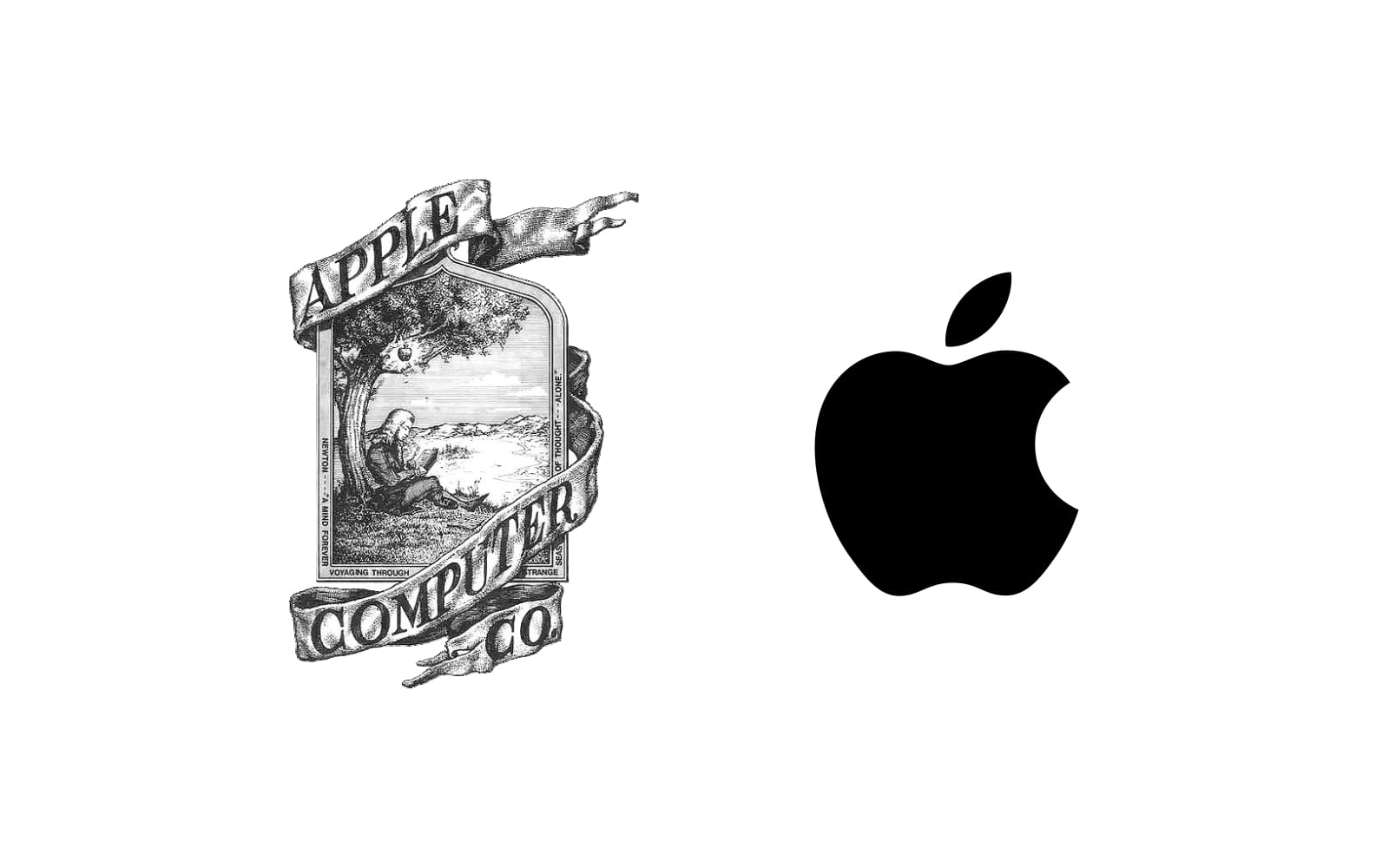
Before: The original 1976 Apple logo featured a detailed illustration of Isaac Newton under an apple tree. It was complex and not scalable.
After: In 1977, the now-iconic Apple silhouette with a bite was introduced. Over the years, it evolved into a clean, monochrome design that is instantly recognizable.
Lesson: Simplifying a logo while maintaining brand essence enhances memorability and scalability.

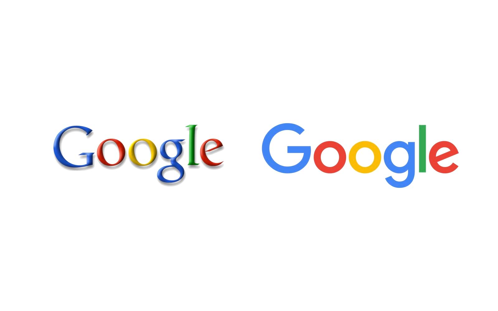
Before: Google’s old logo used a serif typeface with subtle shading. While distinctive, it lacked modern appeal and scalability.
After: In 2015, Google switched to a custom sans-serif font (Product Sans) with a flat design, improving readability across devices.
Lesson: Updating typography and removing unnecessary effects can make a logo more modern and versatile.

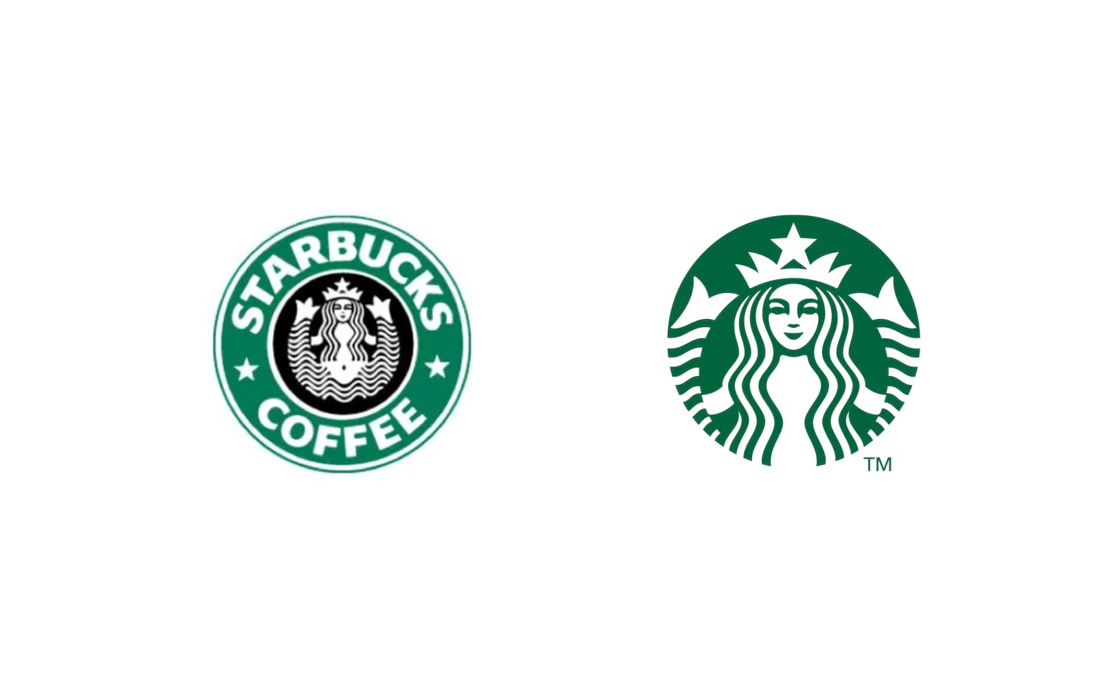
Before: Starbucks’ logo originally included both the siren illustration and the brand name within a circular border.
After: The 2011 redesign removed the wordmark, letting the siren icon stand alone—a confident move for a globally recognized brand.
Lesson: When a logo has strong visual equity, removing extra elements can make it even more impactful.
Many businesses try to fix their logos using free online tools or amateur designers, but the results often lack strategic thinking. Here’s why:
No brand strategy behind the logo.
Poor typography, spacing, and alignment.
Lack of scalability and versatility.
Colors that don’t align with the brand’s message.
This is where Alitestar’s expert branding and design team comes in. We don’t just design logos—we craft strategic brand identities that elevate businesses to the next level.
A professional logo isn’t just about looking good—it’s about communicating trust, credibility, and brand essence at a glance. If your current logo isn’t working, it’s time to fix it the right way.
At Alitestar, we offer premium logo design, brand identity, brand strategy, and branding services tailored to help your business stand out. Whether you’re a startup, entrepreneur, or established company, we help you craft a brand that leaves a lasting impact.
🔹 Schedule a Free Logo Audit with our experts.
🔹 Get in touch with Alitestar for a professional brand transformation.
Your brand deserves a logo that works. Let’s make it happen.


Shaikh Asif is an Award-winning designer, director, strategist, and educator. He’s the Lead Strategic Brand Designer and Art Director of The Alitestar— a strategic branding and design agency that helps startups, ambitious CEOs, and passionate entrepreneurs to achieve success and ultimately create unforgettable brand experiences.