Design
Top New York Airline Brand Logos: Iconic Designs & Branding Insights for Lasting Impact
11.02.2025
By Shaikh Asif
Design
11.02.2025
By Shaikh Asif


In the crowded skies of New York, branding isn’t just about visibility—it’s about authority, identity, and connection. For airlines, the logo is a powerful starting point; it represents the first impression, the promise, and the values of an airline all at once. When you see the sleek, dynamic symbol of an airline like Delta or the approachable, vibrant look of JetBlue, it’s not just design—it’s identity in motion. This identity resonates with travelers, influencing their loyalty, trust, and overall experience with the airline.
But what goes into creating a logo that not only stands out but also stands for something in a high-stakes market like New York? Today, we’re unpacking the design decisions and strategic thinking behind some of the best airline logos in New York. You’ll see how branding choices aren’t just aesthetic; they’re functional, speaking directly to the target audience's desires and expectations. At Alitestar, we understand these principles deeply and help brands find their unique space with logos that speak as clearly as they look.
Let’s start with what makes a logo iconic in the airline industry, beginning with the framework that underpins powerful airline branding.
Crafting an iconic airline logo isn’t a simple process of picking colors or designing a memorable symbol; it’s a strategic blend of visual storytelling, psychology, and brand positioning. For airlines operating out of a high-energy, multicultural hub like New York, these choices are even more nuanced. Each element needs to capture the essence of the airline, reflect its values, and resonate with a global audience. Here’s a closer look at the framework that builds a lasting airline logo:
1. Color Psychology and Cultural Significance
Emotional Impact: Colors are essential in establishing an immediate emotional connection. Blue, for instance, is widely trusted in the airline industry, symbolizing reliability, calm, and professionalism—a significant factor when people are boarding flights and placing trust in an airline. Delta’s use of navy blue and red conveys strength and confidence, while JetBlue’s brighter blue suggests approachability and modernity.
Cultural Sensitivity and Global Relevance: An airline flying internationally must consider color meanings across cultures. Red may signify luck in some cultures, but danger in others. Iconic airline brands take a strategic approach here, selecting colors that align universally with positive associations.
2. Typography: Precision and Personality
Clarity and Readability: Typography in airline logos must be clean and easily legible, ensuring the brand name can be read at a glance—whether it’s on an airport sign, a plane’s fuselage, or a digital platform. Fonts are often sans-serif, conveying modernity and simplicity, but within this style, there’s room for personalization.
Style as a Brand Signal: Take JetBlue’s bold but slightly softened typography, which is modern and accessible, appealing to a diverse and younger audience. By contrast, a traditional airline might use more structured, formal fonts to imply stability and tradition. Typography isn’t just a type choice; it’s a decision that reflects the airline’s brand personality.
3. Symbolism and Iconography: The Heart of Visual Storytelling
Abstract Elements for Recognition: The best logos often employ abstract shapes or symbols rather than literal depictions of airplanes or travel. Delta’s triangle, representing the Greek letter Delta, carries both historical and cultural weight, connecting the airline’s brand identity to its roots and trajectory.
Global and Dynamic Icons: Effective logos in the airline industry often reflect motion, global reach, or ascension. These symbolic cues help convey a message of movement and ambition, aligning with the purpose of air travel itself. Whether it’s an arrow, a stylized globe, or a dynamic shape, symbolism is a powerful way to evoke the feeling of flight and international connectivity.
4. Shape and Composition: Balance and Flexibility
Simplicity and Versatility: Airline logos must be versatile enough to appear on various surfaces and scales, from a tailfin to a business card. This requirement calls for simplicity and a balanced composition, which ensures that logos remain recognizable at any size or distance.
Unique Geometric Choices: Shapes like circles convey unity and inclusivity, which can appeal to airlines looking to emphasize a global, welcoming identity. In contrast, angular logos suggest power and forward motion, as seen with Delta’s triangular icon, which exudes authority and reliability. Composition matters just as much as the colors or symbols themselves.
5. Cohesion with Brand Values and Messaging
Aligning Visuals with Brand Story: Every design choice must be cohesive with the brand’s identity and mission. For a budget airline, the logo might include bright, friendly colors and rounded fonts to communicate affordability and accessibility. For a luxury airline, the design might incorporate more restrained, classic elements to signify exclusivity and sophistication.
Long-Term Brand Storytelling: A logo isn’t just an isolated graphic—it’s a critical component of an airline’s long-term narrative. Each logo should feel like it belongs to the airline’s broader identity, from customer service to in-flight experience, creating a unified brand impression across all touchpoints.
These elements combine to form a strong framework for effective airline branding, and they demonstrate why Alitestar’s approach to brand strategy, logo design, and identity-building is uniquely suited to tackle these challenges. Our expertise lies in the art and science of brand creation, and for airlines, every detail—from color to typography to symbolism—carries the potential to elevate the brand’s perception globally.
When applied effectively, this framework leads to a logo that doesn’t just represent the brand; it embodies it. This is the philosophy we bring to every client at Alitestar, helping you create a brand that’s as meaningful as it is memorable.
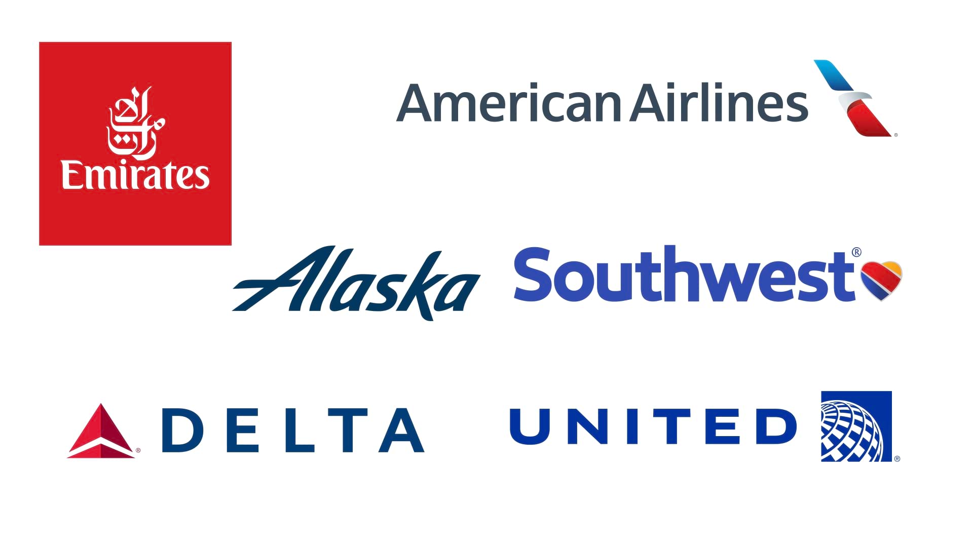
New York’s airline market, with its blend of high competition and diverse customer demographics, offers a fascinating case study in airline logo design. Each major airline that operates prominently in New York—like Delta, JetBlue, and American Airlines—has invested in distinct branding strategies to stand out. Here, we’ll analyze what makes each logo effective and how the strategic design choices align with their brand goals and audience.
1. Delta Air Lines
Overview: Delta is a major legacy carrier with one of the most recognizable logos in the industry, featuring a red triangular “wing” shape.
Brand Positioning: Known for reliability and premium service, Delta’s logo projects authority and stability, appealing primarily to business and frequent travelers.
2. American Airlines
Overview: As a longstanding U.S. carrier, American Airlines’ logo uses a stylized eagle in red, white, and blue, symbolizing patriotism and tradition.
Brand Positioning: The logo’s national imagery appeals to a sense of pride and reliability, targeting customers looking for a trusted airline with a strong American identity.
3. JetBlue Airways
Overview: With a modern, lowercase logo, JetBlue exudes an approachable, customer-friendly image.
Brand Positioning: Aimed at budget-conscious and leisure travelers, JetBlue’s simple and bright design signals affordability and transparency.
4. United Airlines
Overview: United’s globe icon symbolizes worldwide connectivity, emphasizing its international routes.
Brand Positioning: United targets global travelers who seek a dependable airline with an extensive network, focusing on professionalism and stability.
5. Spirit Airlines
Overview: Spirit’s bold yellow logo with black lettering is designed to stand out, echoing the airline’s commitment to affordable fares.
Brand Positioning: Known as a low-cost carrier, Spirit’s bright logo is youthful and approachable, appealing to budget travelers looking for value.
6. Alaska Airlines
Overview: Alaska’s logo features a modernized version of its heritage mascot, an Inupiat Eskimo, which reflects both its roots and progressive branding.
Brand Positioning: While based in the Pacific Northwest, Alaska’s logo resonates with travelers seeking an eco-conscious airline with a focus on service and reliability.
7. Southwest Airlines
Overview: Southwest uses a colorful heart icon as part of its logo, symbolizing customer care and loyalty.
Brand Positioning: Known for customer service, Southwest’s logo appeals to families and leisure travelers looking for a welcoming and affordable flying experience.
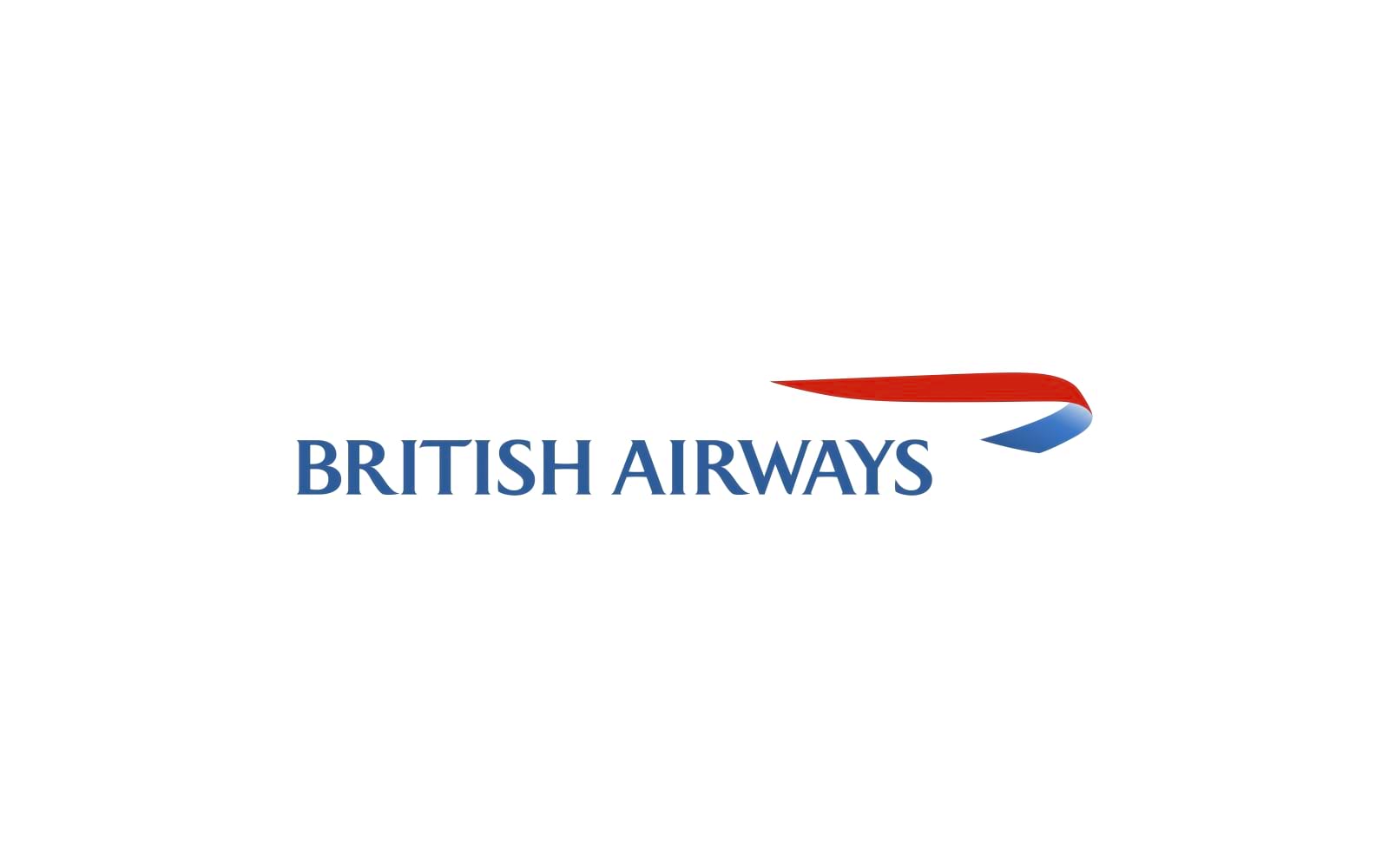
8. British Airways (operates extensively from NYC to Europe)
Overview: The British Airways logo features a stylized speedmarque design, representing grace and sophistication.
Brand Positioning: As a premier international airline, British Airways appeals to luxury and business travelers, with a logo that conveys elegance and quality.
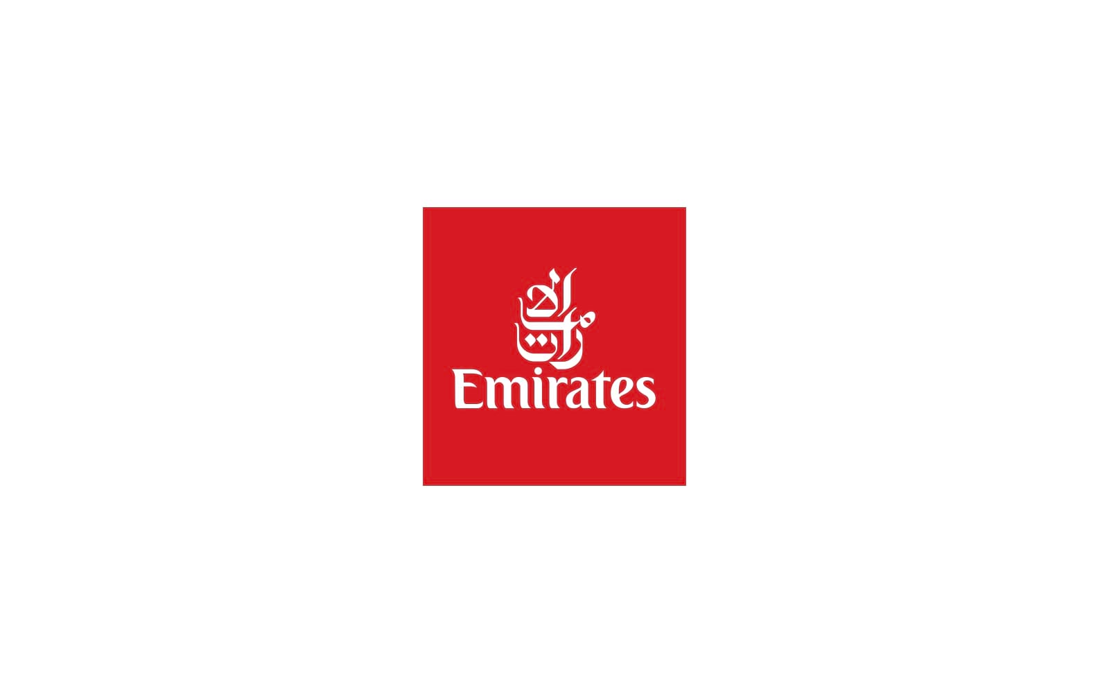
9. Emirates Airline
Overview: The Emirates logo, with its signature red and elegant Arabic calligraphy, reflects luxury and cultural pride.
Brand Positioning: Emirates targets luxury and business travelers, emphasizing high-quality service and a premium experience, particularly on long-haul flights.
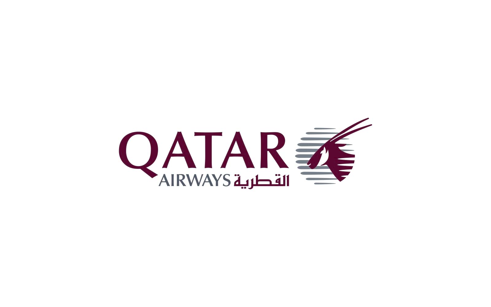
10. Qatar Airways
Overview: Qatar’s logo features a stylized Arabian oryx, a national symbol of Qatar, paired with sophisticated type.
Brand Positioning: Known for luxury, Qatar’s logo targets high-end and business travelers who expect a culturally rich, top-tier travel experience.
In the airline industry, a brand’s logo is just the beginning of its story. Effective airline branding is a strategic interplay of visual, experiential, and emotional elements that must be meticulously aligned. For airlines, which serve a vast array of customer demographics—from corporate executives to leisure travelers—creating a consistent, memorable brand experience is crucial for building trust and loyalty. Let’s delve into how a complete branding ecosystem strengthens these identities, using our list of New York-based airlines as examples.
1. Visual Identity and Consistency Across Touchpoints
Key Aspects: Logos, color palettes, typography, iconography, and other design elements are the foundation, but brand consistency is the key to leaving an indelible mark.
Example: JetBlue is a standout in terms of brand consistency. Its bright blue palette and playful typography extend beyond the logo to boarding passes, in-flight menus, and employee uniforms, creating a cohesive identity that customers immediately recognize.
Why It Matters: Visual consistency not only aids in brand recognition but also reinforces the brand’s promise at every stage of the customer journey.
2. Customer Experience (CX) as Brand Differentiator
Key Aspects: From check-in to in-flight service, each touchpoint should reflect the brand’s ethos.
Example: Delta Air Lines has built a reputation for reliability and customer-centric service, with a strong focus on business travelers. Delta’s use of technology, such as the Fly Delta app, emphasizes seamless experiences and punctuality—core attributes that support its brand identity.
Why It Matters: When service and experience align with a brand’s visual identity, it creates a coherent message. For Delta, every on-time departure and efficient check-in reflects its dedication to reliable service.
3. Brand Voice and Messaging
Key Aspects: Tone, language, and values communicated through social media, advertising, and customer interactions.
Example: Spirit Airlines utilizes a casual, approachable voice that reflects its budget-friendly positioning. Their branding often leans toward fun and unpretentious, with messaging that reflects a clear understanding of its target audience’s priorities.
Why It Matters: The brand voice sets expectations. Spirit’s budget-conscious voice resonates with travelers looking for simplicity and cost savings, enhancing the customer’s brand perception.
4. Storytelling and Emotional Connection
Key Aspects: Storytelling can humanize a brand, connect emotionally, and reinforce brand values.
Example: Emirates uses storytelling to enhance its premium appeal, with campaigns focused on the luxurious experiences that set it apart. The brand’s advertisements often feature global travelers experiencing high-end comfort, capturing an aspirational lifestyle.
Why It Matters: Emotional connections through storytelling make the brand memorable, often creating a preference among customers. For Emirates, this positions the airline as more than just transportation; it’s an integral part of a memorable journey.
5. Branding in Physical and Digital Spaces
Key Aspects: Branded spaces, digital platforms, lounges, kiosks, and in-flight environments all create a sensory experience that should reflect the brand.
Example: United Airlines achieves this in its Polaris lounges, which feature upscale design elements that cater to business travelers and high-end clients. These lounges serve as a physical extension of United’s brand promise of luxury and exclusivity for frequent travelers.
Why It Matters: Physical and digital spaces create immersive experiences that leave a lasting impression. When United’s high-value customers enjoy seamless, luxurious lounges, they reinforce their connection to the brand.
6. Cultural Relevance and Social Impact
Key Aspects: Brands increasingly leverage social and environmental initiatives as part of their identity.
Example: Alaska Airlines has leaned into eco-conscious branding, with environmental initiatives like carbon offsets and sustainable practices. Alaska’s commitment to environmental responsibility resonates with customers who prioritize sustainability.
Why It Matters: Airlines can differentiate themselves through socially responsible branding, attracting customers who value companies with a purpose beyond profit.
7. Community Engagement and Loyalty Programs
Key Aspects: Building loyalty through programs, perks, and personalized experiences that reward brand affinity.
Example: American Airlines’ AAdvantage program is one of the most recognizable and well-established loyalty programs in the industry. The program offers frequent travelers a range of rewards, from free flights to priority boarding, creating a strong incentive for brand loyalty.
Why It Matters: Loyalty programs are vital for building long-term relationships and encouraging repeat business. For American Airlines, AAdvantage reinforces its commitment to customer appreciation, making it an attractive choice for frequent fliers.
An airline brand’s logo may serve as its face, but a comprehensive branding strategy is what makes it memorable, credible, and ultimately successful. For Alitestar, understanding this holistic approach is key when working with airline clients or any brand within a high-stakes industry. From brand identity design to crafting cohesive brand messaging, storytelling, and customer experience, our agency is positioned to elevate brands with impactful strategies that engage customers at every touchpoint.
As we help brands develop their own cohesive ecosystems, the goal is to create not only visually captivating logos but immersive, memorable brands that resonate deeply with their audiences. Our process embraces these elements to build brands that stand out in competitive markets, like airlines, where experience and consistency make all the difference.


Shaikh Asif is an Award-winning designer, director, strategist, and educator. He’s the Lead Strategic Brand Designer and Art Director of The Alitestar— a strategic branding and design agency that helps startups, ambitious CEOs, and passionate entrepreneurs to achieve success and ultimately create unforgettable brand experiences.