Design
Top Professional Consultancy Brand Logos in New York: An Expert Analysis
11.02.2025
By Shaikh Asif
Design
11.02.2025
By Shaikh Asif


In this article, we’ll explore the top professional consultancy brand logos in New York, examining how each brand’s design choices communicate credibility, expertise, and uniqueness. At Alitestar, we create premium logo designs, brand identities, and comprehensive brand strategies tailored for consultancies looking to make a lasting impression.
Exceptional consultancy logos convey authority while being accessible. They’re often minimalist but powerful, evoking trust through color, clean design, and confident typography. Research shows that color psychology plays a pivotal role here; blues and greys are common choices in consultancy logos as they signal professionalism and stabilitye also communicates values: clean, sans-serif fonts often denote clarity and modernity, whereas serif fonts can convey tradition and reliability.
Why It Matters: Clients need to feel they’re in capable hands. An effective logo eliminates ambiguity, letting clients feel secure. Alitestar leverages these principles to design logos that not only capture a brand’s essence but also foster immediate client trust.
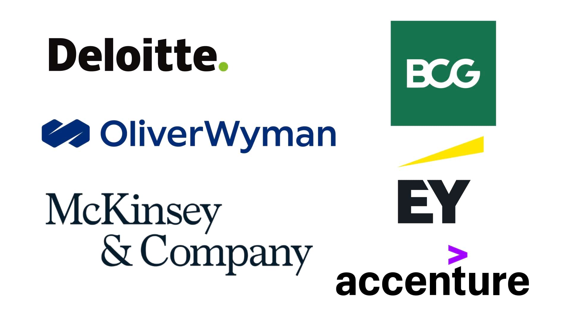
Each of these logos represents the gold standard of consultancy branding in New York, tailored to convey professionalism and competence.
Visual Analysis: Deloitte’s logo features a simple sans-serif wordmark with a distinctive green dot.
Core Message: The clean, minimalist style signals expertise and stability, while the green dot represents innovation—a nod to Deloitte’s forward-thinking consulting services.
Client Perception: The subtlety of the design appeals to clients who value consistency and vision, reinforcing Deloitte as a trusted leader with a progressive outlook.
Visual Analysis: A serif typeface gives McKinsey’s logo a timeless look that is both authoritative and refined.
Core Message: This choice of typeface aligns with McKinsey’s long-standing reputation, suggesting stability and intellectual rigor.
Client Perception: Clients see McKinsey as a beacon of expertise and tradition, ideal for complex, high-stakes consultancy engagements where experience is paramount.
Visual Analysis: KPMG’s logo is a bold, geometric wordmark in blue, framed by rectangular shapes.
Core Message: Blue is often associated with trust, while the blocks symbolize structure and reliability.
Client Perception: The design feels dependable and steady, which appeals to clients in need of a consultancy that is both accessible and globally consistent.
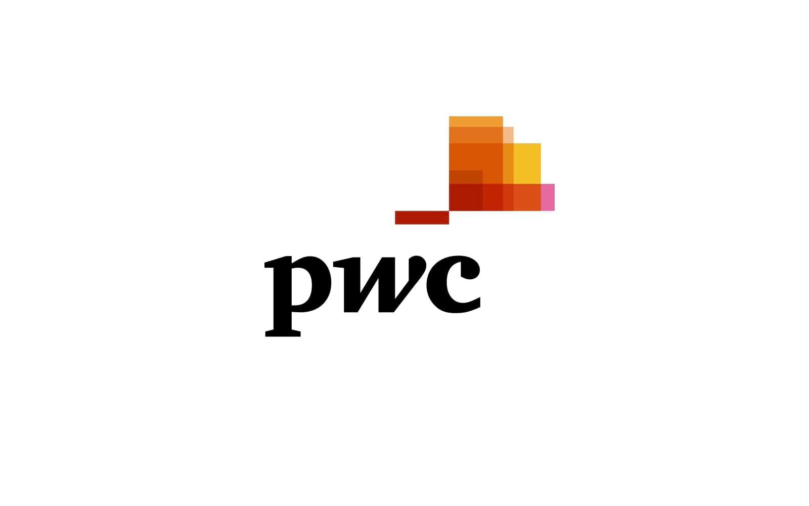
Visual Analysis: PwC’s lowercase wordmark with vibrant color blocks emphasizes approachability.
Core Message: The lowercase typography feels modern and open, while the colorful blocks represent adaptability and creativity within a framework.
Client Perception: This visual identity resonates with clients looking for a consultancy that balances professionalism with innovation, making PwC both approachable and creative.
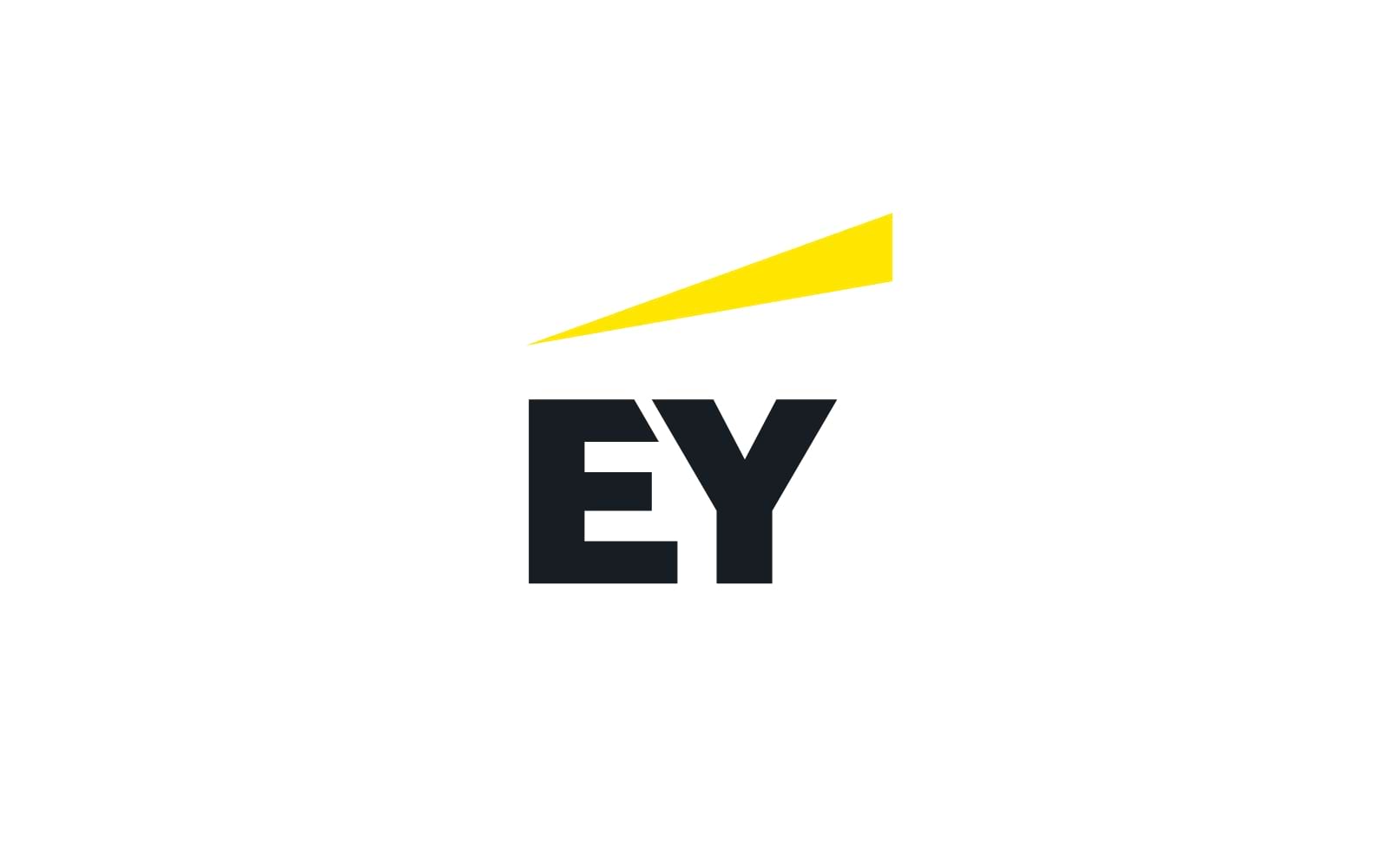
Visual Analysis: A clean wordmark in yellow and grey, with yellow symbolizing energy.
Core Message: The logo’s warm colors and bold design reflect EY’s energetic approach to problem-solving.
Client Perception: Clients perceive EY as optimistic and growth-oriented, particularly in areas where forward-thinking is essential.
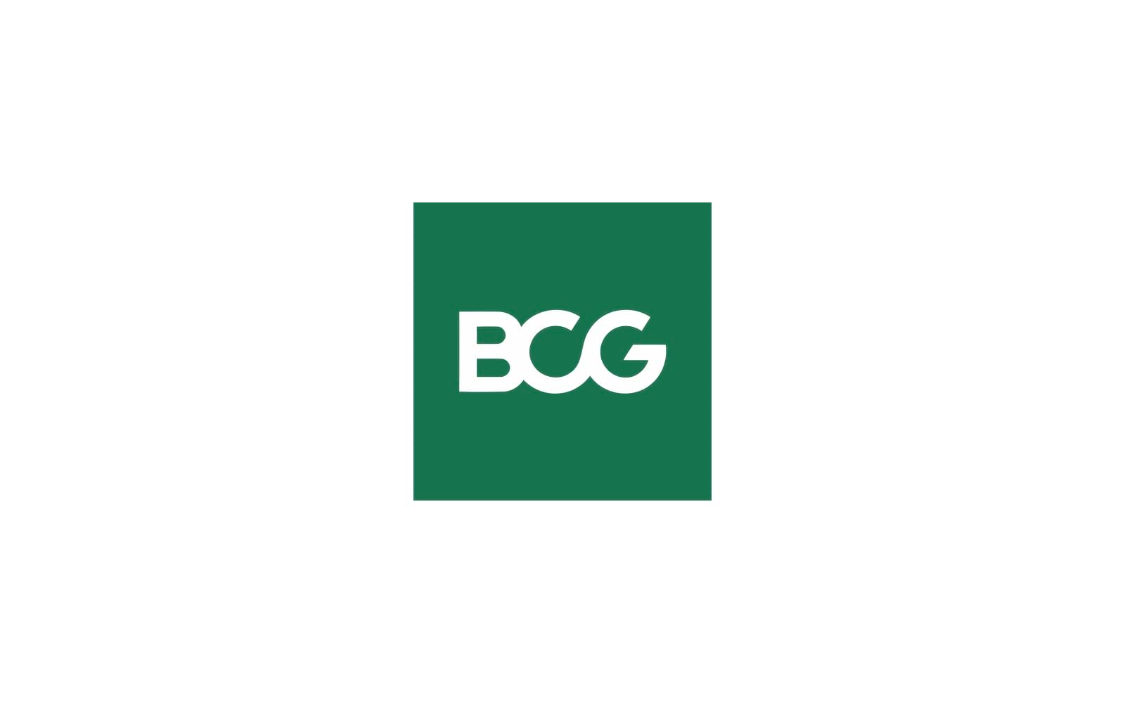
Visual Analysis: BCG’s green serif typeface gives it a classic yet contemporary look.
Core Message: Green is often tied to growth and sustainability, while the serif font conveys experience.
Client Perception: Clients see BCG as sophisticated and forward-looking, with a commitment to responsible growth.
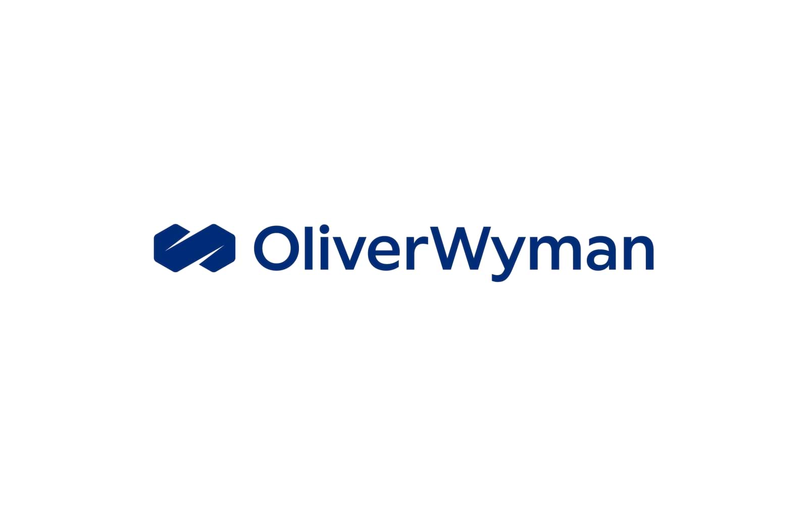
Visual Analysis: A modern wordmark with a blue geometric icon.
Core Message: The blue color connotes trust, while the geometric icon adds depth and sophistication.
Client Perception: Clients see Oliver Wyman as approachable yet insightful, appealing to those who value strategic clarity and structured problem-solving.
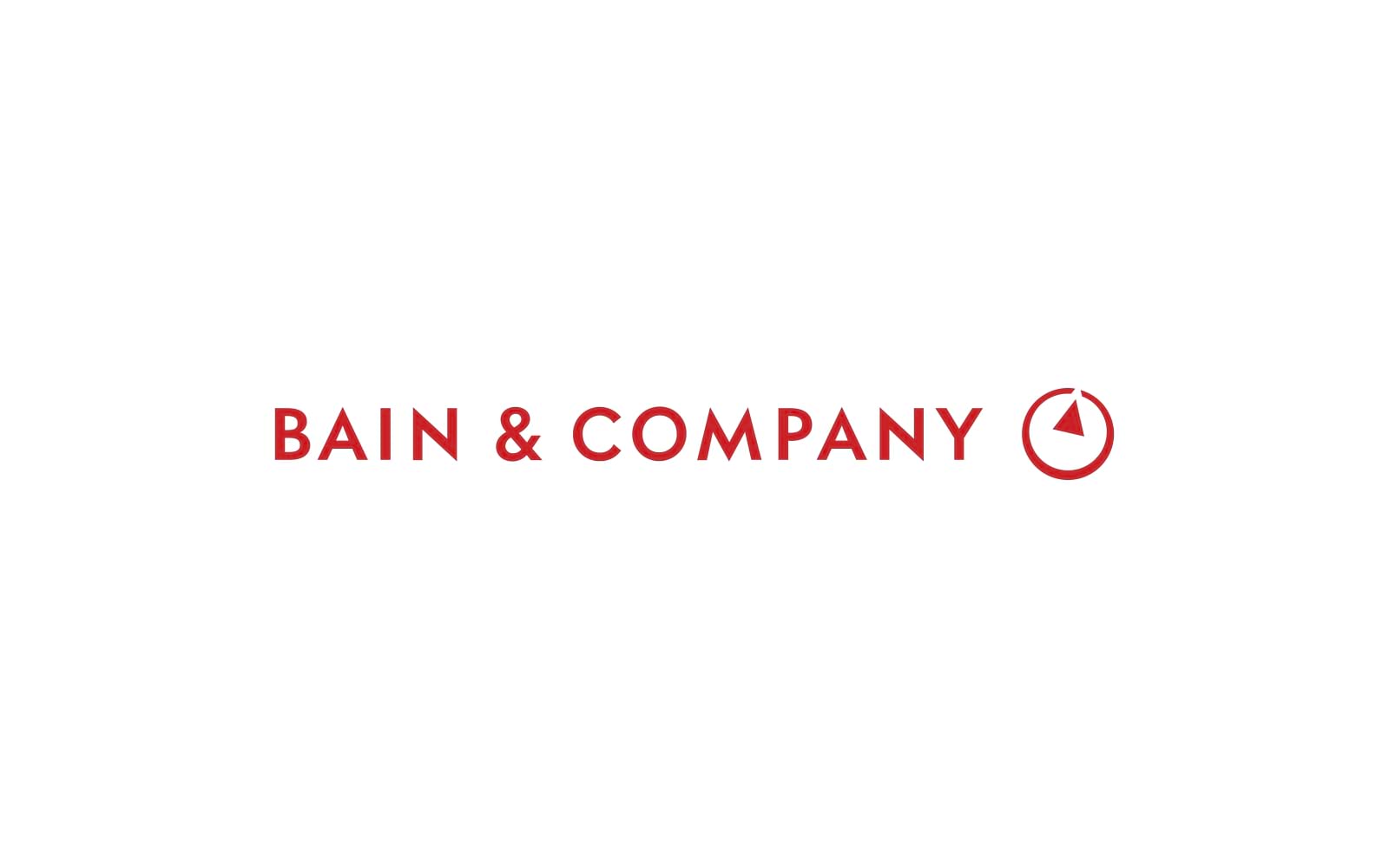
Visual Analysis: The red circular icon paired with a simple wordmark represents boldness.
Core Message: The circular shape signifies completeness, while the red color evokes passion and energy.
Client Perception: Clients see Bain as a driven consultancy that delivers a comprehensive service, ideal for those seeking energetic, high-impact partners.
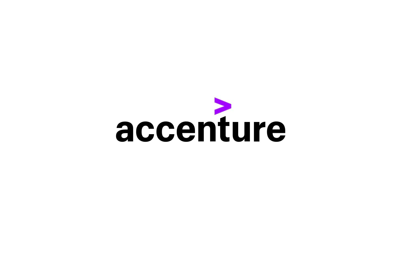
Core Message: The symbol suggests forward motion, emphasizing Accenture’s technology-driven solutions.
Client Perception: This brand identity resonates with clients who value digital transformation and innovative thinking.
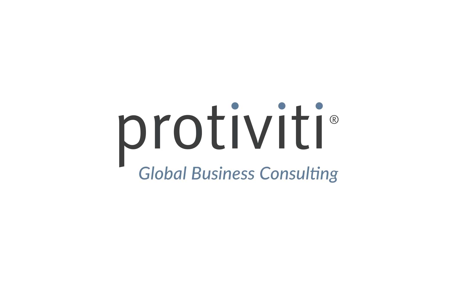
Visual Analysis: Protiviti’s earthy color palette and clean wordmark project accessibility.
Core Message: The warmth of the color palette and simplicity of the logo create a sense of inclusiveness and openness.
Client Perception: Clients perceive Protiviti as thorough and trustworthy, appealing to those who prioritize transparency and collaboration.
Strong consultancy logos are often imbued with brand storytelling that goes beyond visual design. Each logo tells a story—whether it’s Deloitte’s progressive dot or McKinsey’s traditional serif font. Logos must convey the consultancy’s unique narrative in a single glance, aligning with the emotional and logical appeal that storytelling brings to a brand.
Applying Storytelling with Alitestar: At Alitestar, we delve into each client’s narrative, extracting themes that connect with their audience. This is more than design; it’s about capturing essence in a way that resonates immediately. For instance, a consultancy focused on innovative tech might benefit from a streamlined, futuristic logo, while one grounded in finance could employ subtle yet authoritative elements.
The essentials of consultancy logos are grounded in three primary elements:
Color: Blues, greys, and greens are common, signaling trust and dependability. Studies reveal that blue, often associated with calm and competence, reduces anxiety, making it ideal for fields that require high client confidence .
*Serif fonts convey tradition; sans-serifs indicate clarity and accessibility. The choice depends on whether a brand wants to appear classic or contemporary.
Shapes and Space: Clean lines and ample whitespace are key in conveying clarity. Shapes that are geometric suggest stability, while softer lines indicate approachability.
Alitestar leverages these principles to tailor logos to the consultancy sector’s unique expectations, balancing authority with approachability.
A logo serves as the cornerstone of a brand’s identity, but the full identity encapsulates color schemes, typography, imagery, and tone of voice. Studies show that brands with strong, consistent identities perform better in client retention because they build familiarity and reinforce values through consistent visual cues .
Building ith Alitestar: Our approach at Alitestar is to construct comprehensive brand identities, not just logos. This includes detailed brand guidelines to ensure a unified message across all platforms. For consultancy clients, this unity fosters trust, professionalism, and a polished image that speaks volumes about capability.
At Alitestar, we approach each brand with a tailored strategy to design logos that resonate with your target audience. Here’s a quick look at how we would handle a consultancy brand identity:
Discovery Phase: Through detailed workshops, we dig deep to understand your brand’s purpose, values, and competitive landscape.
Brand Strategy: We outline the strategic goals that the logo and brand identity will fulfill—whether that’s conveying innovation, trust, or authority.
Logo Concept Development: Using insights from our research, we create design concepts that align with your brand’s voice and vision.
Iterative Design Process: We refine and test each logo concept, ensuring that it captures your brand’s essence and appeals to your target clients.
Brand Guidelines: Finally, we create a set of comprehensive guidelines, ensuring that your logo is applied consistently across all channels, from digital to print.
New York’s consultancy market demands that your brand identity conveys trust, authority, and a unique value proposition. The logos above showcase how leading firms establish their reputation through thoughtful, strategic design, appealing to clients’ needs for reliability, expertise, and innovation.
At Alitestar, we specialize in crafting brand identities that help consultancies not only stand out but build lasting client relationships. If your consultancy is ready to invest in a premium logo and brand strategy that attracts high-value clients, reach out to us to explore how we can create a brand identity that tells your story and drives results.


Shaikh Asif is an Award-winning designer, director, strategist, and educator. He’s the Lead Strategic Brand Designer and Art Director of The Alitestar— a strategic branding and design agency that helps startups, ambitious CEOs, and passionate entrepreneurs to achieve success and ultimately create unforgettable brand experiences.