Design
Top New York Real Estate Brand Logos: Design Insights & Strategies
11.02.2025
By Shaikh Asif
Design
11.02.2025
By Shaikh Asif


In a city like New York, where skyscrapers tower and competition is fierce, every brand jostles for space—not just on billboards but in the minds of clients. Real estate in this environment isn’t just about property transactions; it’s about trust, legacy, and prestige. And at the heart of each of these qualities is a carefully crafted brand. The logos of leading real estate brands here aren’t mere symbols—they’re the first handshake, the first promise of value, and the most visible layer of a brand’s identity.
Understanding why certain logos resonate more than others in New York’s high-stakes market requires us to look at the art and science behind their design. This article isn’t just a showcase of top logos; it’s a breakdown of what makes them work and the lessons creative professionals, entrepreneurs, and business leaders can draw to elevate their own brand identities.
Whether you’re a startup carving out your niche or an established enterprise looking to refresh your image, a strong, thoughtfully crafted logo is the foundation of building that trust. At Alitestar, we specialize in taking brands from good to remarkable—through logo design, brand identity, strategy, storytelling, and beyond.
Before diving into the top logos, it’s essential to understand the criteria that elevate a logo from visually pleasing to strategically powerful. Here’s the lens we’ll use to evaluate each brand in New York’s real estate sector:
Clarity and Simplicity: A strong logo is clear and immediately recognizable. It cuts through the clutter and communicates a brand’s core message at a glance. In New York’s fast-paced market, simplicity becomes synonymous with clarity, a quality that Alitestar emphasizes in all our design work.
Uniqueness and Differentiation: A logo should differentiate the brand from its competitors. This goes beyond visuals; it’s about capturing the brand’s unique personality. Our team at Alitestar dives deep into brand discovery sessions to identify these unique traits and translate them into distinctive designs.
Color Psychology: Colors have a powerful subconscious effect, influencing how potential clients perceive a brand. For instance, blue tones often represent trustworthiness—a key trait for real estate brands—while green can convey growth and stability. Alitestar integrates color psychology in each project, ensuring colors align with the emotional triggers a brand wants to evoke.
Typography and Readability: The choice of typeface conveys a lot about a brand’s character. Serif fonts may evoke a sense of heritage and trust, while sans-serif fonts feel modern and approachable. In real estate, where credibility is paramount, typography must strike the right balance.
Storytelling through Design: Each design element should tell part of the brand’s story, whether it’s a historical nod to New York’s architecture or an abstract representation of growth and stability. Storytelling is one of Alitestar’s core strengths, helping clients build brands that resonate deeply with their target audience.
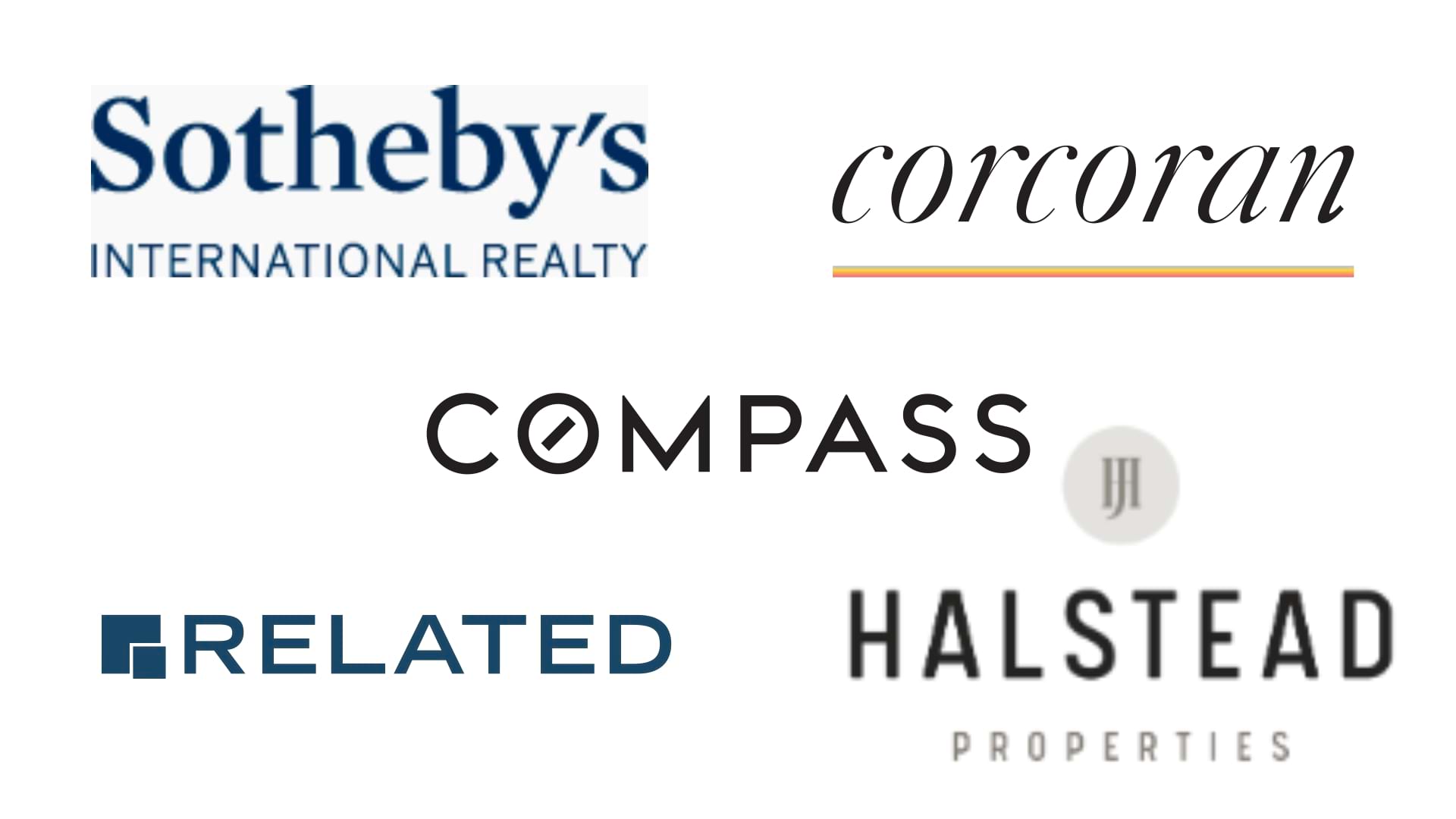
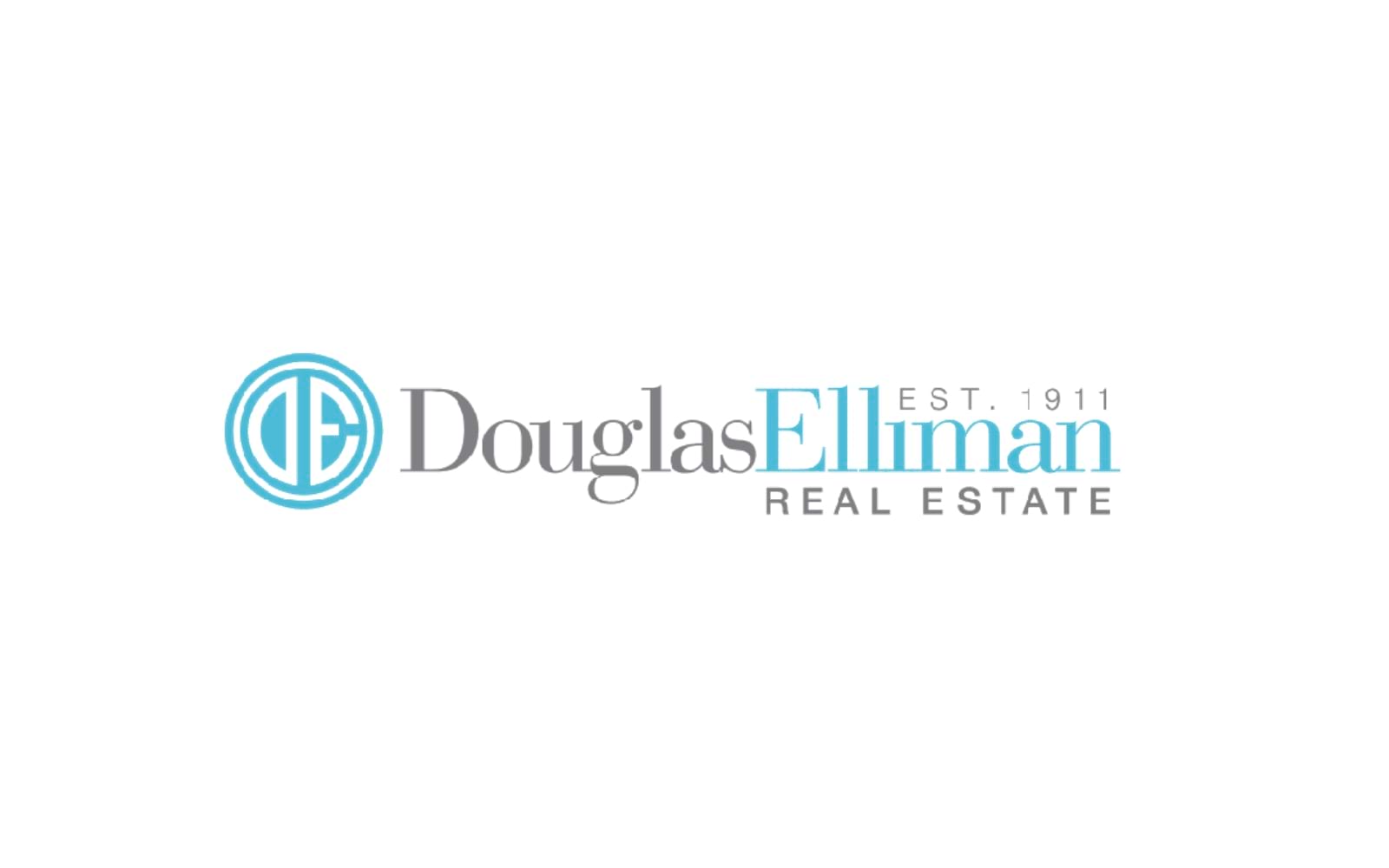
1. Logo Analysis: Douglas Elliman
Overview: Douglas Elliman, one of New York’s most recognizable real estate names, uses a logo that combines timelessness with a contemporary edge. The logo leans on classic typography, emphasizing trust and tradition while feeling accessible and modern.
Clarity and Simplicity: The logo design is remarkably straightforward—an elegant wordmark. This clarity is crucial in real estate, where direct communication is key. Alitestar’s approach to logo design follows a similar path, where simplicity is often the most sophisticated choice.
Typography and Readability: With a serif typeface, Douglas Elliman’s logo brings a sense of prestige, tradition, and reliability. Serif fonts convey a grounded feeling, fitting perfectly for a legacy brand. When Alitestar selects typography for brands, we focus on readability as well as the emotional undertone that different fonts convey to ensure they align with the brand’s positioning.
Color Psychology: The choice of black and white embodies sophistication. Douglas Elliman’s logo conveys timelessness and stability, qualities highly valued in real estate. This aligns with Alitestar’s strategy in using color not just as a design element but as a psychological trigger that reinforces brand values.
Storytelling through Design: The minimalist approach reflects Douglas Elliman’s roots and focus on high-quality service rather than embellishments. Alitestar also uses storytelling to let the brand's story shine through simplicity, ensuring the logo is impactful across digital and print platforms.
Takeaway for Creative Professionals: The Douglas Elliman logo is a masterclass in using minimalism and heritage to create a strong, reputable image. For startups and established brands alike, adopting a similar focus on simplicity and readability can position the brand as a credible, authoritative player.
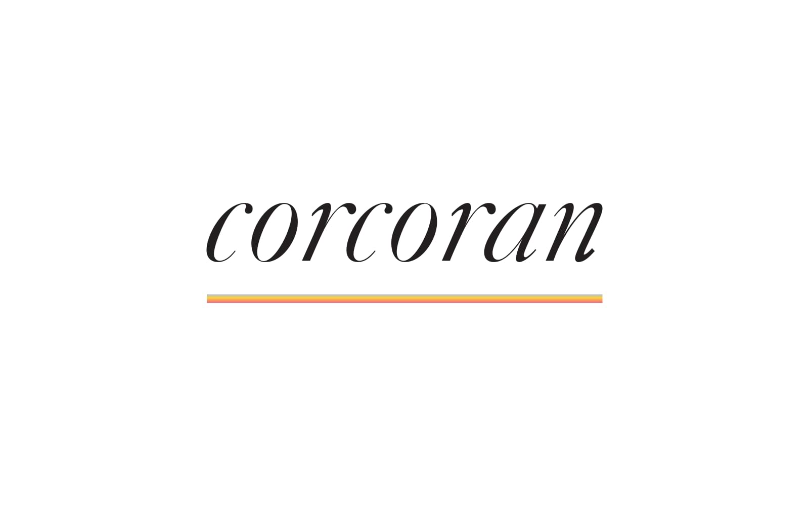
2. Logo Analysis: Corcoran Group
Overview: Corcoran Group’s logo stands out with a sleek, modern aesthetic, using a sans-serif font that conveys approachability and trustworthiness. It’s well-suited for their identity as a forward-thinking real estate group.
Clarity and Simplicity: The logo is direct and easy to recognize, making it memorable. Alitestar employs this principle across all our branding projects, ensuring each logo captures the essence of the brand without unnecessary complexity.
Typography and Readability: With a sans-serif font, Corcoran’s logo exudes modernity and simplicity. This reflects the brand’s personality as progressive and people-centric, an ideal for real estate. At Alitestar, we consider font choices with just as much care, particularly in industries like real estate, where trust is essential.
Color Psychology: The use of black brings sophistication and authority, while subtle variations in typography weight add personality. Alitestar applies color psychology to help our clients create lasting impressions that resonate emotionally with their audience.
Storytelling through Design: Corcoran’s logo tells the story of an innovative brand willing to break away from traditional real estate aesthetics, making them appear accessible and modern. Alitestar’s brand storytelling approach is similar, ensuring that each logo visually communicates a brand’s unique story and values.
Takeaway for Creative Professionals: Corcoran’s approach demonstrates how modern, minimalistic typography can build approachability while maintaining professionalism. For brands wanting to appear both friendly and credible, using a simple, sans-serif font is an effective route.
3. Logo Analysis: Brown Harris Stevens
Overview: Brown Harris Stevens’ logo strikes a balance between tradition and modernity, with a design that feels both exclusive and welcoming. They use a serif font that emphasizes luxury and sophistication, which has historically been associated with their brand.
Clarity and Simplicity: Brown Harris Stevens opts for a clean, straightforward logo. This simplicity makes it versatile and easy to recognize, a principle Alitestar advocates for all our logo design projects.
Typography and Readability: Their choice of a refined serif font exudes elegance and authority, appealing to clients who value heritage and experience. At Alitestar, we prioritize fonts that align with the personality a brand wants to communicate, whether that’s heritage or innovation.
Color Psychology: The brand uses a muted color scheme, enhancing its aura of exclusivity and timelessness. Alitestar helps clients navigate color choices that go beyond aesthetics, understanding that color is a crucial part of the brand’s overall message.
Storytelling through Design: The logo feels both elite and approachable, resonating with clients looking for exclusivity with a human touch. Alitestar’s design philosophy aligns with this, aiming for a balance between exclusivity and accessibility, especially for brands looking to appeal to high-end markets.
Takeaway for Creative Professionals: The Brown Harris Stevens logo is an example of using traditional design elements to build an image of exclusivity. Brands looking to appeal to premium markets can benefit from a similar approach, pairing a heritage font with a simple, elegant color palette.
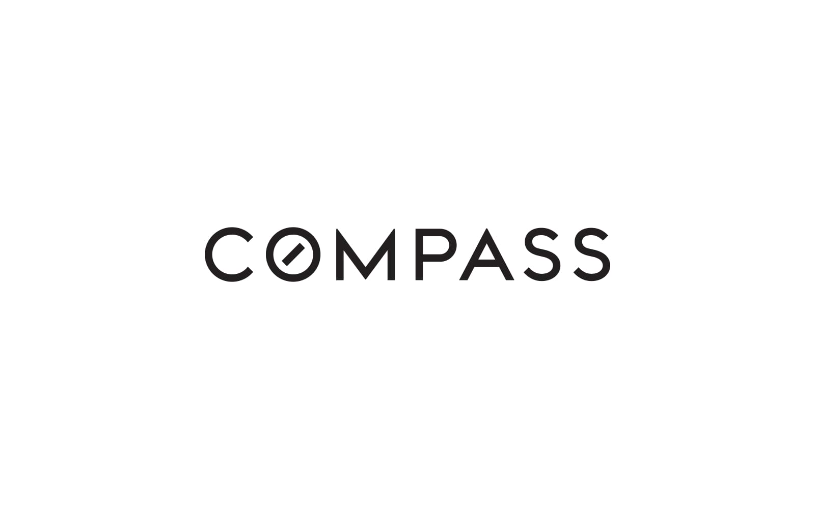
4. Logo Analysis: Compass
Overview: Compass, known for its innovative approach to real estate, has a logo that captures both simplicity and modernity, emphasizing its forward-thinking ethos. This logo employs a minimalist wordmark with a geometric touch, symbolizing precision and guidance—qualities essential in real estate.
Clarity and Simplicity: The simplicity of the Compass logo helps convey focus and reliability. By utilizing straightforward, clean lines, it ensures instant recognition. Alitestar’s design philosophy similarly prioritizes clarity to create logos that communicate a brand’s essence directly and effectively.
Typography and Readability: Compass uses a custom, sans-serif typeface that feels approachable yet professional. The unique “O” with a compass needle subtly embedded emphasizes direction and purpose, aligning with the brand’s mission. At Alitestar, we consider custom typography for clients when it aligns closely with their brand message, using subtle design elements that enhance readability and uniqueness.
Color Psychology: The monochromatic scheme reinforces the brand’s modernity and adaptability across digital and print media. Alitestar advocates for color schemes that support a brand’s image while ensuring versatility across platforms, especially for companies targeting digital-savvy audiences.
Storytelling through Design: The Compass logo conveys a narrative of clarity, innovation, and support—qualities essential for a tech-forward real estate brand. Our storytelling approach at Alitestar ensures each design communicates key aspects of the brand’s values and purpose, making it memorable.
Takeaway for Creative Professionals: Compass demonstrates the effectiveness of subtle customizations within a minimalist design to communicate a brand's core values. For brands aiming for an image of modernity and innovation, unique yet understated elements can elevate a logo’s effectiveness.
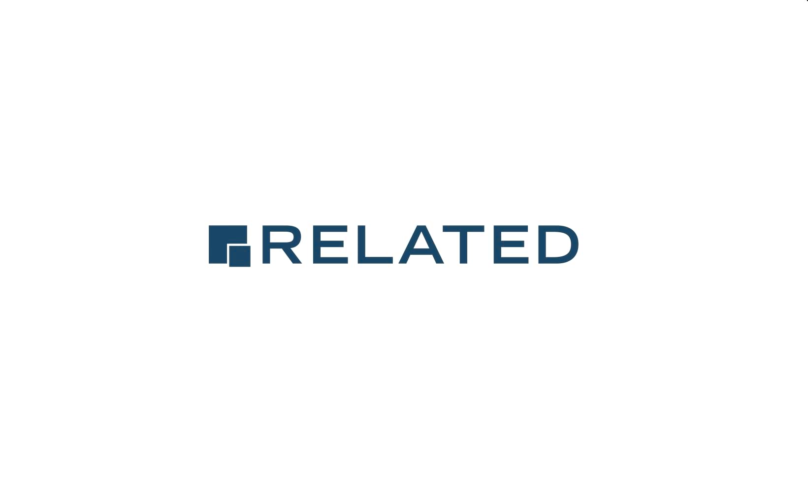
5. Logo Analysis: Related Companies
Overview: Related Companies’ logo exudes sophistication with a design that reflects its status as a high-end real estate development firm. The logo is simple yet refined, with a focus on clean lines and a restrained aesthetic.
Clarity and Simplicity: The logo’s simplicity is its strength, reflecting a brand focused on long-term value rather than transient trends. Alitestar prioritizes clean, timeless designs that ensure logos remain relevant and easily recognizable over time.
Typography and Readability: Related Companies employs a modern serif font, which adds a sense of formality and exclusivity to the logo. Serif fonts communicate tradition and dependability, important for brands in real estate development. At Alitestar, font selection is essential in establishing brand personality and setting the tone for client relationships.
Color Psychology: The neutral color palette used by Related Companies reflects sophistication and stability, reinforcing their premium positioning. Alitestar advises brands on the significance of color choice in influencing audience perception, especially in industries where trust and quality are key.
Storytelling through Design: The Related Companies logo embodies simplicity and longevity, highlighting their commitment to quality and sustainability. Alitestar’s approach to brand storytelling ensures each design is an honest representation of the brand’s core values, aiming for resonance with target audiences.
Takeaway for Creative Professionals: The Related Companies logo shows that a minimalist design paired with a carefully selected serif font can communicate exclusivity and quality. For brands targeting a luxury or high-end market, less is often more.
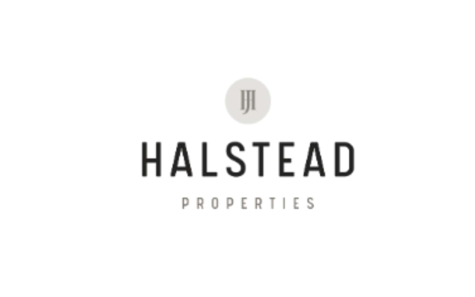
Overview: Halstead’s logo combines modern and traditional elements, representing their commitment to community and progress within the real estate market. The design is fresh, utilizing a dynamic typeface that reflects the brand’s approachable and trustworthy image.
Clarity and Simplicity: The straightforward design ensures the logo is clear and memorable. For brands looking to balance community focus with professionalism, as Halstead does, simplicity can play a critical role in design, a principle Alitestar upholds.
Typography and Readability: The logo uses a bold sans-serif font with softened edges, striking a balance between friendliness and authority. This approach resonates with audiences looking for reliability combined with a human touch. Alitestar selects typography that aligns with a brand’s character, ensuring it communicates the right balance of approachability and professionalism.
Color Psychology: Halstead’s choice of green as the primary color symbolizes growth, renewal, and community—a perfect fit for their brand. Alitestar helps clients harness the psychological impact of color, especially for real estate brands, where color can evoke feelings of trust and connection.
Storytelling through Design: The Halstead logo’s color and font choices tell a story of trust and inclusivity, embodying the brand’s values of community-oriented service. Alitestar’s storytelling approach ensures each design detail resonates with the brand’s mission and audience expectations.
Takeaway for Creative Professionals: Halstead demonstrates how a brand can appear friendly yet credible by using thoughtful color choices and rounded typefaces. Brands aiming to project accessibility without losing professionalism can benefit from this design approach.
Overview: Warburg Realty’s logo reflects its approachability and commitment to New York City’s diverse real estate market. The logo is clean, understated, and approachable, appealing to a broad audience while maintaining a professional aesthetic.
Clarity and Simplicity: The simplicity of the Warburg Realty logo makes it adaptable to various media, a key consideration for urban real estate brands that need a logo to perform well across both digital and print formats. At Alitestar, we advocate for clean designs that ensure versatility across platforms.
Typography and Readability: Warburg’s logo uses a modern sans-serif font with a slight italic angle, which adds dynamism and suggests forward movement. This design choice resonates with a progressive audience and conveys flexibility, a quality we consider at Alitestar when designing for brands focused on growth and agility.
Color Psychology: The dark blue used in Warburg’s logo communicates trust and dependability, essential traits in real estate. Blue also appeals to a wide demographic, making it an ideal choice for a versatile brand like Warburg. At Alitestar, color psychology is foundational in creating logos that connect with target audiences on a subconscious level.
Storytelling through Design: Warburg’s logo tells a story of modernity and reliability, capturing its commitment to a diverse client base in NYC. Alitestar’s approach to storytelling ensures logos encapsulate the spirit and values of the brand, fostering trust and relatability.
Takeaway for Creative Professionals: Warburg Realty’s logo showcases the impact of a straightforward design paired with a timeless color palette. Brands aiming to project inclusivity and modernity can adopt this approach to resonate with a broad audience while retaining a professional look.
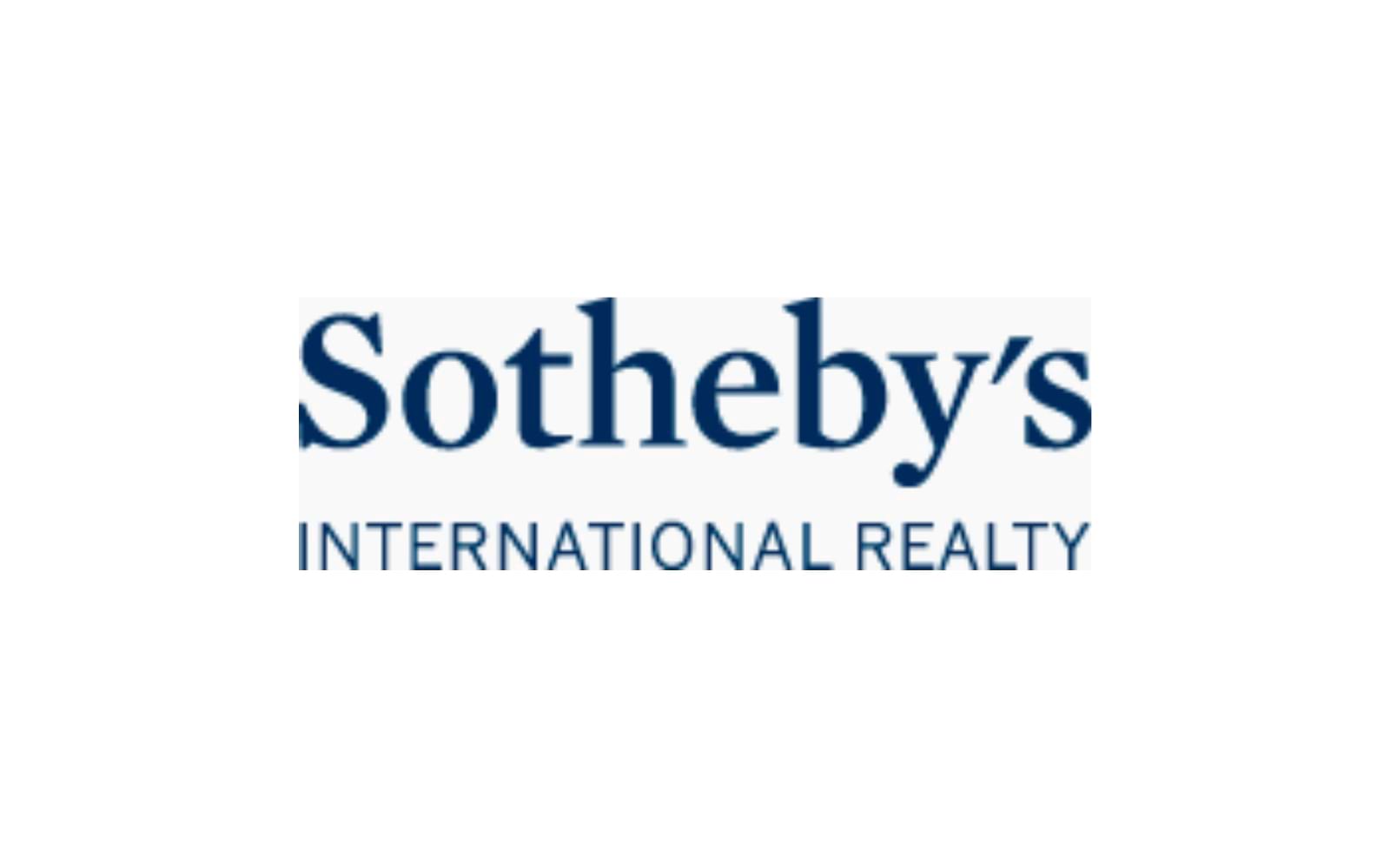
8. Logo Analysis: Sotheby’s International Realty
Overview: Sotheby’s International Realty logo reflects its status as a global luxury brand, rooted in exclusivity and sophistication. The logo is a wordmark that capitalizes on its connection to the prestigious Sotheby’s auction house, appealing to affluent clients.
Clarity and Simplicity: The clean, elegant design maintains clarity across all applications, emphasizing Sotheby’s commitment to high-end service. At Alitestar, we focus on creating logos that are as clear as they are elegant, ensuring they remain impactful across diverse mediums.
Typography and Readability: Sotheby’s uses a sophisticated serif typeface, which aligns with its luxury image. This font choice reflects a sense of heritage and exclusivity, qualities that resonate with high-end clientele. Our process at Alitestar includes carefully selecting fonts that communicate both brand legacy and market relevance.
Color Psychology: The deep navy blue in the logo evokes trust, security, and stability, aligning with the values of a luxury real estate brand. Sotheby’s logo demonstrates how color can anchor a brand’s identity; at Alitestar, we prioritize color selection that reinforces the brand's essence and appeals to its audience.
Storytelling through Design: Sotheby’s logo communicates exclusivity, sophistication, and reliability, creating an aspirational brand image. Alitestar’s approach ensures that each design detail works cohesively to tell the brand’s story, emphasizing values important to the target demographic.
Takeaway for Creative Professionals: Sotheby’s demonstrates the effectiveness of aligning a logo’s color and typography with a luxury brand’s heritage and client expectations. Brands seeking to position themselves as exclusive and high-end can benefit from a similarly restrained yet authoritative logo.
In the vibrant and competitive landscape of New York’s real estate market, a well-crafted logo is not merely a design element; it’s a powerful symbol of trust, identity, and strategic positioning. Each of the logos discussed—from Compass to Douglas Elliman—illustrates how thoughtful design can encapsulate a brand's values and resonate with its target audience.
Through effective use of typography, color psychology, and simplicity, these brands not only distinguish themselves in a crowded marketplace but also create lasting impressions on potential clients. As creative professionals, entrepreneurs, and business leaders, understanding the nuances of these successful logos can serve as a guide for your own branding efforts.
At Alitestar, we believe that a logo should tell a story, encapsulate your brand’s ethos, and resonate deeply with your audience. Our services—including premium logo design, brand strategy, brand identity development, and brand storytelling—are crafted to help businesses like yours achieve these goals. Whether you’re a startup looking to make your mark or an established firm seeking a fresh identity, we’re here to help you navigate the complexities of branding with confidence and clarity.
In the world of real estate, your logo is your first handshake with potential clients; let’s ensure it’s one that leaves a lasting impression. Partner with Alitestar to elevate your brand and stand out in New York’s dynamic real estate market.


Shaikh Asif is an Award-winning designer, director, strategist, and educator. He’s the Lead Strategic Brand Designer and Art Director of The Alitestar— a strategic branding and design agency that helps startups, ambitious CEOs, and passionate entrepreneurs to achieve success and ultimately create unforgettable brand experiences.