Design
Top New York Healthcare Brand Logos: In-Depth Analysis & Branding Insights by Alitestar
26.10.2024
By Shaikh Asif
Design
26.10.2024
By Shaikh Asif


Imagine walking through New York City, surrounded by healthcare giants and new-age startups, each striving to earn the trust of millions. In the heart of this bustling ecosystem, a healthcare brand isn’t just another name—it’s a lifeline. In a city where health, wellness, and innovation converge, a brand’s logo does more than catch the eye. It stands as a seal of trust, a beacon for credibility, and a point of reassurance for patients and partners alike.
At Alitestar, we specialize in creating healthcare brand logos that go beyond mere aesthetics. Our approach combines research-backed strategy, storytelling, and design expertise to deliver logos that not only look great but resonate with audiences on a deeper level. Today, we’ll explore some of the most effective healthcare logos in NYC and break down what makes each one remarkable.
The healthcare industry in New York is unique—its audience is diverse, knowledgeable, and selective. Building a healthcare brand here requires more than a visually appealing design; it demands an understanding of psychology, trust, and reliability. New Yorkers expect the brands they choose to live up to high standards, and this means a logo must convey expertise, care, and innovation in a split second.
For example, research by the American Marketing Association reveals that 60% of consumers form an opinion of a brand within the first three seconds of seeing its logo. This statistic highlights the power a well-crafted healthcare logo has in instilling confidence—especially in a fast-paced, trust-driven sector like healthcare.
Not all logos are created equal, and in healthcare, logo design follows specific principles to create maximum impact. Here’s a look at the criteria that set apart the top New York healthcare logos:
Simplicity and Clarity: Complex designs can overwhelm and confuse audiences. Top logos achieve simplicity that’s clean and professional, making the brand instantly recognizable.
Color Psychology: Colors like blue, green, and white are common in healthcare branding, symbolizing trust, wellness, and cleanliness. However, many NYC brands add subtle variations that make them memorable.
Memorability: In a city like New York, where countless brands vie for attention, a memorable logo is one that imprints itself on the viewer's mind through unique shapes, colors, or icons.
Scalability: Whether displayed on a building or a business card, the logo must retain its impact, clarity, and meaning at any size.
Each of these elements plays a critical role in creating logos that stand out in NYC's healthcare landscape. At Alitestar, we use these principles as the foundation for our design process, ensuring each logo is crafted to convey both immediate clarity and long-term memorability.
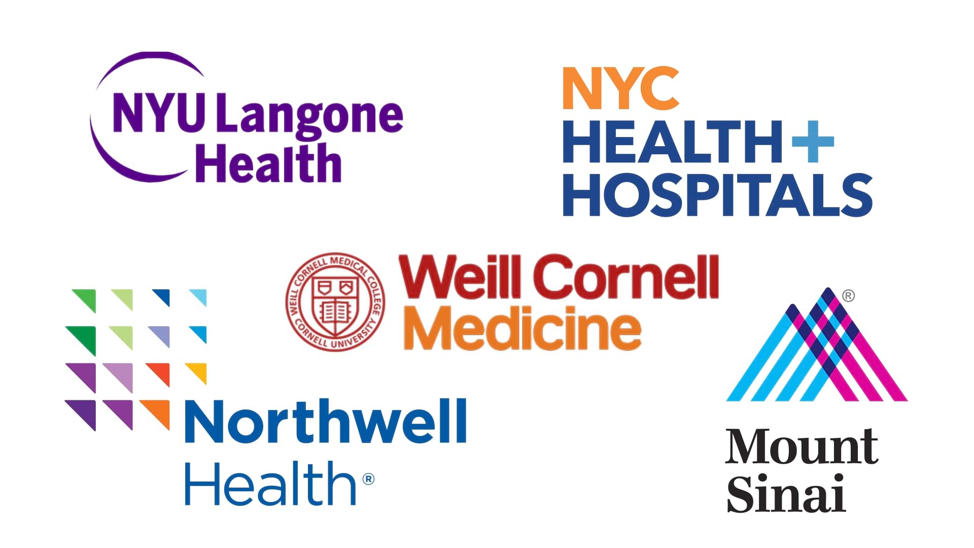
In this section, we’ll explore specific examples of NYC’s top healthcare logos, highlighting what makes each one effective. Let’s break down the design, strategy, and storytelling behind these logos to show why they resonate with their audience and how Alitestar takes a similar approach.
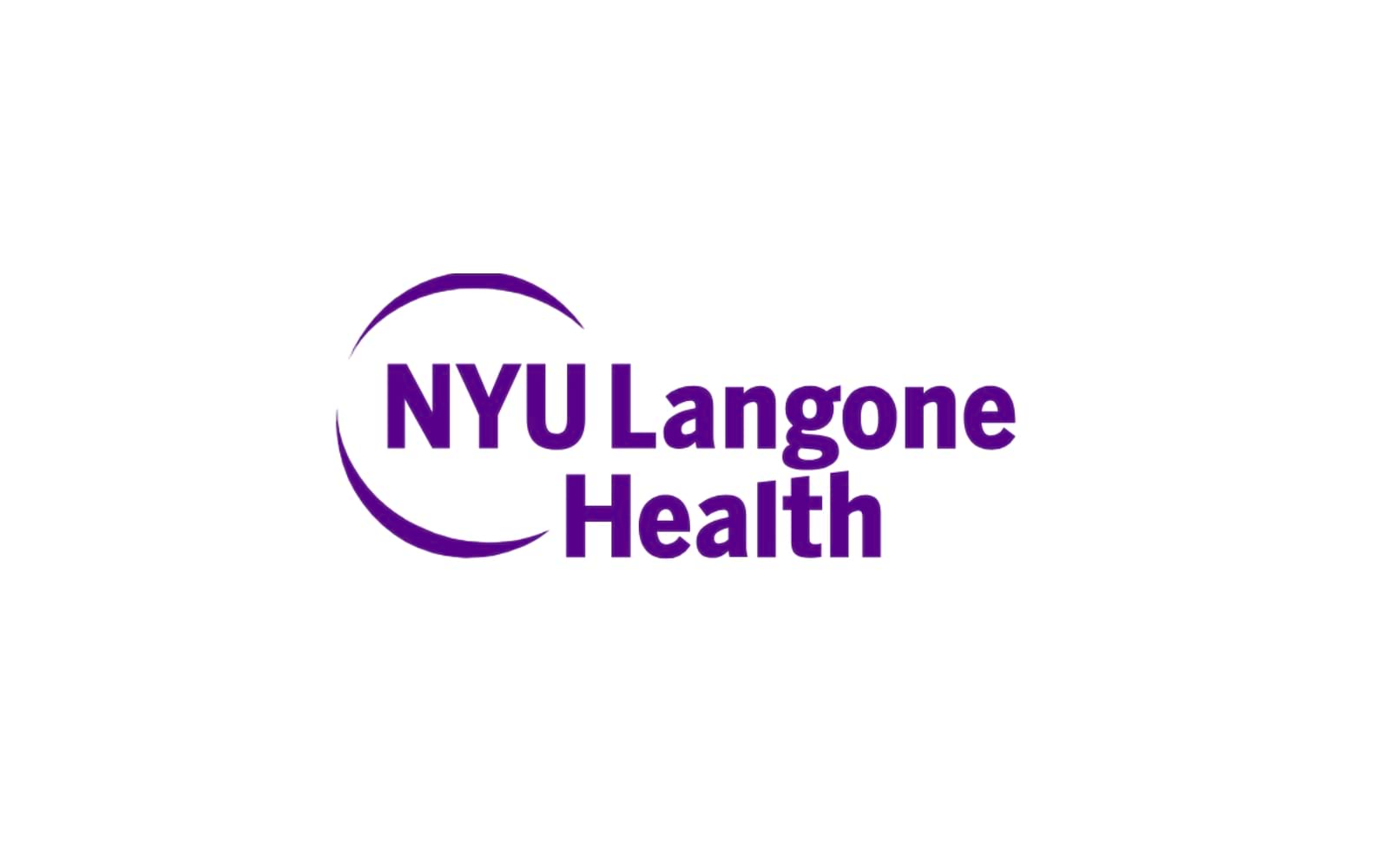
Example 1: NYU Langone Health
Overview: NYU Langone Health is one of New York’s leading healthcare systems, known for its patient-centered approach and cutting-edge research.
Logo Design Breakdown: Their logo combines a clean, modern sans-serif font with a circular emblem that evokes a sense of wholeness and continuity—ideal for healthcare.
Symbolism and Storytelling: The circular emblem suggests an ongoing journey of wellness, while the use of purple, often associated with wisdom and quality, adds a unique character.
Brand Strategy Insight: This logo is designed to communicate NYU Langone Health’s commitment to comprehensive care. At Alitestar, we focus on similar storytelling elements to ensure that each logo we design tells a brand’s story at a glance.
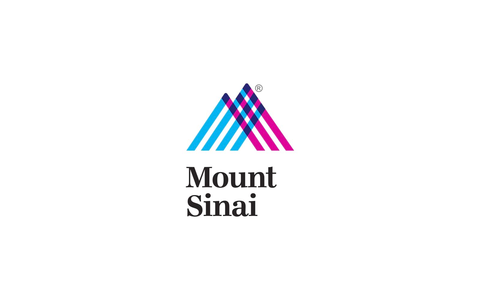
Example 2: Mount Sinai Health System
Overview: Mount Sinai Health System combines quality medical care with innovative research to serve a diverse population.
Logo Design Breakdown: This logo uses intersecting lines to form a symbol resembling both a mountain and a heartbeat, cleverly connecting the brand’s identity to both resilience and health.
Color Psychology and Symbolism: The logo’s mix of blue, pink, and purple adds a modern twist, breaking away from typical healthcare colors to give Mount Sinai a standout identity.
Alitestar’s Approach: Like Mount Sinai, we believe in integrating strategic symbolism in logos. By understanding a brand’s core values, we craft logos that visually convey those values with impact.
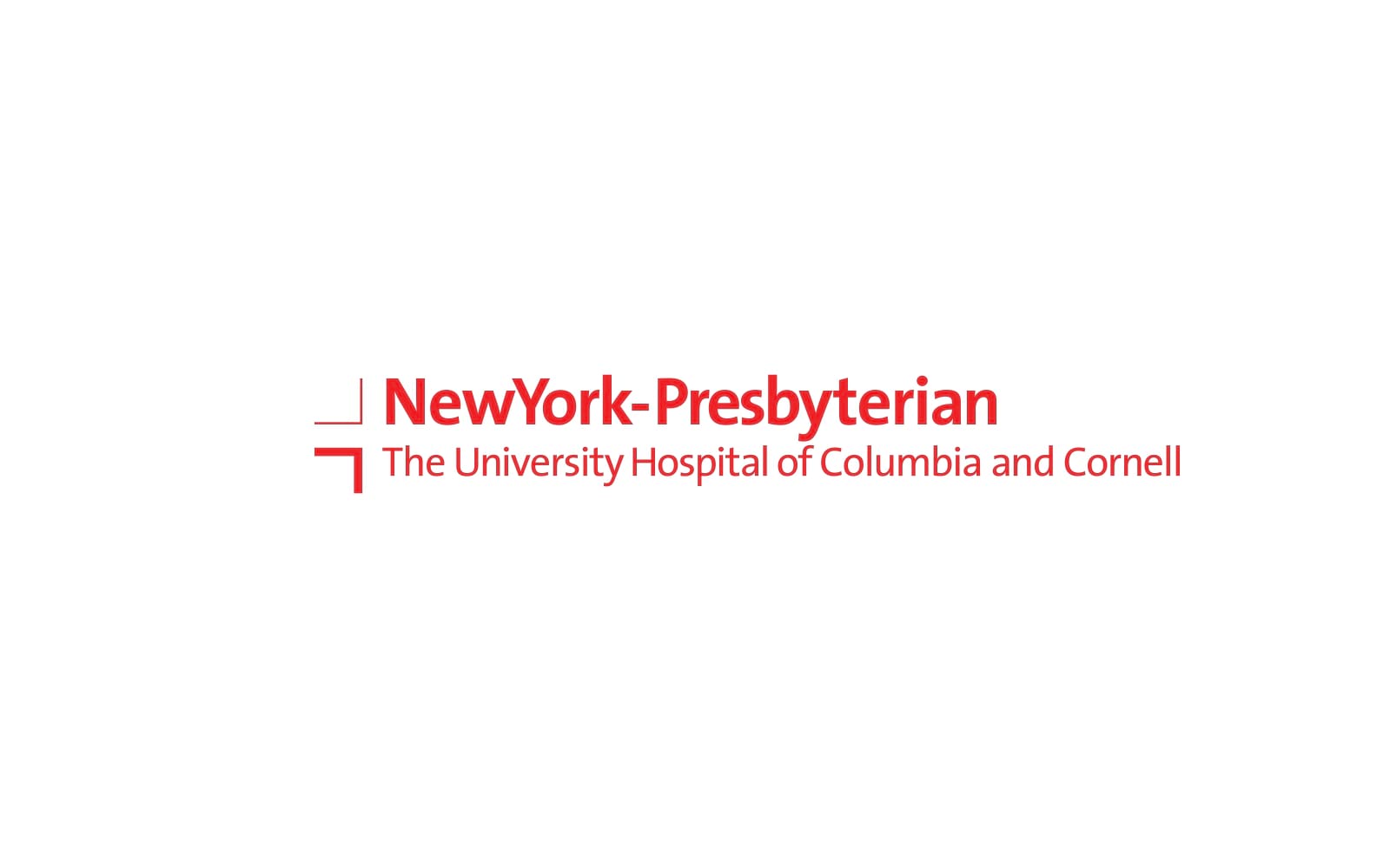
Example 3: NewYork-Presbyterian
Overview: NewYork-Presbyterian is among the most recognized healthcare institutions in NYC, known for high standards of patient care and medical excellence.
Logo Design Breakdown: This logo uses a simple, bold typeface in a solid red color—a deliberate choice that invokes urgency, energy, and action, which aligns with the healthcare field.
Symbolism and Storytelling: The choice of red is not only symbolic of healthcare but also emphasizes NewYork-Presbyterian's role as a first responder in health and emergency care, especially crucial in NYC's demanding environment.
Alitestar’s Take: At Alitestar, we use color psychology to its fullest by strategically selecting colors that resonate deeply with each brand’s audience. Red, when used carefully, communicates confidence and proactive care, especially suitable for brands like NewYork-Presbyterian that aim to project authority and responsiveness.
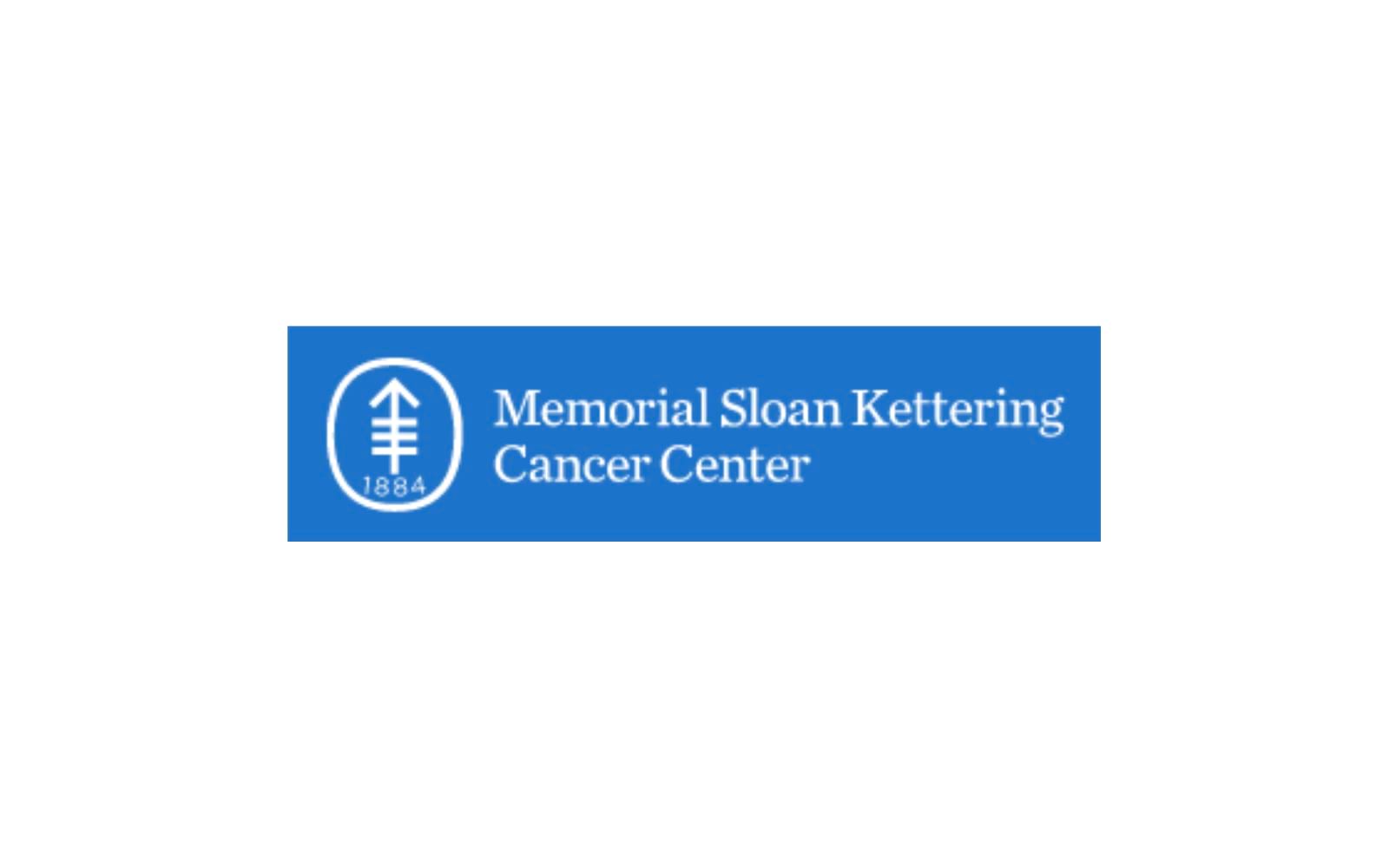
Example 4: Memorial Sloan Kettering Cancer Center
Overview: Memorial Sloan Kettering is globally recognized for its cancer treatment and research, with a longstanding reputation for compassion and hope.
Logo Design Breakdown: Their logo features a cross within a circle, a powerful symbol of health and wholeness, accompanied by an elegant serif font that underscores professionalism and tradition.
Symbolism and Storytelling: The cross conveys healing and care, while the circle around it adds a sense of protection, echoing the institution’s commitment to safeguarding health.
Brand Strategy Insight: In healthcare, especially for brands like Sloan Kettering, a logo must convey compassion and hope without compromising professionalism. Alitestar’s design philosophy mirrors this approach by creating logos that balance empathy with authority—essential for brands focused on sensitive care areas like cancer treatment.
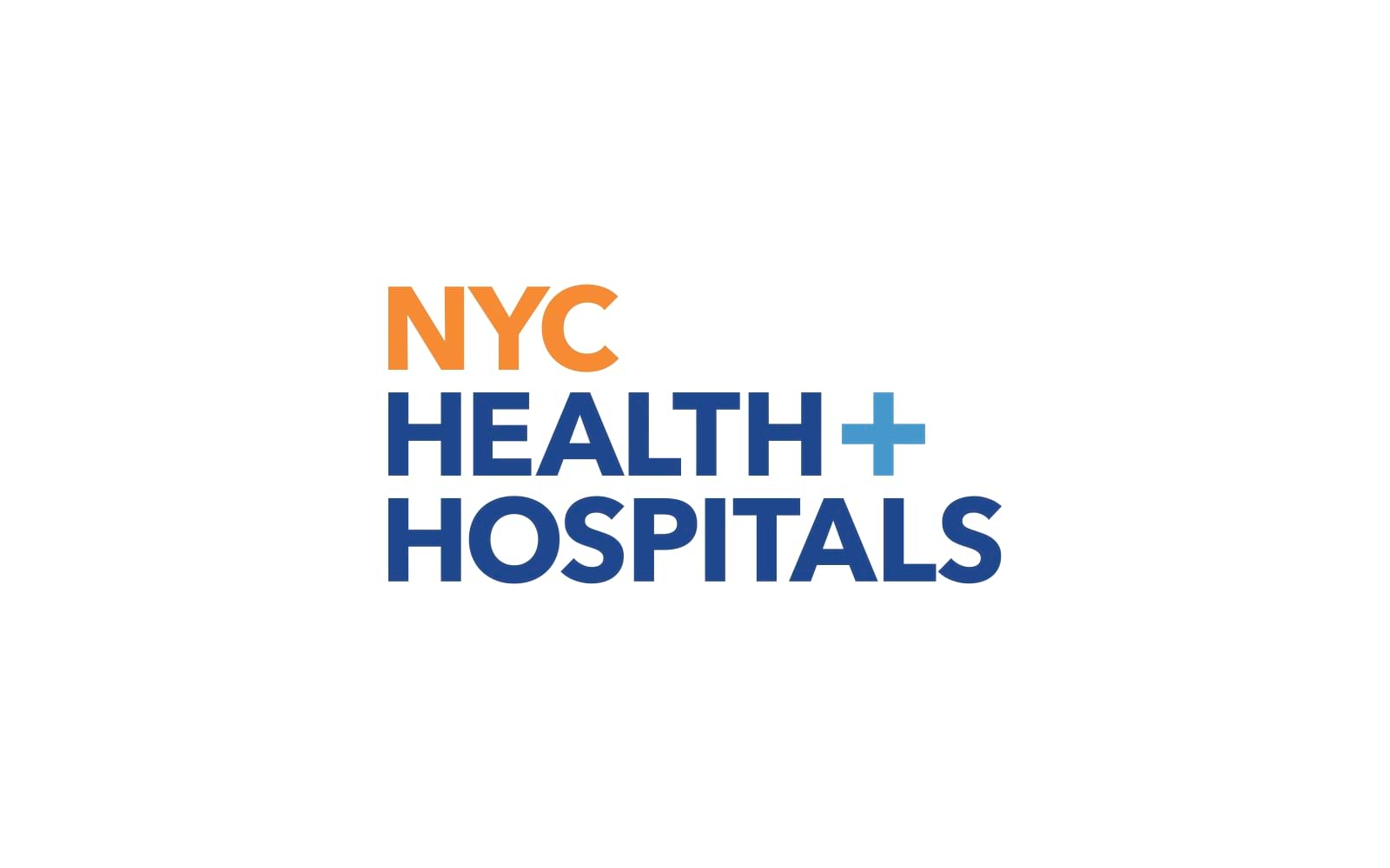
Example 5: NYC Health + Hospitals
Overview: NYC Health + Hospitals is the largest public healthcare system in the U.S., dedicated to providing quality healthcare access for all New Yorkers.
Logo Design Breakdown: This logo is straightforward, using a plus symbol and a clean, contemporary typeface that reflects inclusivity and accessibility.
Symbolism and Storytelling: The ‘+’ symbol isn’t just a healthcare reference—it also conveys addition, support, and inclusiveness, aligning with the organization’s mission of providing comprehensive care for all.
Alitestar’s Perspective: A well-thought-out logo for a public institution like NYC Health + Hospitals needs to communicate accessibility, trust, and inclusivity. Alitestar emphasizes these values in our designs, ensuring that the logo reflects the brand’s commitment to service and inclusivity through subtle but powerful elements like symbols and typography.
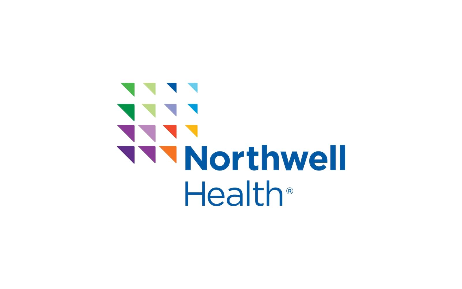
Example 6: Northwell Health
Overview: As one of the largest healthcare providers in New York, Northwell Health prides itself on innovation and patient-centric services.
Logo Design Breakdown: Northwell’s logo features a series of colored squares that progressively change in tone, suggesting growth, progression, and forward-thinking.
Symbolism and Storytelling: The gradient design in the logo represents the brand’s evolution and commitment to innovation, an essential value in a constantly advancing healthcare industry.
Brand Strategy Insight: For a healthcare provider that focuses on innovation, using a logo that represents movement and growth is essential. Alitestar also uses progressive design elements to emphasize evolution and adaptability, especially for brands rooted in innovation and advancement.
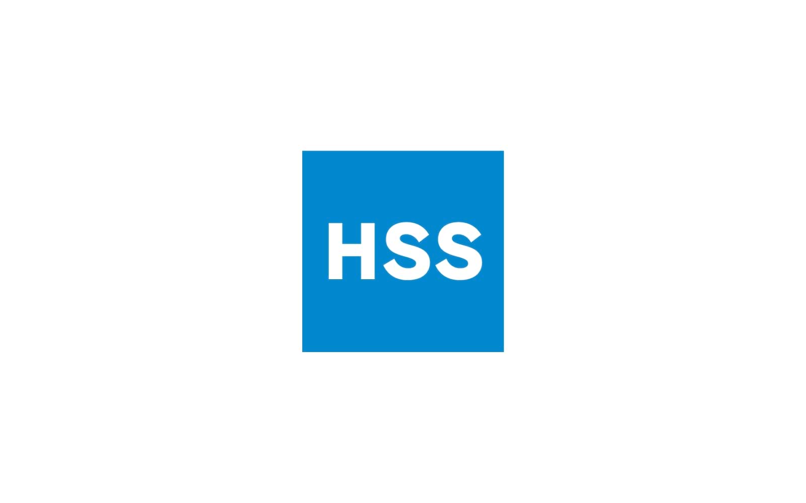
Example 7: Hospital for Special Surgery (HSS)
Overview: HSS specializes in orthopedic surgery and has a reputation for excellence in this field, both nationally and internationally.
Logo Design Breakdown: HSS’s logo is a simple blue square with white lettering, reflecting the brand’s precise, focused approach to healthcare.
Symbolism and Storytelling: The choice of blue is strategic here, as it symbolizes trust and reliability, essential in surgical and orthopedic care. The minimal design reflects the precision and expertise the brand is known for.
Alitestar’s Perspective: Logos for specialized fields like orthopedic surgery must project trust and focus. At Alitestar, we create logos that are minimalist but powerful, mirroring the expertise and focus required in specialized healthcare sectors.
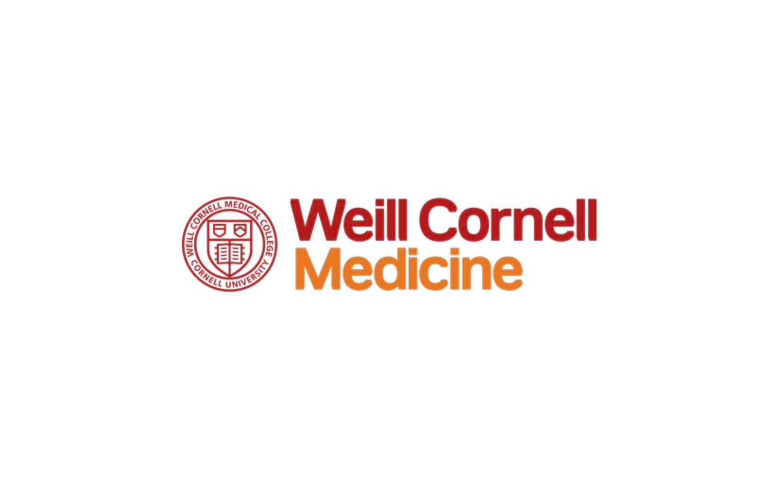
Example 8: Weill Cornell Medicine
Overview: Weill Cornell Medicine is affiliated with Cornell University and known for its commitment to high-quality medical education and research.
Logo Design Breakdown: The logo uses a traditional serif font paired with a red and white color scheme, lending a sense of academia and tradition to the brand.
Symbolism and Storytelling: The font choice underscores professionalism and history, while red, associated with the Cornell brand, ties the institution to its legacy of medical excellence.
Alitestar’s Take: For institutions with a strong academic affiliation, brand elements like typography and color become powerful tools to connect to heritage. Alitestar leverages these elements for educational and research-focused brands, ensuring logos feel both scholarly and trustworthy.


Shaikh Asif is an Award-winning designer, director, strategist, and educator. He’s the Lead Strategic Brand Designer and Art Director of The Alitestar— a strategic branding and design agency that helps startups, ambitious CEOs, and passionate entrepreneurs to achieve success and ultimately create unforgettable brand experiences.