Design
Mastering the Art of Sports Brand Logos A Startup’s Guide to Design Psychology and Success
09.02.2025
By Shaikh Asif
Design
09.02.2025
By Shaikh Asif


Embarking on a journey through the dynamic world of sports branding, we uncover the secrets behind the top 10 sports brand logos that startups can learn from in 2024, delving into the creative process behind designing a sports logo for brand recognition. We explore the iconic sports logos and their design secrets, offering inspiration for creating a memorable sports brand logo for your startup. Drawing from the inspirational sports brand logo designs for new businesses, we keep a pulse on the latest sports logo design trends for startup branding success. We dissect what elements make a sports brand logo stand out, including the impact of color psychology and the typography of successful sports brand logos, ultimately blending aesthetics with brand values to craft a harmonious visual identity that resonates with consumers and stands the test of time.
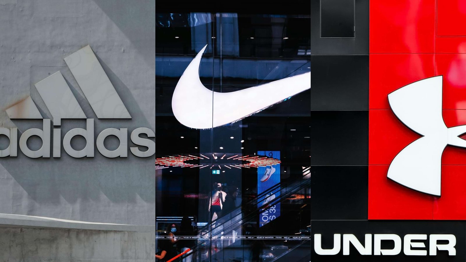
The Nike Swoosh is one of the most recognizable logos in the world. It symbolizes motion and speed but also represents the wing of the Greek goddess Nike, who personified victory. This aligns perfectly with the brand’s focus on performance and triumph in sports. Nike uses a simple yet powerful color palette, dominated by black and white with occasional bold colors like red. Black conveys sophistication and elegance, while white represents purity and safety. The use of red is energizing, representing passion and power.
Nike’s brand values are about inspiration and innovation. They aim to bring out the athlete in everyone, encouraging people to “Just Do It.” This message is about motivation, determination, and the pursuit of excellence, regardless of the level of athleticism.The emotions evoked by Nike’s branding are those of empowerment, motivation, and the joy of achieving personal goals. Their marketing often tells stories of overcoming obstacles, which resonates deeply with a wide audience.Nike’s messaging is unique in that it doesn’t just sell products; it sells a lifestyle and an ideology. It’s about being part of a community of people who are passionate about sports and self-improvement.
Adidas, another titan in the sports industry, has a brand identity that is both iconic and deeply rooted in its heritage. Here’s a creative exploration of what makes Adidas’s brand identity unique: Adidas is known for its three stripes, which are more than just a design element; they represent a mountain, challenging athletes to push themselves to new heights. The Trefoil logo, used for the Originals line, symbolizes diversity and the global nature of the brand.
Adidas’s brand values revolve around performance, passion for sports, and the spirit of competition. They aim to support athletes in their pursuit of excellence and to be the best sports brand in the world.The emotions Adidas evokes are determination, resilience, and camaraderie. Their branding and messaging focus on the collective journey of athletes and teams striving for success.Adidas’s messaging is about the power of sport to change lives and the importance of teamwork. They often highlight stories of athletes who have overcome adversity, which inspires and resonates with their audience.
Under Armour’s logo features the iconic “UA” initials, stylized in a bold, angular font. The interlocking letters represent strength, unity, and forward movement. The U and A are tightly connected, symbolizing the brand’s commitment to performance and teamwork.
Typography: The brand’s typography is robust and straightforward, emphasizing functionality. The sans-serif fonts used in their marketing materials and product designs communicate clarity and purpose. Under Armour’s messaging is concise and impactful. Under Armour’s core values revolve around performance, innovation, and authenticity. They cater to athletes who demand the best gear to enhance their abilities. The brand’s commitment to cutting-edge technology and materials sets it apart. Under Armour evokes emotions of drive, dedication, and resilience. Their marketing often features real athletes pushing their limits, sweating, and overcoming obstacles. The brand connects with those who strive for greatness. Under Armour’s messaging is about empowerment and self-improvement. Their famous slogan, “I Will”, encapsulates the mindset of athletes who refuse to settle. It’s a call to action, urging individuals to give their all.
The ASICS logo features a stylized ‘A’ that resembles a loop or swirl, followed by the lowercase letters ‘sics’. This design is dynamic and fluid, representing continuous movement and progress. The loop in the ‘A’ can also be seen as a path or track, hinting at the brand’s running heritage.
The logo’s dark blue color on a white background conveys reliability, trust, and professionalism. Blue is often associated with depth and stability, reflecting the brand’s commitment to performance and quality.
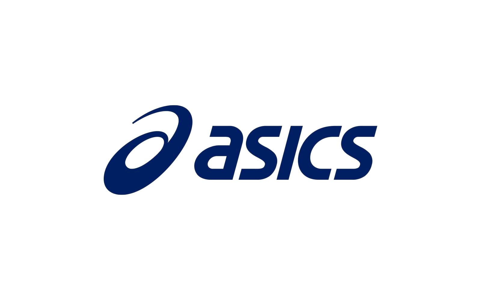
The sans-serif, modern font used in the ASICS logo is clean and approachable. It suggests a brand that is both contemporary and accessible, aligning with ASICS’s mission to bring high-quality athletic gear to a wide audience.ASICS stands for “Anima Sana In Corpore Sano,” which translates to “Healthy Soul In A Healthy Body.” This philosophy is at the core of their brand, emphasizing balance, wellness, and the pursuit of fitness. The ASICS brand evokes feelings of balance, health, and progress. It connects with individuals who see physical fitness as a journey rather than a destination, and who value personal growth and well-being.
They promote not just physical health but also mental clarity and emotional balance, encouraging a well-rounded approach to athleticism.
The FILA logo features the brand name in capital letters. The first letter “F” is colored red, while the remaining letters “ILA” are colored blue. This design is simple yet impactful. Let’s explore the meaning behind it: Red “F”: The red “F” signifies passion, energy, and determination. It’s a nod to the fire within athletes, urging them to give their all. Blue “ILA”: The blue letters represent stability, trust, and reliability. They evoke a sense of consistency and quality.
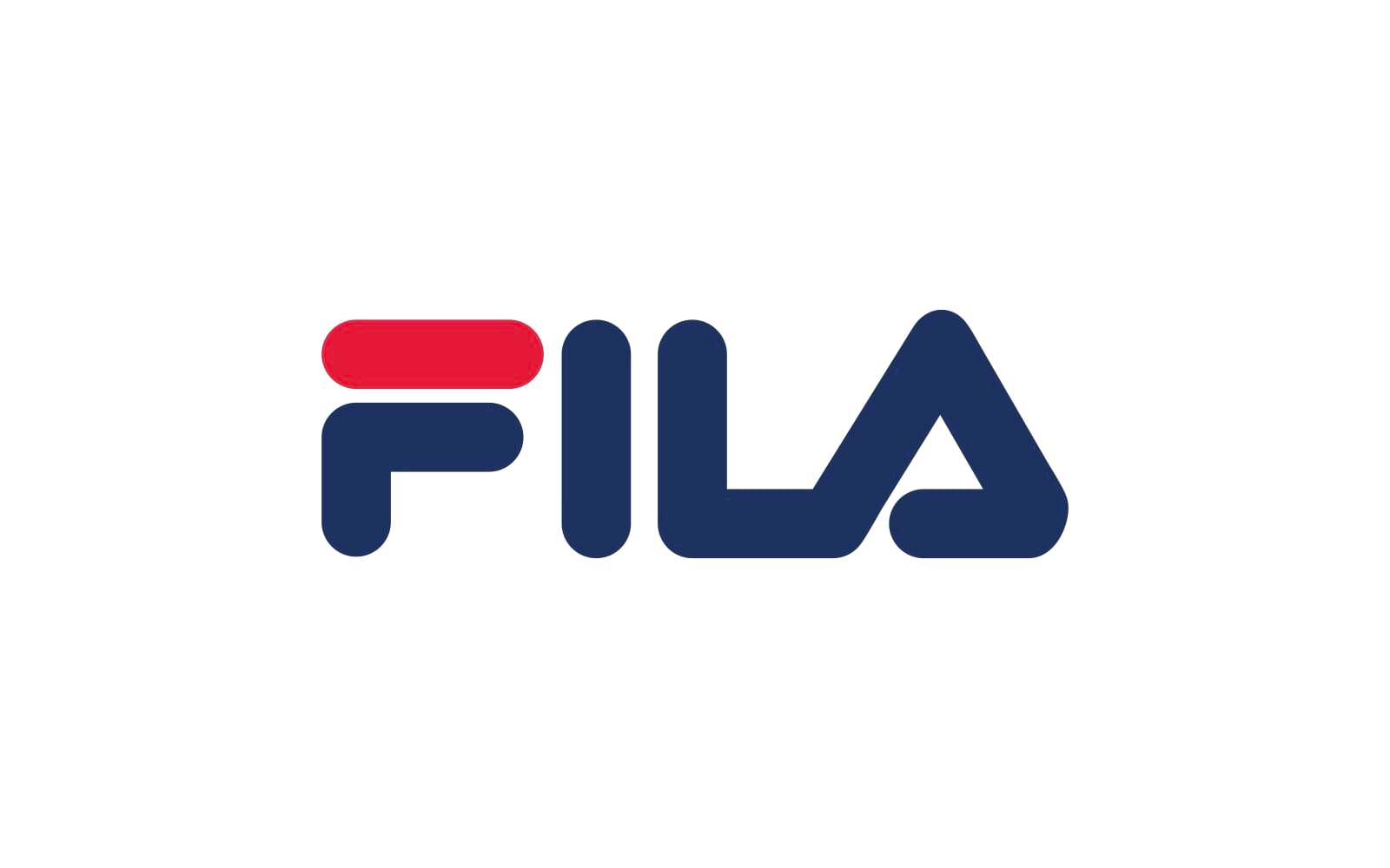
The combination of red and blue creates a dynamic contrast, reflecting FILA’s commitment to both performance and style.
Red: Associated with intensity, action, and adrenaline. It’s the color of competition and pushing boundaries. Blue: Symbolizes reliability, professionalism, and a sense of tradition. It balances the boldness of red. FILA’s brand values revolve around performance, heritage, and timelessness. They celebrate the legacy of sports and champion athletes who strive for greatness. FILA evokes emotions of drive, nostalgia, and athletic camaraderie. Their branding connects with those who appreciate classic sportswear and the spirit of competition. FILA’s messaging is about honoring tradition while embracing innovation. They celebrate the past while pushing forward, appealing to athletes who value both heritage and progress.
The TYKA logo features the brand name in uppercase letters. The bold sans-serif typeface gives it a modern and athletic feel. To the left of the text, there’s a graphic element resembling a stylized flame. Let’s break it down:
Text (“TYKA”): The bold letters convey strength, confidence, and dynamism. The all-caps treatment suggests authority and impact
Flame Graphic: The stylized flame represents several powerful concepts:
Energy: Flames symbolize vigor, intensity, and the fire within athletes.Aspiration: Like a burning desire to excel, the flame embodies ambition and goals. Transformation: Flames consume and transform, reflecting growth and progress.
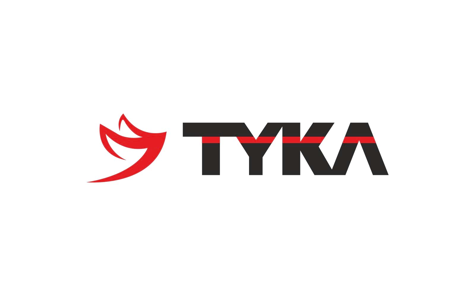
TYKA’s brand values likely revolve around performance, ambition, and innovation. They cater to athletes who aim high and seek cutting-edge gear. TYKA evokes emotions of drive, fierce competition, and personal bests. Their branding resonates with those who refuse to settle for mediocrity. TYKA’s messaging could be about unleashing potential, igniting greatness, and embracing challenges. They inspire athletes to push beyond limits.
The New Balance logo features a white stylized “N” next to the words “new balance” in lowercase white font. The design is simple yet impactful:
![]()
“N” Icon: The white “N” represents several key concepts:
Innovation: The angular, asymmetrical shape suggests forward-thinking and cutting-edge design.
Balance: The diagonal line within the “N” creates equilibrium, symbolizing harmony and stability. Athleticism: The slanted angle evokes movement and agility, fitting for a sports brand.
“new balance” Text: The lowercase font is approachable and friendly. It emphasizes the brand’s commitment to everyday athletes, not just elite professionals.
Red Background: Red is bold, energetic, and attention-grabbing. It signifies passion, determination, and action. White (“N” and Text): White represents purity, clarity, and simplicity. It complements the red background. The lowercase sans-serif font used for “new balance” is clean and legible. It reflects accessibility and inclusivity, appealing to a wide range of athletes. New Balance’s brand values likely revolve around comfort, performance, and authenticity. They celebrate individuality and cater to those seeking quality footwear. New Balance evokes emotions of trust, reliability, and personal well-being. Their branding resonates with people who prioritize comfort and functionality. New Balance’s messaging could be about finding your perfect fit, embracing uniqueness, and supporting your journey. They encourage athletes to be true to themselves.
The Mizuno logo features a stylized bird in white against a blue square background. Here’s what each element represents:
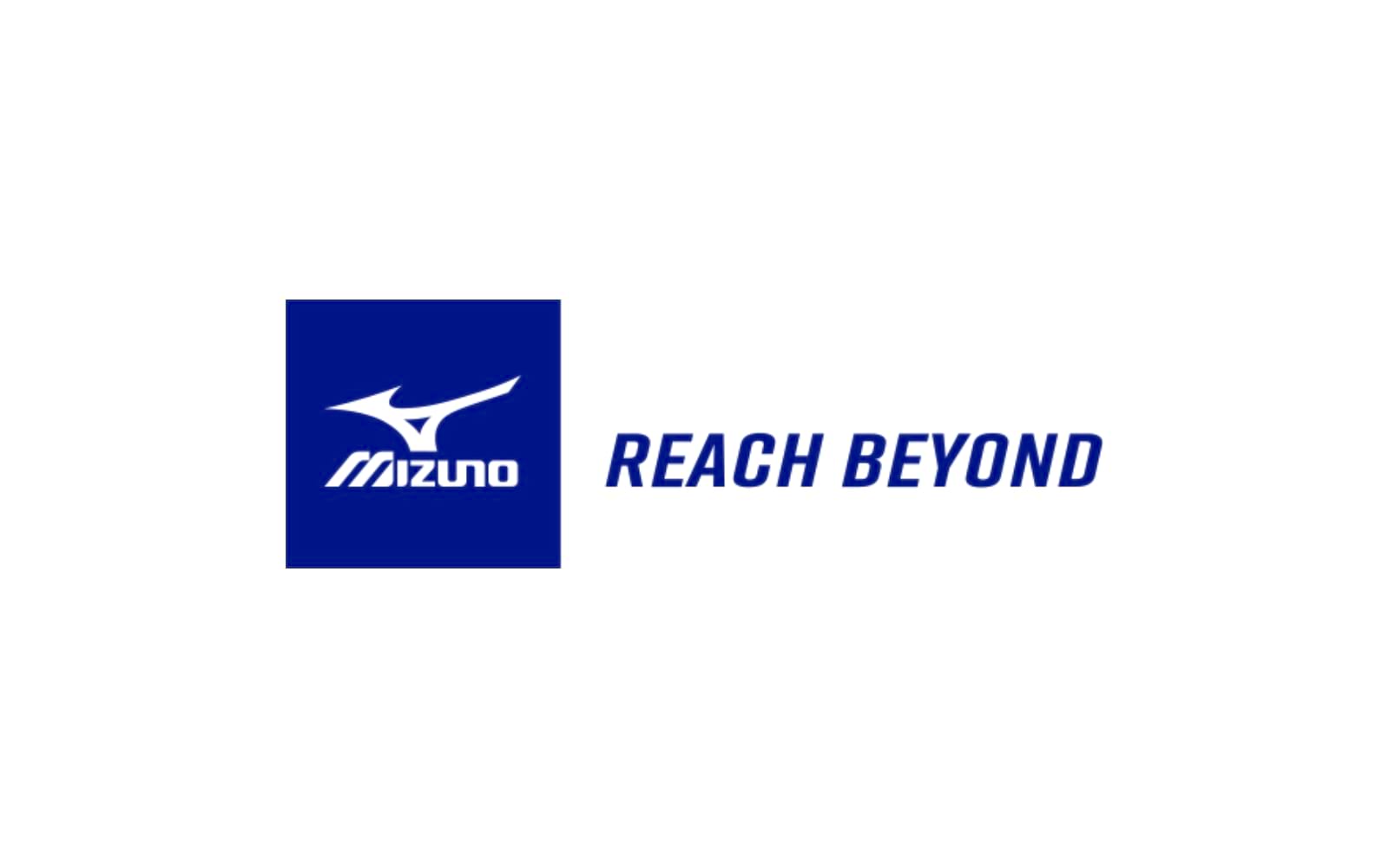
Bird Icon:
The bird, with its wings extended, symbolizes motion, freedom, and aspiration. It evokes the idea of reaching beyond limitations, pushing boundaries, and soaring to new heights. The dynamic posture suggests agility and progress.
“REACH BEYOND” Text:
The capital letters in “REACH BEYOND” emphasize ambition and determination. The phrase itself is a powerful call to action, urging athletes to surpass their own expectations. It aligns perfectly with Mizuno’s mission to inspire excellence.
“MIZUNO” Text:
The lowercase font for “MIZUNO” is approachable and friendly. It reinforces the brand’s commitment to everyday athletes, not just elite professionals. Blue Background: Blue represents depth, trust, and stability. It’s the color of the sky and water, suggesting vast possibilities. White (“N” and Text): White signifies purity, clarity, and focus. It complements the blue background. Mizuno’s brand values likely revolve around performance, innovation, and authenticity. They celebrate athletes who seek both functionality and style. Mizuno evokes emotions of drive, ambition, and personal growth. Their branding resonates with those who strive for excellence in sports and life. Mizuno’s messaging could be about surpassing limits, embracing challenges, and finding your edge. They inspire athletes to go beyond what they thought possible.
The NIVIA logo, with its bold capital letters and the stylized ‘X’ or rotated square frame, conveys a sense of structure and dynamism. The triangular cutouts at each corner add a touch of innovation and flair.
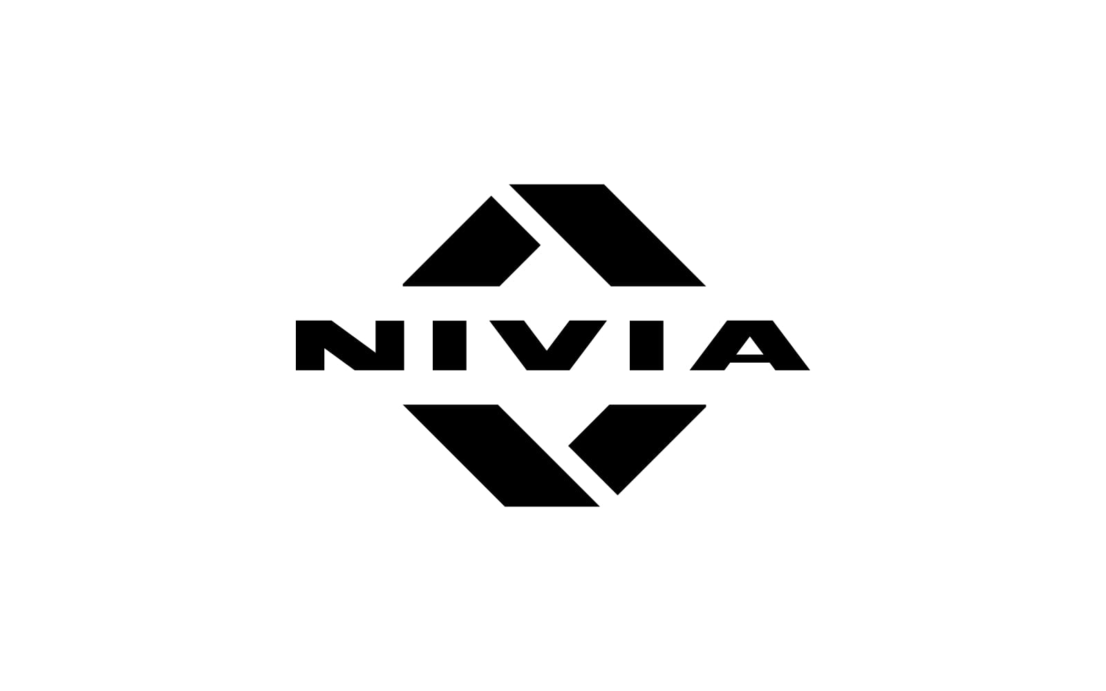
The use of black in the logo suggests power, elegance, and sophistication. It’s a color that commands attention and denotes authority, making it a strong choice for a sports brand. The typography of NIVIA is bold and impactful, reflecting the brand’s commitment to strength and reliability. The uppercase letters indicate stability and presence, essential qualities for athletes and sports enthusiasts. NIVIA’s brand values likely center around resilience, performance, and accessibility. They aim to provide quality sports gear that empowers athletes at all levels to achieve their best. The NIVIA brand evokes determination, confidence, and the thrill of competition. It connects with the audience’s desire for achievement and the pursuit of sporting excellence. NIVIA’s messaging might focus on the journey of the athlete, the passion for sports, and the relentless pursuit of improvement. It’s about inspiring action and fostering a spirit of perseverance.
The Lotto logo features a graphic element that resembles a stylized letter ‘X’ or a rotated square frame with triangular cutouts at each corner. Here’s what it conveys:
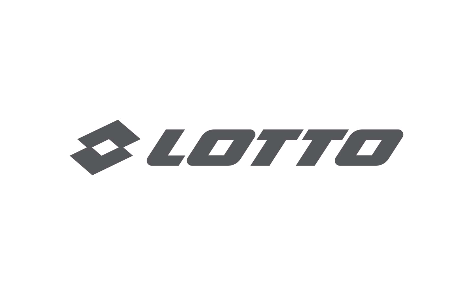
Dynamic Shape (“X”):
The geometric design suggests motion, energy, and agility. It resembles a crossroads, symbolizing choices and possibilities. The triangular cutouts add a sense of openness and freedom.
“LOTTO” Text:
The uppercase font for “LOTTO” is bold and impactful. It signifies strength, reliability, and a commitment to sports excellence.
Color Palette:
The use of black in the logo represents sophistication, elegance, and timelessness. Against a white background, it creates high contrast and visual impact. The font choice for “LOTTO” is straightforward and legible. It communicates clarity and functionality, essential for a sports brand. Lotto’s brand values likely revolve around performance, innovation, and versatility. They cater to athletes who seek quality gear for various sports. Lotto evokes emotions of determination, choice, and adventure. Their branding resonates with those who embrace challenges and explore their limits. Lotto’s messaging could be about empowering athletes, embracing versatility, and making bold moves. They inspire individuals to step onto the field with confidence.
The Diadora logo features the brand name in lowercase letters. The design is intriguing due to its unique font and stylized elements:
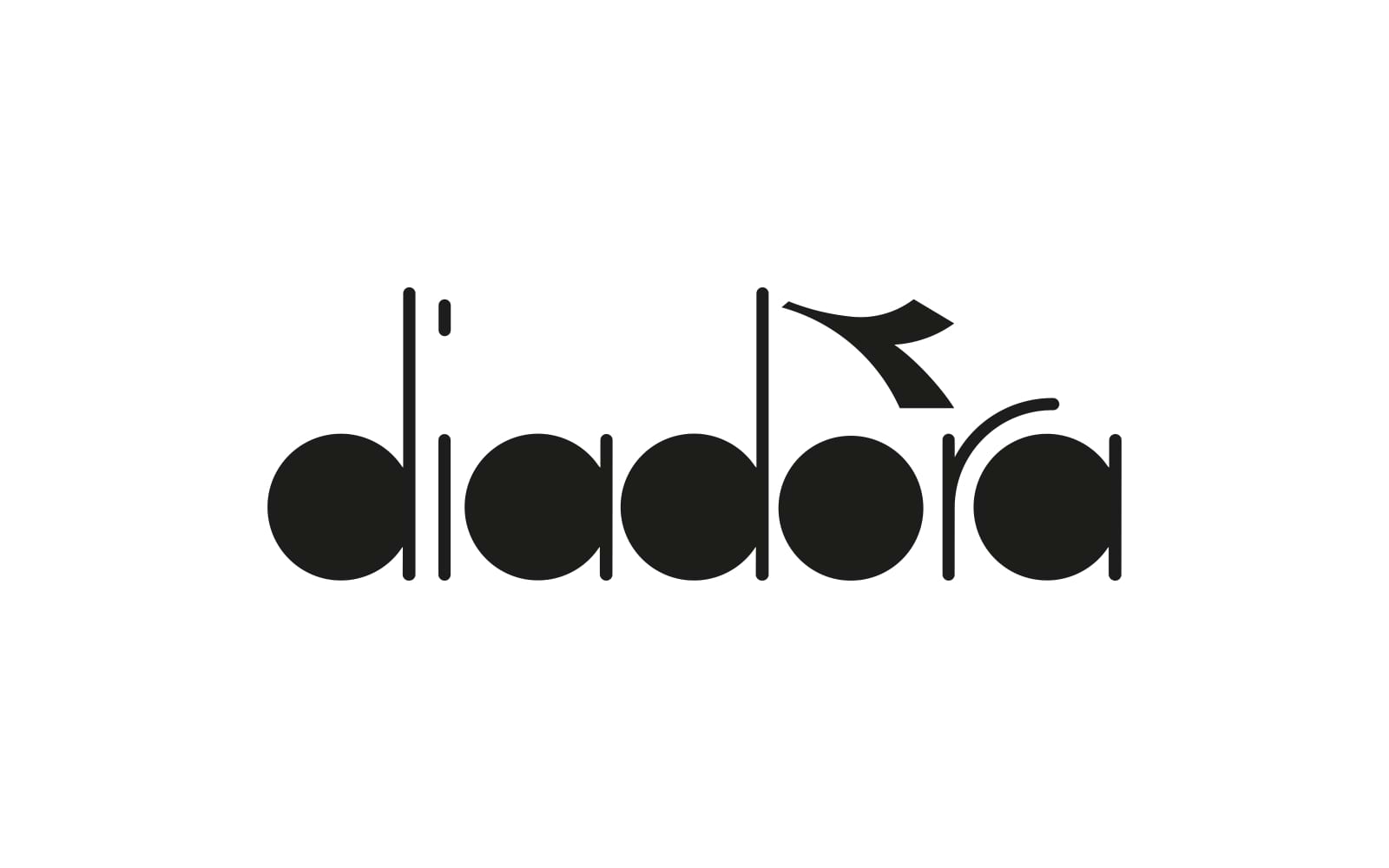
Letter “D”:
The letter “D” is stylized as a circle, suggesting wholeness, unity, and inclusivity. It represents the brand’s commitment to providing comprehensive sports solutions.
Letter “A”:
The letter “A” is also circular, mirroring the design of the “D.” It reinforces the idea of balance and symmetry.
Letter “R”:
The extended leg of the letter “R” curls upwards, creating a sense of motion and aspiration. It resembles an athlete in action, reaching for new heights. The unique font design for “diadora” communicates originality and memorability. It sets the brand apart from more conventional logos. Diadora evokes emotions of elegance, movement, and personal expression. Their branding resonates with athletes who appreciate both form and function. Diadora’s messaging could be about blending fashion with function, embracing individuality, and making a statement. They inspire athletes to express themselves through their gear.
In the arena of sports branding, the logos we’ve discussed are not merely emblems; they are beacons of aspiration, symbols of commitment, and embodiments of the brand’s soul. From the inspirational designs that startups can emulate to the iconic sports logos that have stood the test of time, each carries a story of ambition and achievement. As we’ve journeyed through the nuances of creating memorable sports brand logos, delving into the impact of color psychology and typography, we’ve seen how these visual identities are more than just art—they’re a strategic symphony of design elements. They resonate with audiences, inspire athletes, and drive the spirit of competition. Whether you’re a startup looking to make your mark or an established brand aiming to stand out in the industry, remember that a great logo is your silent ally—powerful, persuasive, and perpetually at play.
A: An iconic sports brand logo is a blend of memorable design, deep psychological impact, and the ability to evoke the core values of the brand. It’s not just about looking good; it’s about resonating with fans and athletes alike, creating a lasting impression that transcends the sports field.
A: Startups can create standout logos by focusing on uniqueness, simplicity, and relevance. The logo should be distinctive, easy to recognize, and reflective of the startup’s mission and values. Engaging a professional designer or design team who understands your vision can also make a significant difference.
A: Absolutely! Color psychology plays a pivotal role in branding. The right color can enhance brand recognition, influence emotions, and even drive purchasing decisions. It’s crucial to choose colors that align with your brand’s personality and the message you want to convey.
A: Typography is important because it’s not just about the words; it’s about how those words are presented. The right font can convey strength, elegance, or speed, contributing to the overall narrative of the brand. It’s an essential tool in the visual storytelling of your sports brand.
A: A sports brand should consider updating its logo when it no longer reflects the brand’s identity or fails to connect with the target audience. However, any changes should be made thoughtfully to maintain brand recognition and loyalty.
A: Common pitfalls include overcomplicating the design, being too similar to competitors, neglecting the brand’s story, and overlooking the logo’s scalability across different mediums. Avoiding these mistakes can help ensure a more effective and impactful logo.
A: Success can be measured through brand recognition surveys, social media engagement, merchandise sales, and overall market presence. Listening to customer feedback and monitoring how the logo performs in different contexts can also provide valuable insights.


Shaikh Asif is an Award-winning designer, director, strategist, and educator. He’s the Lead Strategic Brand Designer and Art Director of The Alitestar— a strategic branding and design agency that helps startups, ambitious CEOs, and passionate entrepreneurs to achieve success and ultimately create unforgettable brand experiences.