Design
How to Choose Fonts for Logo Design: A Comprehensive Guide
10.02.2025
By Shaikh Asif
Design
10.02.2025
By Shaikh Asif


How to Choose Fonts for Logo Design: A Comprehensive Guide for Creative Professionals and Business Leaders In the world of branding, a logo isn't just a symbol—it’s the face of your brand, and one of its most critical elements is the font. Whether you're a graphic designer, a startup owner, or an established CEO, the font you choose for a logo can communicate the essence of your brand to the world. But with thousands of fonts out there, how do you know which one will resonate with your audience and embody your brand's values?
As creative professionals, understanding how to strategically select fonts for logo design is one of the most impactful skills you can hone. Here’s a practical guide that will take you step by step through the process of font selection, ensuring your design aligns with your client's brand identity, storytelling, and long-term business goals. Plus, we’ll explore how premium branding agencies like Alitestar can assist you with logo design, brand strategy, and identity creation that stands out in today’s competitive market.
Fonts aren’t just an aesthetic choice—they’re a vital part of your brand’s identity. Think of fonts as the “voice” of your logo. Just like you’d use a different tone of voice in a formal business meeting than you would at a casual social gathering, fonts need to match the personality and values of the brand. According to research by Adobe, 90% of the information that the brain processes is visual, and fonts are integral to that visual identity.
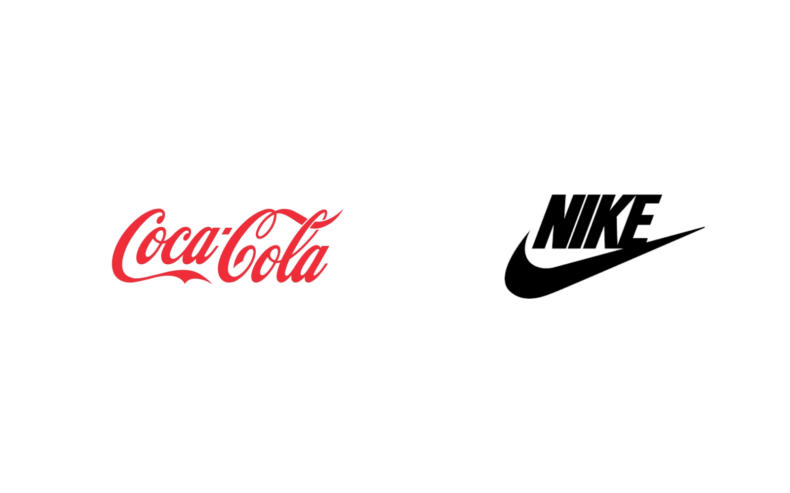
Take the timeless elegance of Coca-Cola’s script font or the modern, bold typeface of Nike’s logo—both instantly recognizable and perfectly aligned with the brand's ethos. In logo design, fonts must capture the right emotion, appeal to the right audience, and remain memorable.
Pro Tip: Always begin by defining the brand's core values before choosing any design elements. When you’re clear about what the brand stands for, selecting a font that embodies those values becomes far easier.
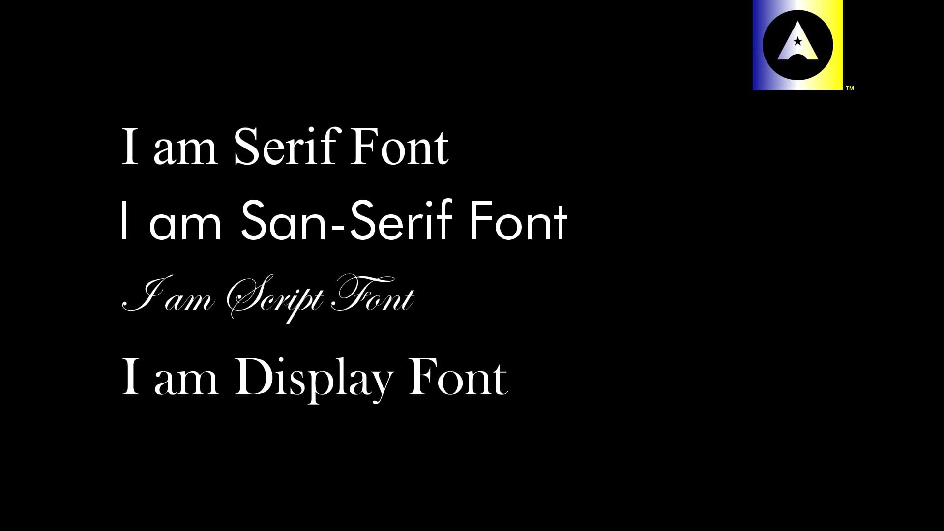
Fonts speak volumes. They convey emotion, authority, and tone even before a single word is read. To choose the right font for a logo, you need to understand the psychology behind different font styles:
Serif Fonts: Traditionally associated with formality, reliability, and tradition (e.g., Times New Roman). If your client’s brand is aiming for sophistication or has a heritage narrative, a serif font may be the perfect match.
Sans-serif Fonts: Clean, modern, and minimalistic (e.g., Helvetica). These fonts are ideal for brands that want to project a contemporary or approachable image.
Script Fonts: Elegant and personal, often evoking feelings of luxury or creativity (e.g., Lobster or Pacifico). These fonts can add a unique flair but must be used carefully to ensure legibility.
Display Fonts: Designed to make a statement. They are often unique, quirky, or bold, and while they may not be suitable for every brand, they can work wonders for logos aiming to be playful or daring.
A study conducted by the University of Vienna shows that typefaces significantly influence how viewers perceive a brand. Fonts that are inconsistent with brand messaging can cause confusion and even erode trust in the brand.
Now, let's get into the practical steps of selecting fonts for your logo design. One of the first questions to ask when choosing a font is: What message should the logo communicate? Whether the brand is modern and innovative or classic and dependable, the font should be a direct reflection of these values.
Practical Steps to Align Fonts with Brand Identity:
1. Understand the Brand Story: Is the brand edgy and disruptive, or does it lean towards tradition and legacy? For instance, a tech startup might gravitate towards sleek sans-serifs, while a luxury brand may favor custom scripts or elegant serifs.
2. Know the Audience: Is the target market young and trendy, or mature and professional? A deep understanding of your client’s audience allows you to select a font that speaks their language. For example, sans-serifs tend to appeal more to younger, digitally-savvy audiences, while serifs may attract a more conservative or formal clientele.
3. Experiment with Pairing: Sometimes, one font isn’t enough to fully communicate a brand’s complexity. Pairing fonts can be a powerful way to differentiate elements within a logo—just be sure to balance contrast with harmony.
A logo has to work everywhere—on business cards, websites, billboards, packaging, and more. That’s why your font choice must be versatile enough to scale up or down without losing impact. But you also want it to be unique enough to make the brand memorable.
Here’s the challenge: striking a balance between distinctiveness and adaptability.
How to Achieve the Balance:
Simplicity is Key: Overly decorative or complex fonts may lose clarity when resized. Stick to fonts that maintain legibility at different scales and formats.
Customization: Custom fonts or slight modifications to existing fonts can make a logo feel more unique without compromising versatility. At Alitestar, we often tweak typefaces to better align with a brand’s personality and ensure that no one else has the exact same look.
Let’s break down the best practices that every designer or business leader should consider when selecting fonts for logos:
Legibility is Non-Negotiable: A font may look stylish, but if people can’t read it, it won’t serve its purpose.
Scalability: The font needs to work on large billboards and tiny social media icons alike.
Test Across Mediums: Make sure the font looks good not only digitally but also in print.
Avoid Overused Fonts: Trends come and go, but your brand needs to last. Avoid overly trendy fonts that might date your logo within a few years.
At Alitestar, we take a meticulous approach to every font decision we make. One recent project for a luxury fashion brand required us to find a balance between elegance and modernity. After an exhaustive discovery phase, we opted for a customized serif font that communicated sophistication but had enough modern lines to appeal to a younger demographic.
Our approach always begins with deep brand discovery, understanding the client’s goals, audience, and competition. From there, we work through a series of typographic experiments to ensure that the final design not only reflects the brand’s essence but is also adaptable and scalable.
Choosing the right font for a logo isn’t just about aesthetics—it's about building a strong, strategic foundation for your brand's identity. When done right, fonts can make a logo truly unforgettable, resonating with your audience on a deeper level.
At Alitestar, we don’t just design logos; we craft visual identities that tell a story and build lasting connections. Whether you need help with brand strategy, naming, identity design, or a comprehensive brand overhaul, we’re here to help you create a brand that stands the test of time.


Shaikh Asif is an Award-winning designer, director, strategist, and educator. He’s the Lead Strategic Brand Designer and Art Director of The Alitestar— a strategic branding and design agency that helps startups, ambitious CEOs, and passionate entrepreneurs to achieve success and ultimately create unforgettable brand experiences.