Design
Top 10 Best Professional Consultancy Logos: Building Credibility and Trust Through Strategic Design
10.02.2025
By Shaikh Asif
Design
10.02.2025
By Shaikh Asif


In the competitive world of professional consultancy, standing out is crucial. Clients are not just seeking expertise; they’re looking for a brand they can trust. This trust often begins with your logo—the visual cornerstone of your brand. A logo isn’t just a design; it’s a symbol of your consultancy’s professionalism, values, and promise to deliver exceptional services.
A well-crafted logo does more than represent your business; it communicates your identity in a single glance. It embodies your consultancy’s ethos, distinguishing you from competitors and leaving a lasting impression on potential clients. For professional consultancies, where trust and credibility are paramount, a logo is often the first and most critical interaction a client has with your brand.
At Alitestar, we understand the profound impact a well-designed logo can have. Through this article, we will explore the world’s top 10 professional consultancy logos, analyzing the elements that make them effective, memorable, and aligned with their brand values. Whether you’re an emerging consultancy looking to create a logo or an established firm considering a rebrand, this guide provides essential insights to inspire and inform your decision-making.
Building Trust Through Strong Branding
In the realm of consultancy, trust is the currency of success. Without it, clients won’t seek your advice, nor will they stay loyal. But trust doesn’t happen overnight—it’s built over time through consistent, credible branding. A strong, recognizable logo is the foundation of this trust. According to the Edelman Trust Barometer, a staggering 81% of consumers say they must trust a brand to make a purchase decision. This figure emphasizes just how critical branding is for consultancy firms.
Your logo plays a pivotal role in communicating that trustworthiness from the outset. A polished, professional logo signals that your consultancy is stable, reliable, and experienced—qualities that clients seek when making business decisions. Moreover, a logo helps foster emotional connections with clients, making them feel confident in your ability to deliver results.
At Alitestar, we specialize in creating logos that speak directly to these trust-building needs. Our approach is to design logos that not only captivate visually but also embody the core values of your consultancy, ensuring that your brand is positioned as a leader in its industry.
What Makes a Consultancy Logo Stand Out?
Designing a consultancy logo is both an art and a science. While creativity plays a key role, a successful consultancy logo must also tick several practical boxes. Here are the criteria we used to identify the world’s top 10 consultancy logos:
Brand Alignment: How well does the logo represent the consultancy’s mission, values, and personality? A strong logo is an extension of the brand's identity and should resonate with its target audience.
Uniqueness: With countless firms vying for attention, a consultancy logo needs to stand out in a crowded market. Does the logo have distinctive elements that differentiate it from competitors?
Simplicity and Scalability: Simple logos are often the most effective because they are easy to recognize and versatile across different mediums. Scalability is essential—your logo must look sharp on everything from business cards to billboards.
Memorability: A great logo sticks with people. Does it leave a lasting impression that clients will recall when they need consultancy services?
Timelessness: Design trends come and go, but a great consultancy logo stands the test of time. We looked for logos that avoid fleeting trends and instead focus on classic design principles that remain relevant for years.
A Closer Look at Excellence
Below are the top 10 consultancy logos that exemplify exceptional design, aligned with the core values of their respective brands. These logos are not only aesthetically pleasing but also strategically crafted to enhance brand identity and foster client trust.
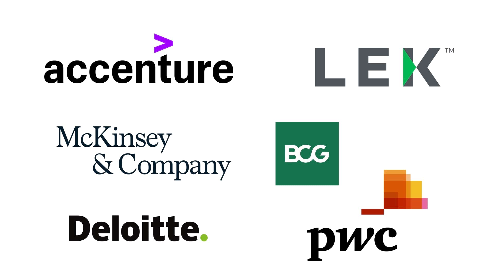
Design Elements: McKinsey’s logo utilizes a classic serif typeface that evokes tradition, authority, and professionalism. Its straightforward black-and-white color scheme reinforces its seriousness and commitment to delivering clear, no-nonsense advice.
Brand Alignment: The minimalism of McKinsey’s logo perfectly mirrors the firm’s no-frills, results-driven approach to consultancy. It communicates stability and trustworthiness—exactly what clients expect from one of the world’s most respected firms.

Design Elements: BCG’s logo features bold, sans-serif typography, with clean lines that project modernity and forward-thinking. The spacing and simplicity reflect a consultancy that values clarity and innovation.
Brand Alignment: The logo aligns seamlessly with BCG’s focus on cutting-edge, data-driven solutions. The boldness of the design emphasizes the firm’s confident, strategic approach to problem-solving.

Design Elements: Deloitte’s logo is sleek and highly professional, using a clean wordmark with a green dot that symbolizes growth and innovation—two pillars of the firm’s mission.
Brand Alignment: The subtle green in the logo communicates Deloitte’s focus on helping clients grow and succeed. The simplicity of the logo reflects Deloitte’s broad expertise across industries while maintaining an approachable, modern appeal.

Design Elements: The PwC logo is visually dynamic, integrating a gradient color palette with a modernized wordmark. The fragmented look suggests adaptability and evolution.
Brand Alignment: PwC’s logo reflects its mission to help businesses navigate change in a complex, ever-shifting environment. The colors and design elements communicate flexibility and an innovative mindset.

Design Elements: EY’s logo is simple yet striking, with a prominent yellow beam that adds vibrancy and optimism. The design is contemporary and straightforward, avoiding any unnecessary embellishments.
Brand Alignment: The beam of light symbolizes EY’s guiding principle: helping clients find clarity in a complex world. The bright, positive color palette reflects EY’s optimistic vision of a better working world.

Design Elements: KPMG’s logo is a bold wordmark in blocky, all-caps letters that evoke strength and reliability. Its blue color symbolizes trust, stability, and professionalism—key traits for a consultancy.
Brand Alignment: The simplicity and authority of KPMG’s logo reflect its role as a trusted advisor in the financial and consulting worlds. The design is timeless and effective in conveying dependability.

Design Elements: Accenture’s logo features a distinctive forward arrow, symbolizing progress and forward-thinking. The lowercase typography gives the logo a friendly, modern feel, while the arrow adds a futuristic touch.
Brand Alignment: This logo perfectly captures Accenture’s brand promise of innovation and transformation. The forward arrow suggests a consultancy that’s always looking ahead, helping clients navigate the future.

Design Elements: Bain’s logo features a bold red circle with an arrow pointing upward, symbolizing focus and results. The red color projects confidence and energy, perfectly in line with the firm’s assertive, results-oriented approach.
Brand Alignment: The upward-pointing arrow reinforces Bain’s commitment to delivering measurable outcomes for its clients, while the circular shape symbolizes completeness and unity in their solutions.

Design Elements: Roland Berger’s logo is minimalist and modern, featuring clean lines and a geometric composition. The monochrome color scheme adds to its sleek and professional look.
Brand Alignment: The simplicity and precision of the logo reflect Roland Berger’s focus on delivering clear, actionable insights. The minimalist approach underscores the consultancy’s no-nonsense, high-quality services.

Design Elements: LEK’s logo is direct and professional, with a clear serif font that conveys authority and clarity. The simple, no-fuss design ensures that the focus remains on the consultancy’s expertise and professionalism.
Brand Alignment: This logo reflects LEK’s reputation for providing clear, strategic advice. Its simplicity mirrors the firm’s straightforward approach to consultancy, reinforcing its position as a trusted partner.

Staying Ahead of the Curve
The design trends we see in consultancy logos today are driven by a desire for clarity, professionalism, and forward-thinking. Some key trends include:
Minimalism: More consultancy firms are opting for minimalist logos. Clean lines, simple color schemes, and streamlined typography create a professional image that appeals to clients looking for expertise and clarity.
Monochrome Palettes: Black-and-white or single-color logos are increasingly popular, offering timelessness and versatility. A monochrome logo works across all mediums, from digital platforms to printed materials.
Geometric Shapes: Circles, arrows, and other geometric elements are often used to symbolize direction, focus, and progress—qualities essential to consultancy firms.
Customized Typography: Unique, custom fonts help distinguish consultancies from competitors, adding a personal touch while maintaining professionalism.
At Alitestar, we incorporate these trends while ensuring that each logo remains distinctive and tailored to the brand’s long-term vision.
Beyond Aesthetics—Building a Strong Brand Foundation
A well-designed logo does more than make your consultancy look good—it’s a powerful tool for building your brand. A strong logo:
Fosters Recognition: A memorable logo ensures that clients remember your firm when they need consultancy services.
Establishes Professionalism: A polished logo demonstrates that your consultancy is serious about its brand, which in turn fosters client trust.
Communicates Expertise: Your logo speaks volumes about your firm’s expertise and credibility, even before a client engages with your services.
Creates Emotional Connection: A thoughtful design can evoke emotions that make clients feel connected to your brand, increasing loyalty and trust.
At Alitestar, we excel in crafting logos that not only look great but also embody the core values of consultancy firms. We understand that your logo is often the first point of contact with potential clients, so it needs to make a lasting impression.
Elevating Your Consultancy Through Strategic Design
The top consultancy logos we’ve discussed in this article exemplify how powerful a well-designed logo can be in building a professional consultancy brand. They are more than just visuals—they are strategic tools that communicate credibility, expertise, and trust. Whether you’re launching a new consultancy or rebranding an existing one, investing in a high-quality logo is a step toward long-term success.
At Alitestar, we specialize in creating logos that help consultancies stand out in a crowded market. Let us help you elevate your brand with a logo that not only captures attention but also embodies the core principles of your consultancy.


Shaikh Asif is an Award-winning designer, director, strategist, and educator. He’s the Lead Strategic Brand Designer and Art Director of The Alitestar— a strategic branding and design agency that helps startups, ambitious CEOs, and passionate entrepreneurs to achieve success and ultimately create unforgettable brand experiences.