Design
The 10 Best Healthcare Logo Designs in the World: Expert Insights on Creating a Powerful Healthcare Brand Identity
10.02.2025
By Shaikh Asif
Design
10.02.2025
By Shaikh Asif


In the complex and sensitive world of healthcare, a logo serves as more than just a symbol; it embodies trust, care, and professionalism. When patients choose a healthcare provider, they are making a decision that impacts their well-being and, in many cases, their lives. The logo of a healthcare organization is often the first touchpoint that conveys the values and promises of the brand. It needs to evoke trust, compassion, and expertise—all critical components in this industry.
The best healthcare logos in the world have mastered the art of balancing simplicity with symbolism, making them instantly recognizable and emotionally resonant. They don’t just represent the organization; they tell a story, one that reassures patients they are in good hands. This article will explore the most successful healthcare logos globally, analyze what makes them effective, and provide insights into how Alitestar can help healthcare brands achieve similar success. By the end, you'll see how a powerful logo can be the cornerstone of a brand's identity and a critical asset in building trust with your audience.
Why Branding is Essential in the Healthcare Industry
In healthcare, branding is not a luxury—it's a necessity. Unlike other industries where customers might be willing to take risks or try new things, healthcare decisions are often life-changing. Patients and their families need to feel confident in the care they choose, and branding plays a pivotal role in establishing that confidence.
According to research published in the Journal of Medical Marketing, healthcare organizations that invest in strong branding strategies are more likely to be perceived as trustworthy, leading to higher patient satisfaction and loyalty. This is because a well-established brand offers a sense of stability and reliability, both of which are crucial in healthcare.
Branding in healthcare extends beyond just the logo—it encompasses the entire patient experience, from the moment they see an advertisement to the care they receive. A consistent and professional brand image helps to create a seamless experience that reassures patients at every touchpoint. For healthcare organizations looking to differentiate themselves in a crowded market, a strong brand is not optional; it's essential.
At Alitestar, we understand the unique challenges of healthcare branding. We offer a comprehensive range of services, including logo design, brand strategy, brand identity, and brand storytelling, all tailored to meet the specific needs of healthcare providers. Our goal is to help you build a brand that not only attracts new patients but also fosters long-term loyalty.
Key Elements of Successful Healthcare Logos
Creating a healthcare logo that resonates with your audience involves more than just design skills—it requires an understanding of the industry's unique demands. Here are the key elements that make a healthcare logo truly stand out:
Simplicity: In healthcare, simplicity is key. A logo that is overly complex can be confusing and may fail to make a lasting impression. The best healthcare logos are clean, straightforward, and easy to remember. They communicate the brand’s essence in the simplest form possible.
Symbolism: Healthcare logos often incorporate symbols that are universally recognized and associated with care, safety, and medical expertise. For instance, the caduceus, a staff with two serpents winding around it, is widely recognized as a symbol of medicine and healthcare. However, the most successful logos take these symbols and give them a unique twist that aligns with the brand’s identity.
Color Psychology: Colors have a profound impact on how a logo is perceived. In healthcare, blue is the most commonly used color as it represents trust, professionalism, and reliability. Green is also popular, symbolizing health, growth, and healing. The choice of color can significantly influence how patients feel about your brand.
Adaptability: A healthcare logo must be versatile enough to work across all platforms, from digital to print, and on everything from business cards to large-scale signage. It should maintain its impact and clarity, whether it’s displayed on a website, an app, or a physical location.
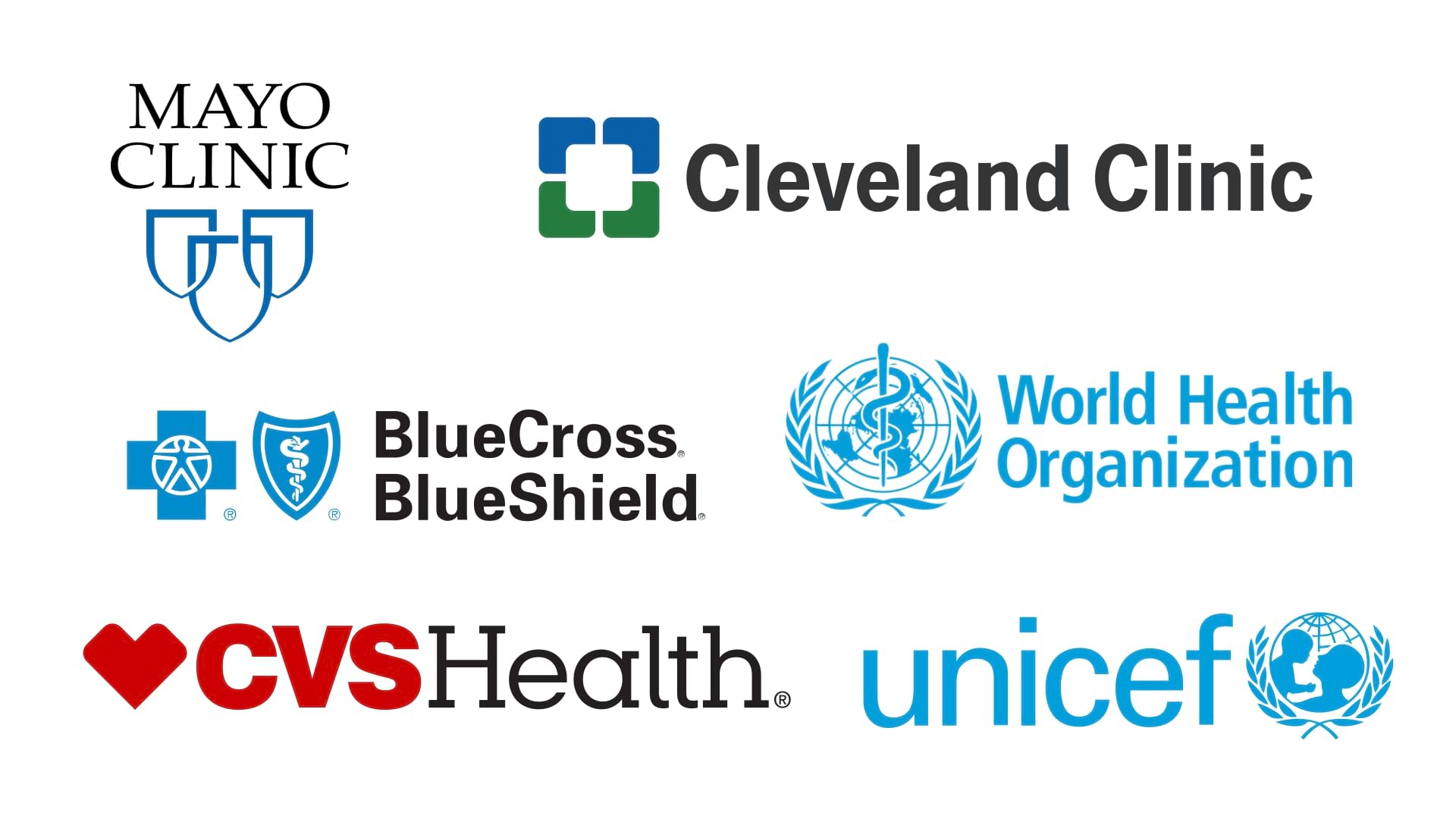
To illustrate these principles, let’s look at some of the world’s most effective healthcare logos. For example, the Mayo Clinic’s logo—a simple yet powerful shield—represents protection and care, values that are central to their brand. The Cleveland Clinic’s interlocking squares symbolize unity and comprehensive care, reflecting their collaborative approach to healthcare. These logos are not only visually appealing but also deeply connected to the brands’ identities.
Design: The Mayo Clinic logo features a simple yet powerful shield with the organization’s name inscribed in a clean, bold font. The shield symbolizes protection, safety, and trust—core values of the Mayo Clinic.
Symbolism: The shield is a universal symbol of protection and care, resonating deeply with patients seeking reliable healthcare services. The design is minimalist, reflecting the clinic's focus on clear, effective communication and patient care.
Impact: Over the years, this logo has become synonymous with high-quality, compassionate care. It’s a reassuring symbol for patients, signifying that they are in safe hands.
Design: The Cleveland Clinic logo features four interlocking squares, representing collaboration and comprehensive care. The use of clean lines and geometric shapes gives the logo a modern, professional look.
Symbolism: The interlocking squares symbolize the interconnectedness of various healthcare disciplines within the clinic. The green color used in the logo represents health, growth, and healing.
Impact: This logo effectively communicates the clinic’s commitment to a collaborative, patient-centered approach to healthcare. It’s widely recognized and respected in the industry.
Design: The Blue Cross Blue Shield logo combines two powerful symbols: the cross and the shield. The cross represents health and medical care, while the shield stands for protection and security.
Symbolism: The blue color used in the logo is often associated with trust, stability, and professionalism, making it an ideal choice for a healthcare brand.
Impact: This logo has stood the test of time, becoming one of the most recognized symbols in healthcare globally. It’s a trusted emblem for millions of patients seeking health insurance and medical services.
Design: The Kaiser Permanente logo features a stylized sun rising above a horizon, symbolizing hope, health, and a bright future. The use of simple, clean lines gives the logo a modern, approachable feel.
Symbolism: The rising sun is a powerful symbol of renewal, hope, and the promise of better health. The logo reflects the organization’s mission to improve the health and well-being of its members.
Impact: This logo effectively communicates Kaiser Permanente’s commitment to preventive care and overall wellness. It’s a symbol of the brand’s forward-thinking approach to healthcare.
Design: The Red Cross logo is one of the most universally recognized symbols in healthcare. The simple red cross on a white background is both striking and memorable.
Symbolism: The red cross is a symbol of aid, relief, and emergency care, instantly recognizable in nearly every country around the world.
Impact: The Red Cross logo is synonymous with emergency assistance, disaster relief, and humanitarian aid. Its simplicity and global recognition make it one of the most effective healthcare logos ever created.
Design: The WHO logo features a globe with a staff and serpent, which is a traditional symbol of medicine, encircled by olive branches representing peace.
Symbolism: The globe signifies the global reach of the organization, while the staff and serpent symbolize the medical profession. The olive branches emphasize the organization's mission to achieve global health and peace.
Impact: As the emblem of the world's leading public health authority, the WHO logo represents health, unity, and peace. It’s recognized worldwide as a symbol of authority in healthcare.
Design: The Johnson & Johnson logo is a classic example of wordmark design, using the company’s name in a handwritten script. The red color adds a sense of urgency and care.
Symbolism: The handwritten style of the logo conveys a personal touch, emphasizing the company’s commitment to caring for people. The red color symbolizes life, health, and care.
Impact: This logo has become a symbol of quality and trust in healthcare products and services. It’s a reassuring presence in the homes of millions of people around the world.
Design: The UNICEF logo combines the acronym for the United Nations Children's Fund with a globe, an olive branch, and a silhouette of a mother and child.
Symbolism: The globe represents the global scope of UNICEF’s work, while the olive branch symbolizes peace. The mother and child imagery emphasizes the organization’s focus on children’s health and well-being.
Impact: This logo is instantly recognizable as a symbol of care and protection for children worldwide. It embodies UNICEF’s mission to improve the lives of children and families globally.
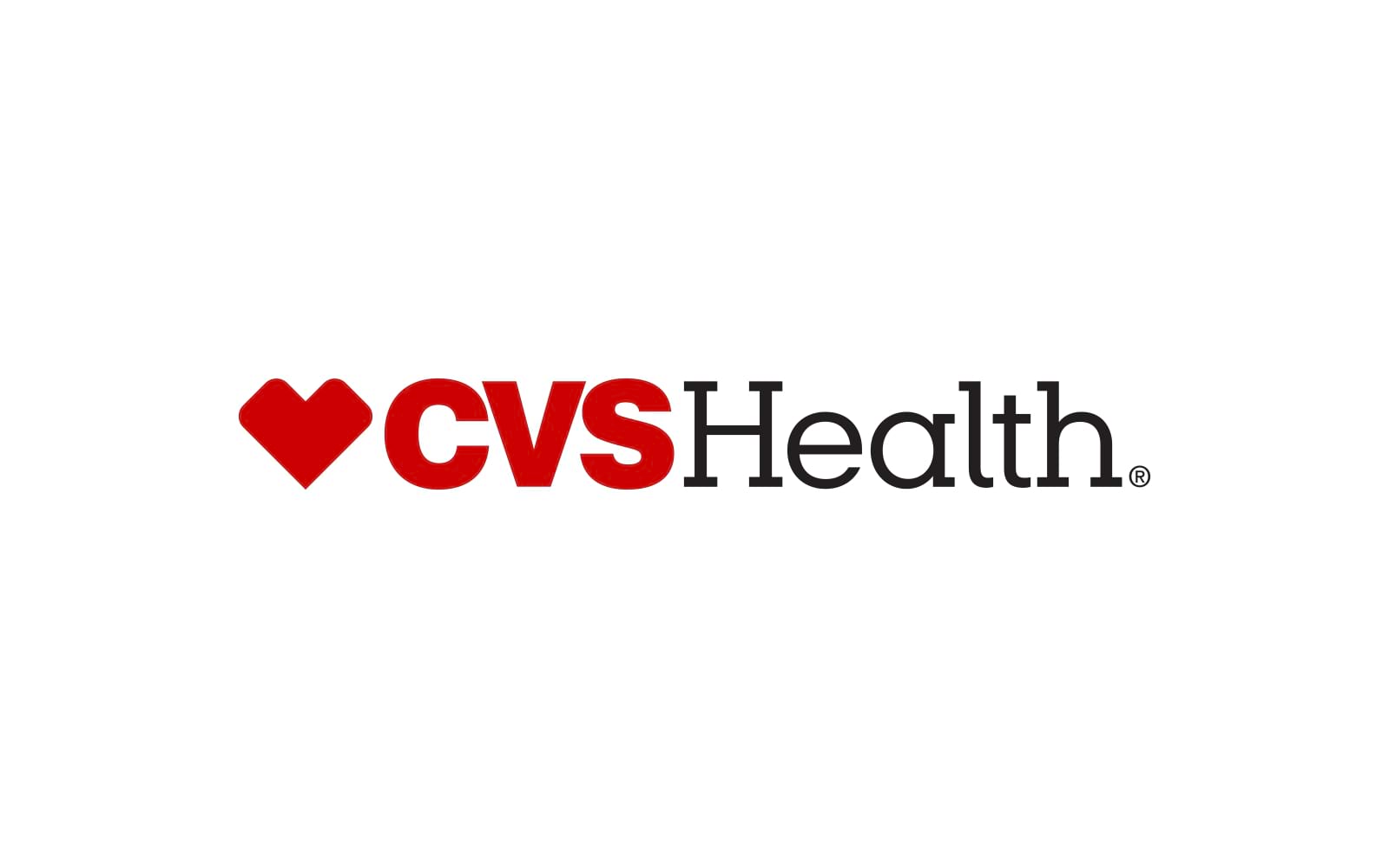
Design: The CVS Health logo features a heart symbol followed by the brand name. The heart is designed in a simple, modern style, making it highly recognizable.
Symbolism: The heart represents care, compassion, and health—core values of CVS Health. The logo is a visual reminder of the brand’s commitment to improving the health of its customers.
Impact: This logo has helped CVS Health establish itself as a leader in the retail pharmacy industry, known for its focus on customer care and wellness.
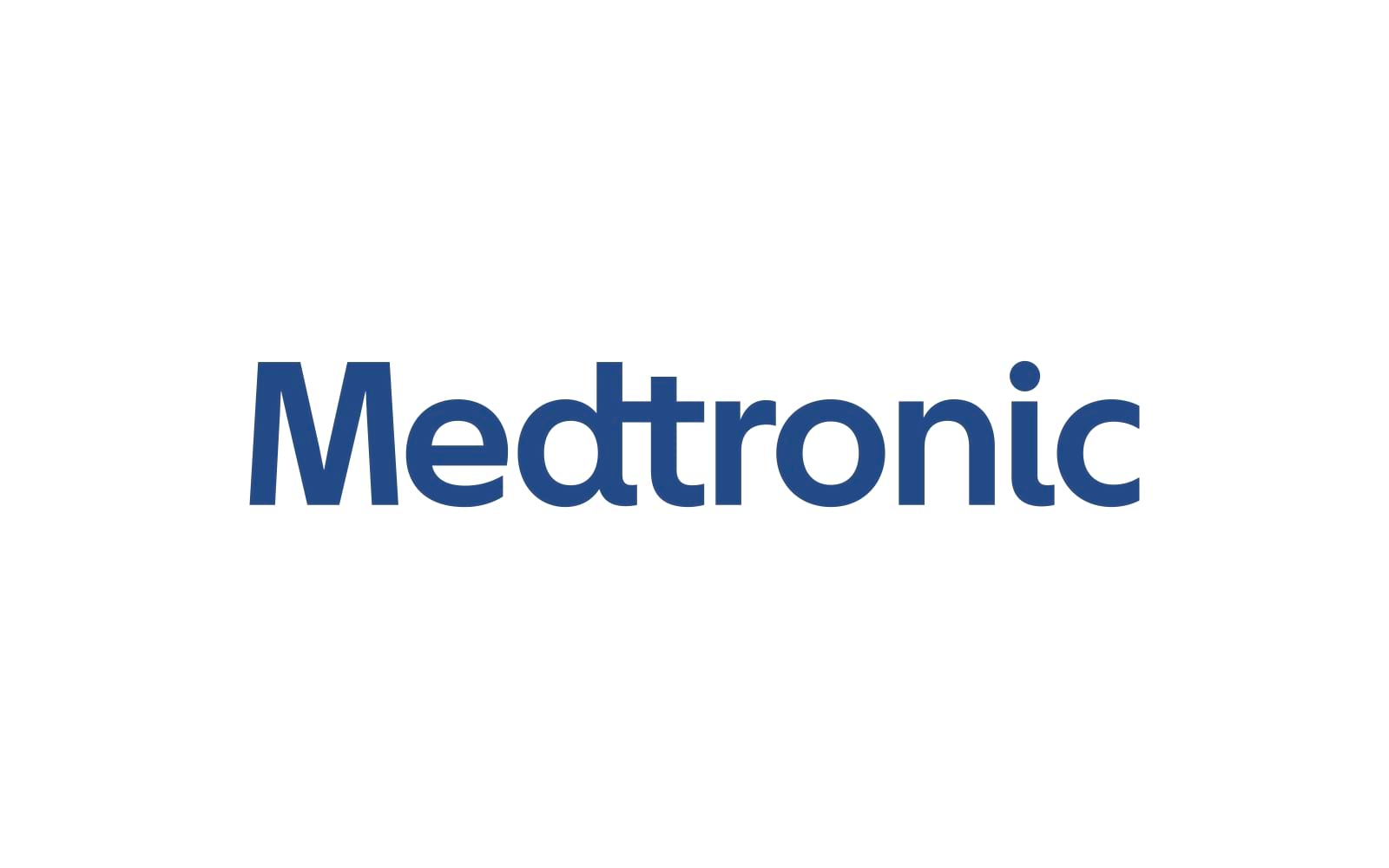
Design: The Medtronic logo features a stylized globe and a human figure, symbolizing the global impact and human-centered approach of the company’s medical technology solutions.
Symbolism: The globe represents Medtronic’s global reach, while the human figure emphasizes the company’s focus on improving patient lives through innovative healthcare solutions.
Impact: Medtronic’s logo is a strong representation of its mission to alleviate pain, restore health, and extend life. It’s a symbol of innovation and excellence in medical technology.
These ten healthcare logos exemplify the power of effective design and branding in the healthcare industry. Each logo not only represents its respective brand but also embodies the values and mission that resonate deeply with patients and the broader public. By analyzing these logos, healthcare organizations can draw inspiration for their own branding efforts, ensuring they communicate trust, care, and professionalism.
At Alitestar, we are dedicated to helping healthcare brands create logos that not only look great but also tell a compelling story. Whether you’re a new healthcare provider or an established organization looking to rebrand, we can help you design a logo that stands out in the industry and connects with your audience on a meaningful level.
Crafting a Narrative Through Design
A logo is often the starting point for a healthcare brand’s identity, but it’s the story behind the logo that truly connects with patients. Brand identity encompasses all the visual and emotional elements that define a brand, from the logo to the color palette, typography, and overall design language. However, it’s the narrative—the story that ties all these elements together—that makes the brand memorable and trustworthy.
In healthcare, storytelling is crucial. Patients want to feel a connection to their healthcare providers, and a compelling brand story can provide that connection. According to a study published in the Journal of Healthcare Management, patients are more likely to engage with brands that they feel have a personal story or mission. This is why effective healthcare branding goes beyond just creating a logo; it involves crafting a narrative that resonates with your audience.
At Alitestar, we specialize in creating cohesive brand identities that tell a compelling story. We work closely with our clients to understand their mission, values, and goals, and then translate those into a visual language that speaks to their target audience. Whether it’s through logo design, brand guidelines, or brand storytelling, our goal is to create a brand identity that patients can connect with on an emotional level.
Your Guide to Designing a Healthcare Logo with Alitestar
Creating a successful healthcare logo is a multi-step process that requires careful planning and execution. Here’s how we approach logo design at Alitestar:
Brand Discovery:
The first step in creating a healthcare logo is understanding the brand’s core values, mission, and target audience. This involves deep research into the organization’s history, goals, and the market it operates in. We start by asking the right questions: What does the brand stand for? Who is the target audience? What message should the logo convey?
Brand Strategy:
Once we have a clear understanding of the brand, we develop a comprehensive brand strategy that aligns the logo with the organization’s overall branding goals. This includes determining the best visual elements to represent the brand and ensuring that the logo will work across all mediums.
Brand Naming:
If the brand is new or undergoing a rebranding, we may also assist in the naming process. The name and logo should complement each other, working together to create a strong brand identity.
Logo Design:
With the strategy in place, we move on to the design phase. Our design team creates several logo concepts, each one reflecting the brand’s values and mission. We then work closely with the client to refine these concepts until we arrive at the perfect logo.
Brand Guidelines: To ensure consistency across all platforms, we create a set of brand guidelines that outline how the logo should be used. This includes specifications for color, typography, and placement, as well as guidelines for how the logo should be applied in different contexts.
Brand Storytelling:
Finally, we help our clients build a narrative around their brand. This involves crafting a story that ties the logo to the brand’s history, mission, and values. This story is then integrated into all branding materials, from the website to marketing campaigns.
At Alitestar, we take pride in our thorough approach to logo design. Our goal is to create logos that are not only visually appealing but also deeply meaningful, helping healthcare organizations build strong, lasting connections with their audience.


Shaikh Asif is an Award-winning designer, director, strategist, and educator. He’s the Lead Strategic Brand Designer and Art Director of The Alitestar— a strategic branding and design agency that helps startups, ambitious CEOs, and passionate entrepreneurs to achieve success and ultimately create unforgettable brand experiences.