Design
Top 10 Best Negative Space Logos: Mastering the Art of Subtle and Impactful Branding
10.02.2025
By shaikh asif
Design
10.02.2025
By shaikh asif


In the realm of branding, logos serve as the visual cornerstone of a company’s identity. Yet, amidst the crowded landscape of design, negative space logos have carved out a unique niche. These logos don't just display an image—they tell a story, create a memorable impression, and convey a brand's message with precision. For startups, entrepreneurs, and established businesses alike, understanding the power of negative space in logo design can be transformative.
Negative space, the area surrounding the subject of a logo, is often overlooked by the untrained eye. However, when harnessed effectively, it can elevate a logo from mere design to a powerful tool of communication. In this article, we will explore the top 10 best negative space logos of the world, delving into what makes them stand out and why they are celebrated as masterpieces in the branding world.
Before diving into the list, it's important to understand the criteria that set these logos apart:
Creativity: The clever use of negative space to convey dual meanings or hidden messages.
Simplicity: A minimalist approach that ensures the logo is easily recognizable and memorable.
Brand Alignment: How well the logo reflects the company’s identity, values, and mission.
Timelessness: A design that remains relevant and effective despite changing trends.
Visual Impact: The immediate effect the logo has on the viewer, creating a lasting impression.
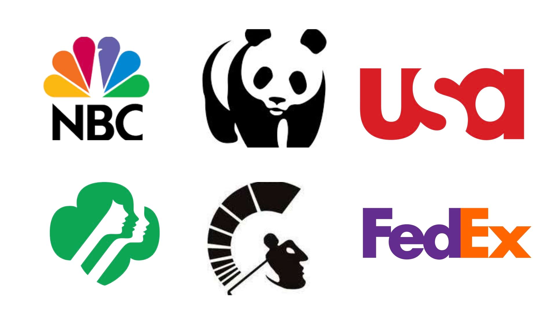
Analysis: The FedEx logo is a classic example of negative space usage. At first glance, it appears to be a simple logotype. However, the clever placement of the letters ‘E’ and ‘x’ creates an arrow in the negative space, symbolizing speed and precision—core values of the FedEx brand. This subtle detail elevates the logo from being merely functional to being a brilliant representation of the company’s services.
Analysis: The NBC logo is a colorful peacock with its feathers spread out, symbolizing the company’s pride in the quality of its broadcasts. But the brilliance lies in the negative space—between the feathers, the body of the peacock is cleverly shaped, creating a striking and memorable image. This use of negative space reinforces the logo’s visual impact, making it one of the most recognizable logos in the world.
Analysis: The WWF logo features a panda, an animal known for its rarity and vulnerability. The design uses negative space to create the panda’s distinctive features with just a few black shapes on a white background. This minimalist approach not only makes the logo instantly recognizable but also underscores the organization's mission to protect endangered species.
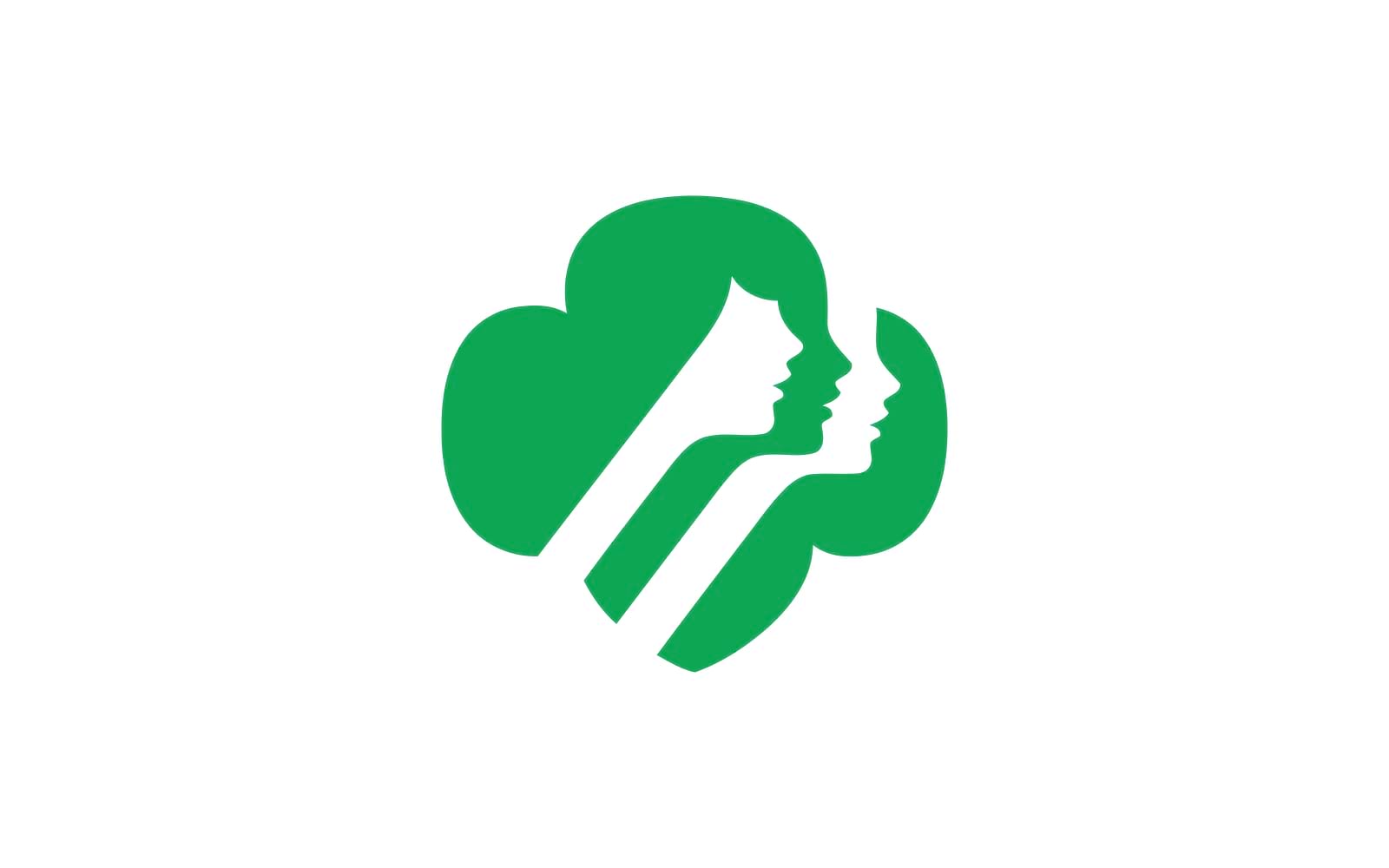
Analysis: The Girl Scouts logo is a masterclass in subtlety. At first, it appears to be a simple profile of a young girl. However, with closer inspection, three faces emerge from the negative space, symbolizing the community and unity among the Girl Scouts. This clever use of negative space not only reinforces the organization's values but also creates a lasting visual impact.
Analysis: The Spartan Golf Club logo is a perfect blend of elegance and strength. The logo depicts a golfer swinging, but the negative space reveals the face of a Spartan warrior. This dual imagery not only makes the logo memorable but also aligns perfectly with the brand’s identity, combining the sport’s grace with the warrior’s spirit.

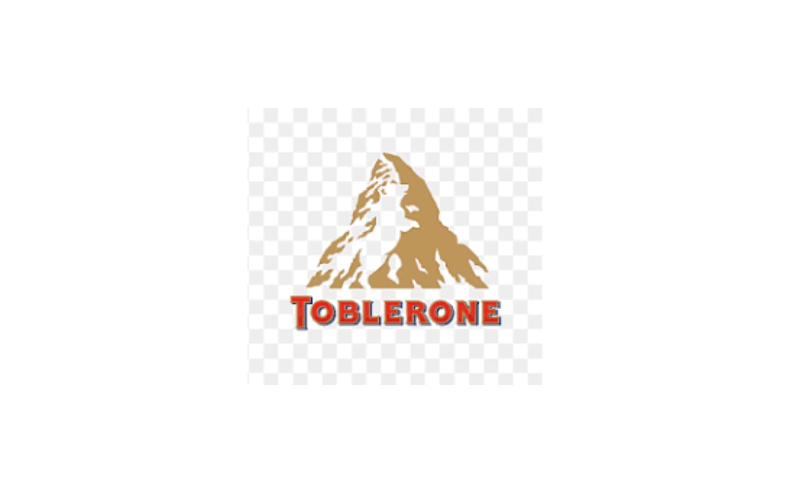
Analysis: Toblerone's logo is another brilliant example of hidden imagery. The logo features a mountain, symbolizing the Swiss Alps, where the chocolate originates. Hidden in the mountain's negative space is the image of a bear, representing the city of Bern, the chocolate’s birthplace. This clever design element adds depth to the logo, connecting the brand to its heritage.
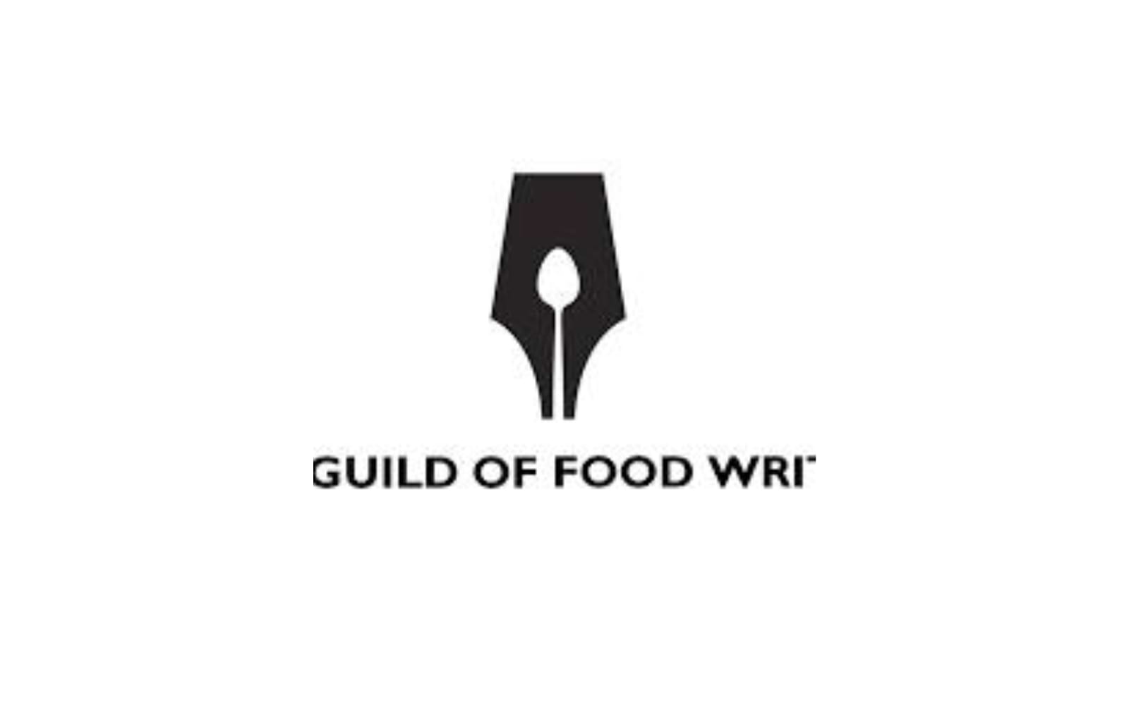
Analysis: The Guild of Food Writers logo is a sophisticated representation of the organization's identity. The logo features a pen nib, but upon closer inspection, the negative space within the nib reveals a spoon. This clever design choice beautifully merges the concepts of writing and food, perfectly encapsulating the brand’s essence.
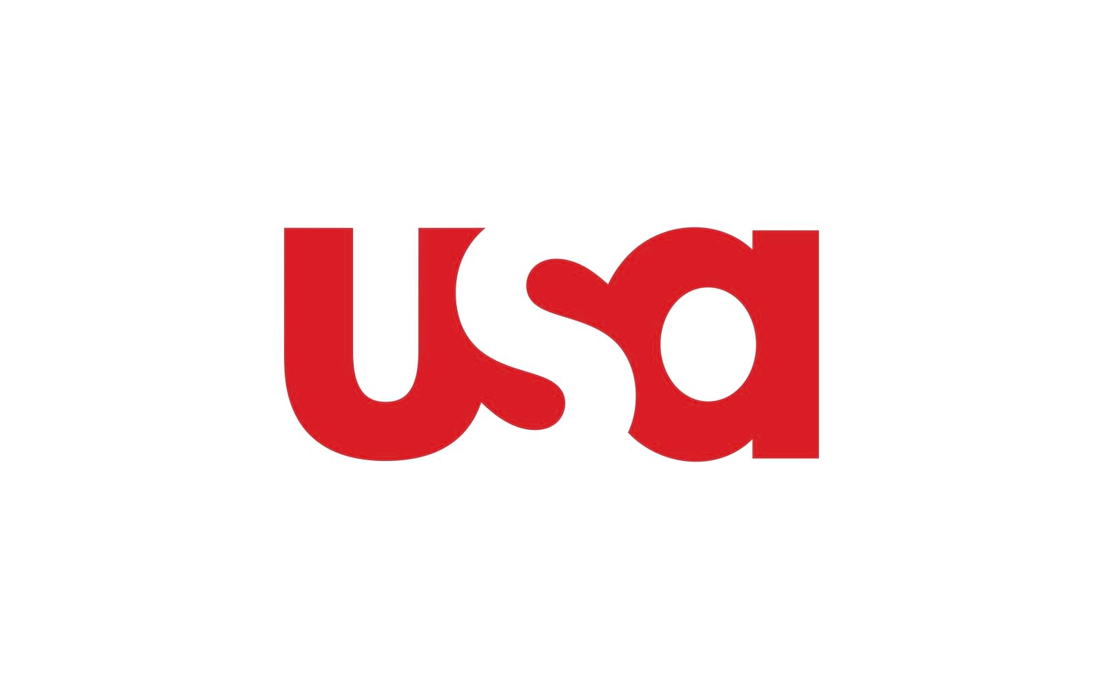
Analysis: The USA Network logo is a modern, minimalist design that uses negative space to create a subtle, yet powerful impact. The letters 'U', 'S', and 'A' are designed in such a way that the negative space forms an abstract shape of the American flag, reinforcing the network's national identity and appeal.
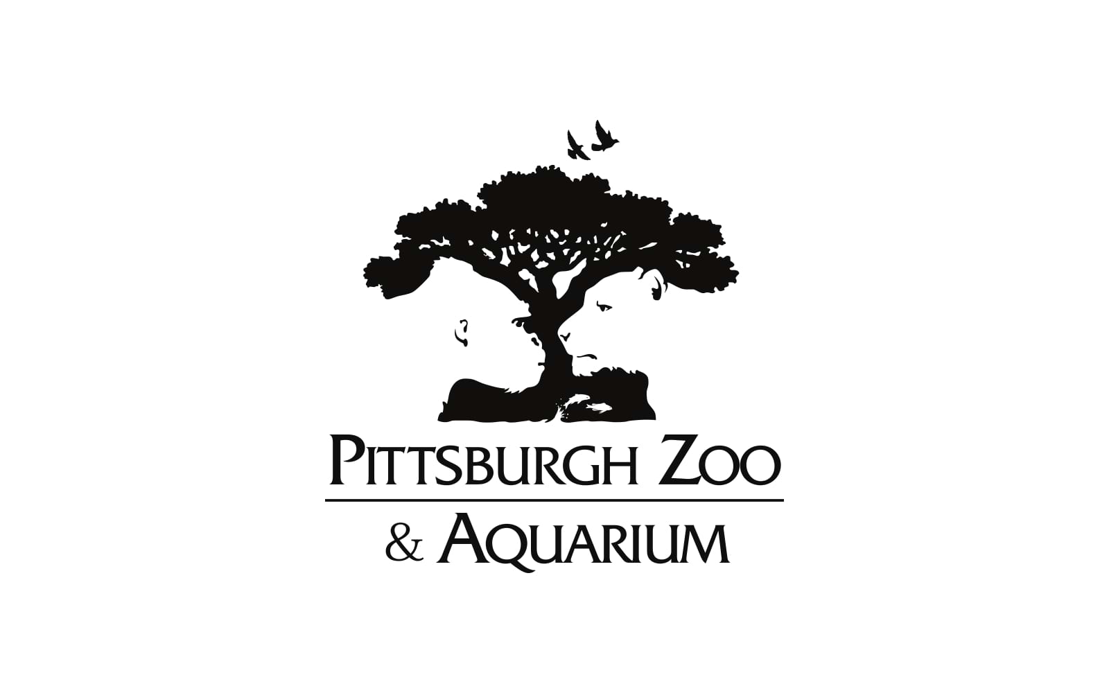
Analysis: The Pittsburgh Zoo & PPG Aquarium logo is a creative use of negative space that highlights the organization’s dual focus on land and sea life. The logo features a tree, but within the negative space, one can see the faces of a gorilla and a lion on one side, and aquatic creatures like fish on the other. This design not only captures the diversity of the zoo’s inhabitants but also creates a compelling visual narrative.
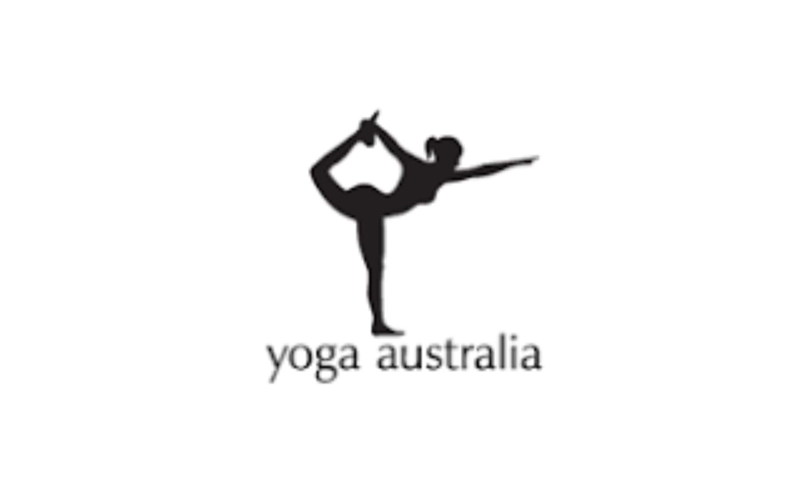
Analysis: The Yoga Australia logo is a serene and simple design that captures the essence of yoga. The logo depicts a person in a yoga pose, but the negative space created by the figure’s arm and leg forms the shape of Australia. This clever use of negative space beautifully ties the practice of yoga to the country, making the logo both meaningful and memorable.
The Importance of Negative Space in Logo Design
Negative space is more than just a clever design trick; it’s a powerful tool that can elevate a brand’s identity. In logo design, negative space allows for dual meanings, hidden messages, and deeper connections with the audience. It can make a logo more engaging, more memorable, and more effective in communicating a brand’s values and mission.
For businesses and entrepreneurs, investing in a logo that uses negative space effectively is a step toward creating a strong and lasting brand identity. It’s not just about aesthetics; it’s about making sure your brand stands out in a crowded marketplace.
How Alitestar Can Elevate Your Brand
At Alitestar, we understand the intricate art of logo design and branding. Our team of experts specializes in creating logos that are not just visually appealing, but also strategically aligned with your brand’s identity and goals. Whether you’re looking for a minimalist design that uses negative space or a bold, complex logo, we can craft a visual identity that resonates with your target audience.
Our services go beyond logo design. We offer comprehensive branding solutions, including brand strategy, brand naming, brand storytelling, brand guidelines, and more. Our goal is to ensure that your brand not only looks good but also tells a compelling story that drives business growth.
Negative space logos are more than just a design trend—they are a powerful branding tool that can set your business apart. The top 10 logos we’ve explored demonstrate the impact of thoughtful design and the potential of negative space to create memorable, effective logos. If you’re ready to elevate your brand with a logo that captures the essence of your business, contact Alitestar today. Let’s create a visual identity that not only stands out but also stands the test of time.


Shaikh Asif is an Award-winning designer, director, strategist, and educator. He’s the Lead Strategic Brand Designer and Art Director of The Alitestar— a strategic branding and design agency that helps startups, ambitious CEOs, and passionate entrepreneurs to achieve success and ultimately create unforgettable brand experiences.