Branding
Non-profit Branding Case Studies and Examples
09.02.2025
By Shaikh Asif
Branding
09.02.2025
By Shaikh Asif


Crafting an Authentic Branding That Reflects Your Nonprofit Values
Nonprofit organizations play a crucial role in shaping our society and making a positive impact on the world. But in a sea of charitable causes, how can your nonprofit stand out and make a lasting impression? One key element is branding—the visual identity that represents your organization’s mission, values, and impact.
In this article, we will analyze how six notable nonprofit organizations use their logos to convey their values and appeal to their target audience.
Elevating Your Nonprofit Brand Through Compelling Design
When it comes to your nonprofit organization, your brand is more than just a logo or a catchy slogan—it’s the essence of who you are and what you stand for. Elevating your nonprofit brand through compelling design means going beyond aesthetics and delving deep into the heart of your mission and values. It’s about creating a visual identity that resonates with your audience and communicates the impact you’re making in the world.
But why is design so important for nonprofits? Well, think about it this way: when potential donors and supporters come across your organization, what’s the first thing they see? It’s likely your logo or some aspect of your visual branding. And in today’s digital age where attention spans are short and competition is fierce, you need to make a strong first impression that captures hearts and minds. That’s where premium design services come into play. By investing in top-notch design expertise, you’re not just getting a pretty logo or a sleek website—you’re investing in the future of your cause. You’re sending a message to the world that you take your mission seriously and that you’re committed to making a real difference.
Beyond the Logo: Building a Cohesive Brand Identity for Nonprofit Brands
While a logo is an important element of your nonprofit’s brand identity, it’s just the tip of the iceberg. Building a cohesive brand identity goes beyond the logo and encompasses everything from your color palette to your typography, from your tone of voice to your visual style. A cohesive brand identity is essential for nonprofit brands because it helps to create consistency and recognition across all touchpoints. Whether someone encounters your organization on social media, your website, or a printed flyer, they should immediately recognize your brand and associate it with your mission and values.
But building a cohesive brand identity takes more than just slapping your logo on everything—it requires careful planning, attention to detail, and a deep understanding of your audience and goals. It’s about crafting a visual language that speaks to who you are as an organization and what you stand for in the world.
The iconic panda logo of WWF is a masterclass in symbolic design. The panda is not only an endangered species but also serves as a symbol of vulnerability and the need for conservation. The WWF logo conveys a message of conservation, sustainability, and the urgency of protecting endangered species and natural habitats. It’s a call to action, reminding us of our responsibility to the planet and its biodiversity.
![]()
The panda symbolizes the vulnerability of wildlife and the need for global efforts to preserve nature for future generations. It’s a powerful visual communication that resonates with people worldwide, inspiring them to support and engage with WWF’s mission.WWF’s use of black and white in its logo draws directly from the colors of the panda, which not only makes for a striking visual but also represents the clarity of their mission. The absence of color suggests a return to the basics, highlighting the fundamental issues at stake. The bold, sans-serif typeface used by WWF conveys a sense of strength and stability. It’s straightforward and legible, reflecting the organization’s transparent approach to its work and goals.Every aspect of WWF’s brand identity is designed to reflect its commitment to the environment. The simplicity of the design suggests a global, inclusive approach, free from cultural or geographical bias.
The Feeding America logo is characterized by its use of vibrant colors and a symbolic icon. The wheat icon in the logo represents nourishment and abundance, aligning with the organization’s mission to combat hunger. It’s a universal symbol of food that resonates with the idea of feeding those in need.
![]()
The green and orange colors are energetic and convey a sense of hope and positivity. Green is often associated with growth and renewal, suggesting the organization’s role in helping communities thrive. Orange adds a friendly and inviting touch, reflecting the warmth and approachability of the organization. The bold, sans-serif font is modern and suggests a sense of reliability and professionalism. It communicates that Feeding America is a trustworthy and effective organization. The logo’s design reflects values of community support, nourishment, and the fight against hunger. It’s a beacon of hope for those facing food insecurity. The message is clear – Feeding America is about providing essential support to those who need it most, ensuring that no one goes hungry. The combination of the wheat icon and the vibrant colors evokes feelings of compassion and solidarity. It encourages people to support the cause and join the movement to end hunger.
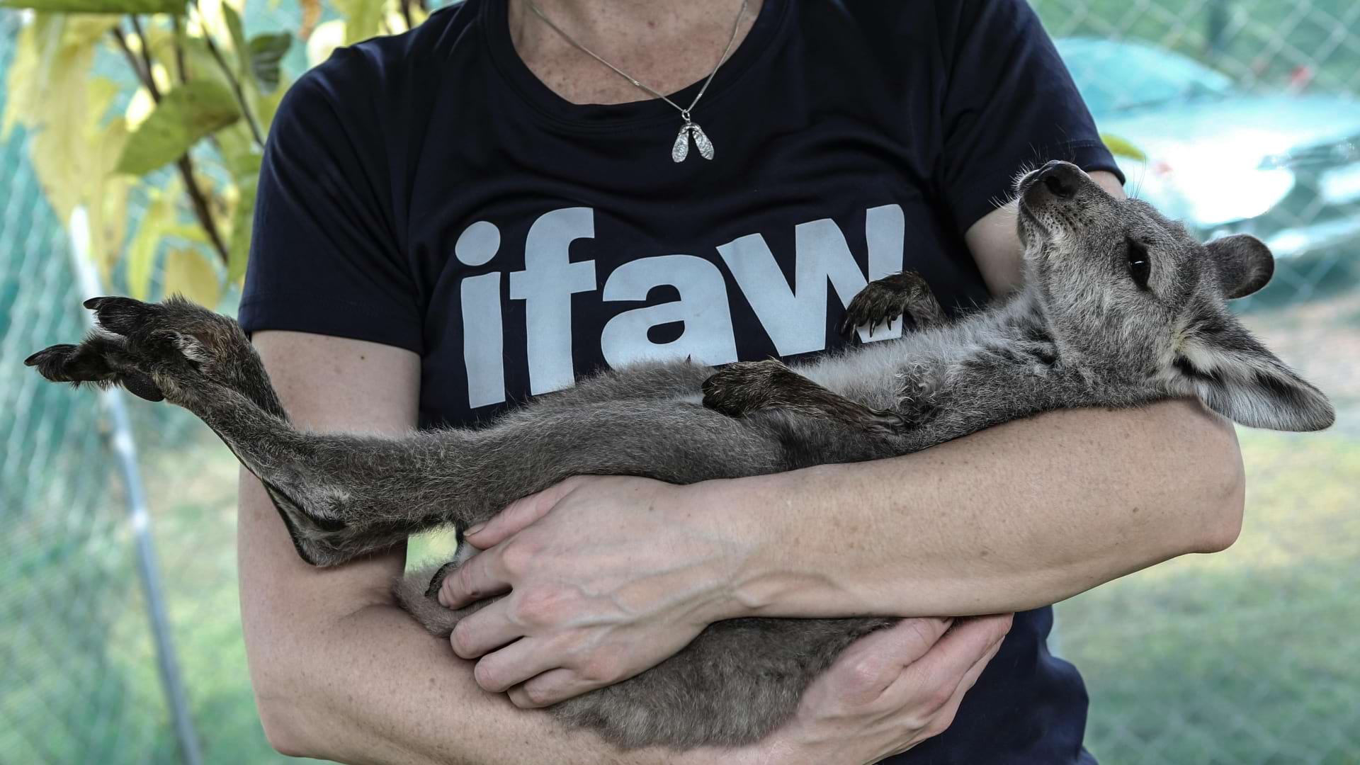
The International Fund for Animal Welfare (IFAW) logo is a reflection of the organization’s commitment to animal welfare and conservation. The logo features bold, lowercase typography, which makes the organization appear accessible and friendly. The choice to underline the “a” in “Ifaw” emphasizes that animals are at the center of everything the organization does.
![]()
While the specific colors of the logo are not detailed in the search results, typically, the use of blue in animal welfare organizations’ logos can signify trust, loyalty, and responsibility, which are key attributes for a charity that deals with animal protection.The simplicity of the design, without complex imagery or icons, suggests a clear and focused mission. It communicates that IFAW’s approach is straightforward and dedicated solely to the welfare of animals.The logo’s design reflects IFAW’s values of direct action, global reach, and a science-based approach to animal welfare. It’s a visual representation of the organization’s dedication to making a tangible impact on the lives of animals worldwide. The message conveyed by the logo is one of hope, action, and the importance of animal welfare. It invites engagement and support by clearly stating its purpose and approach. The bold but simple design can evoke a sense of trust and reliability, inspiring confidence in the organization’s work and encouraging support from the public.
The logo’s simplicity speaks to the universal nature of humanitarian aid. It suggests that assistance and compassion are not bound by complexity but are fundamental human values. The use of purple in the logo is significant. Purple is often associated with dignity, wisdom, and respect, aligning with the organization’s mission to treat every individual with dignity and to approach humanitarian aid with wisdom and insight.
![]()
The bold, clean typeface reflects a modern and efficient approach to aid. It communicates that Human Appeal is focused on delivering help in a direct and impactful way. The logo encapsulates the organization’s commitment to responding to human needs with urgency and respect. It’s a visual pledge of support and action. The message is one of hope, support, and the power of human connection. It reassures those in need that help is at hand and invites others to contribute to the cause. The logo aims to evoke a sense of solidarity and shared humanity. It’s a call to recognize the plight of others and to act with empathy and purpose.
The Dubai Cares logo is a vibrant and meaningful representation of the organization’s commitment to providing education to children and young people in developing countries. The colorful handprints are a powerful symbol of the human touch and the individual care that Dubai Cares extends to each child it supports. They represent the helping hands of volunteers, donors, and communities coming together for a common cause.
![]()
The use of multiple colors in the handprints reflects the diversity and the inclusive nature of the organization’s mission. It suggests that education is a right for all children, regardless of their background. The dual-language typography, featuring both Arabic and English, emphasizes the global reach and the roots of the organization in the United Arab Emirates. It speaks to the organization’s commitment to bridging cultural divides through education. The logo reflects values of hope, care, and the transformative power of education. It’s a visual commitment to creating a better future for the next generation. The message is one of unity and collective responsibility. It conveys that education is the key to solving many of the world’s challenges and that everyone has a role to play in supporting this cause. The handprints evoke a sense of warmth and personal connection, inspiring a feeling of optimism and the desire to make a difference in the lives of children who need support. This creative interpretation of the Dubai Cares logo highlights the organization’s focus on community, diversity, and the belief that education can change the world.
The American Red Cross logo features a bold red cross on a white background. The color red signifies urgency, strength, and passion, while the cross is a universally recognized symbol of aid and assistance. The font is clean and simple, conveying a sense of reliability and professionalism. The American Red Cross logo stands out by its association with emergency response and disaster relief. Its unique selling proposition lies in its commitment to providing humanitarian aid to those in need, both domestically and internationally.
![]()
The logo strikes a perfect balance between simplicity and sophistication—it's instantly recognizable and memorable, yet elegant and refined in its design. The American Red Cross logo is highly adaptable and scalable, appearing consistently across various media and platforms, from print materials to digital campaigns. The American Red Cross logo brings immense value by reinforcing the organization's mission and values, fostering trust and credibility with donors and volunteers, and driving support for its lifesaving programs and services.
Crafting an authentic branding that reflects your nonprofit values is essential for building trust, engaging supporters, and driving impact. it’s about telling your story, engaging your audience, and making a real impact in the world. By investing in premium design services and building a cohesive brand identity, you can elevate your nonprofit’s brand and attract the support you need to make a difference.
To create a logo that resonates with your organization’s values, start by distilling your mission into core concepts. Use symbols that are universally recognized for those values, and incorporate elements that tell your story at a glance. For instance, a tree can symbolize growth and nurturing, while hands might represent support and community.
Colors evoke emotions and can communicate your message before a word is read. For nonprofits, blue can convey trust and dependability, green can represent growth and renewal, and orange might suggest energy and optimism. Choose colors that align with the emotional response you want to elicit from your audience.
To differentiate your logo, consider what’s common in your sector and then zag where others zig. If most use abstract symbols, maybe choose a literal one. If the palette is typically muted, go bold. An unexpected font or a clever visual twist can also make your logo memorable.
Avoid being too literal or complex; simplicity is key. Don’t follow trends that may quickly become dated. Ensure scalability so your logo is legible at any size, and be wary of color combinations that may not be accessible to all viewers.
Your logo should be the spearhead of your branding strategy. Use it consistently across all platforms to build recognition. Tell the story behind your logo in your marketing materials to deepen the connection with your audience. A strong logo can become a badge of support, encouraging donors and volunteers to proudly share their affiliation with your cause.


Shaikh Asif is an Award-winning designer, director, strategist, and educator. He’s the Lead Strategic Brand Designer and Art Director of The Alitestar— a strategic branding and design agency that helps startups, ambitious CEOs, and passionate entrepreneurs to achieve success and ultimately create unforgettable brand experiences.